Generate a new design based on this screen using your own content.
Thank you! Your submission has been received!
Oops! Something went wrong while submitting the form.
# Design from Reference: Drip 404 Page
Create an original, high-fidelity visual design inspired by the reference. Prioritize composition, typography, colors, spacing, and component styling over technical implementation.
## Reference
- **Product:** Drip
- **Category:** 404 Page
- **Screenshot:** https://cdn.prod.website-files.com/5e9dc792e1210c5325f7ebbc/62ec9c6b9147fecea6373682_1659621441636-screenshot-device-efacd2b450392da55b417befa9a83a40-1659600715317.webp
Analyze the screenshot first. If inaccessible, request it rather than guessing.
## Content
{{content.instructions}}
{{content.data}}
Preserve essential messaging and factual accuracy. Adapt structure and copy length for visual balance; never invent product claims.
## Visual Design
Use this context to reproduce the reference's visual language: layout, typography, colors, spacing, borders, radii, and distinctive elements. The screenshot takes priority if descriptions conflict.
## Direction
{{preferences.fidelityInstructions}}
## Output
{{output.instructions}}
Deliver a polished, cohesive design with precise alignment, hierarchy, and spacing. Produce the requested visual artifact, not just a description. If unsupported, explain the limitation.
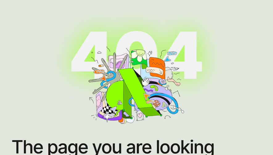
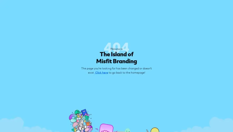
Drip’s 404 page exudes a playful, inviting vibe with a distinctly modern twist. The design leans into minimalism—ample white space draws focus to central visual elements and messaging. Subtle pops of brand color inject friendliness, while neat alignment and a polished finish keep it professional.
Layout and Structure
The structure is refreshingly focused: a single hero section dominates the page, holding all critical content above the fold. There’s no clutter—no features or pricing distractions—allowing users to immediately process what’s happened and how to navigate forward. The footer persists, ensuring access back to core site areas if needed.
Visual Elements
A standout illustration—a large, whimsical cartoonish character—anchors the composition, turning a dead-end into a moment of surprise and delight. The absence of animations ensures snappy load times while maintaining visual interest. Minimal iconography is paired with succinct explanatory text.
Color Palette and Typography
Drip’s recognizable “blurple” (blue-purple) sits boldly against an all-white background, spotlighting key actions. Headings are set in a clean, geometric sans-serif, emphasizing hierarchy and readability; body text is lighter and approachable, guiding the visitor’s eye naturally.
User Experience Patterns
Navigation is frictionless—a clear, primary call-to-action button resolves user confusion, directing them back to the homepage. The persistent footer offers secondary navigation options. The copy is conversational, diffusing frustration with humor and reassurance.
Unique or Notable Design Choices
The most impressive aspect is the brand-forward whimsy: Drip transforms a standard error page into an experience that reinforces its product’s personality, blending professionalism with a welcoming, human touch. The page doesn't just acknowledge the error—it keeps the brand relationship warm and memorable.