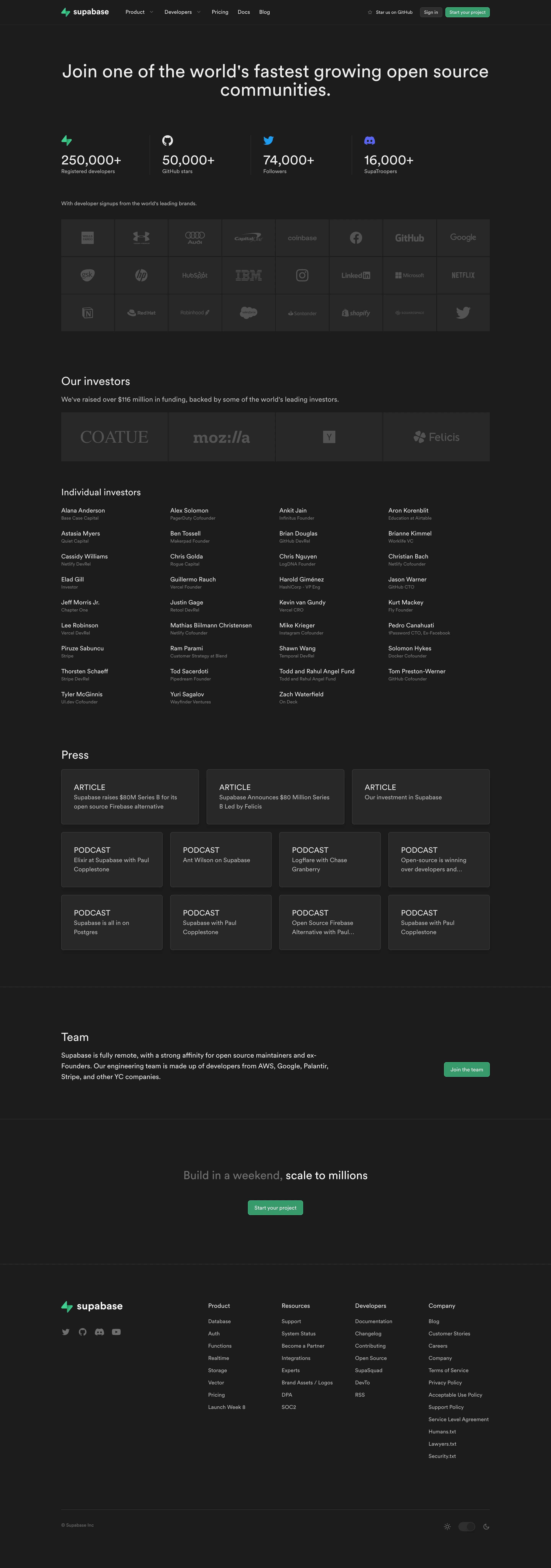
Generate a new design based on this screen using your own content.
Thank you! Your submission has been received!
Oops! Something went wrong while submitting the form.
# Design from Reference: Supabase About Page
Create an original, high-fidelity visual design inspired by the reference. Prioritize composition, typography, colors, spacing, and component styling over technical implementation.
## Reference
- **Product:** Supabase
- **Category:** About Page
- **Screenshot:** https://cdn.prod.website-files.com/5e9dc792e1210c5325f7ebbc/6acadcb08c9a73ab05f13143_6acadc0d6b836b627c08242f_cms-f7e2d350c4e3db2fb3b491da.webp
Analyze the screenshot first. If inaccessible, request it rather than guessing.
## Content
{{content.instructions}}
{{content.data}}
Preserve essential messaging and factual accuracy. Adapt structure and copy length for visual balance; never invent product claims.
## Visual Design
Use this context to reproduce the reference's visual language: layout, typography, colors, spacing, borders, radii, and distinctive elements. The screenshot takes priority if descriptions conflict.
## Direction
{{preferences.fidelityInstructions}}
## Output
{{output.instructions}}
Deliver a polished, cohesive design with precise alignment, hierarchy, and spacing. Produce the requested visual artifact, not just a description. If unsupported, explain the limitation.
Supabase’s company page embodies a distinctly modern and minimalist aesthetic. A soothing, dark-on-light palette provides a sense of sophistication and focus, while subtle gradients and generous white space create an open, breathable feel. Visual restraint and thoughtful composition lend a professional, trustworthy vibe balanced by moments of playful color in accent graphics.
Layout and Structure
The layout follows a clear, information-first structure. A bold hero section introduces the Supabase mission with succinct copy and prominent logo arrangement, immediately followed by modular sections for team, values, and global presence. Each segment is purpose-built: grid systems showcase employee photos, company stats are spotlighted in a visual card format, and partner logos flow in well-aligned carousels—streamlining the visitor journey from introduction to deeper context. The footer is data-rich, featuring navigation, social links, and subtle branding.
Visual Elements
Custom illustrations and geometric background accents add depth and dynamism without overwhelming the content. Team photography is candid and authentic, reinforcing a human touch. Iconography is minimal, precise, and consistent, contributing to brand cohesion. Subtle hover animations and fade-in effects make interactions feel responsive and engaging.
Color Palette and Typography
The primary color scheme revolves around deep greens, complemented by off-whites and muted grays, producing a calm and mature look. Typography features a contemporary sans-serif with distinct weights and sizes to differentiate headings from body copy, ensuring information hierarchy is immediately clear.
User Experience Patterns
Navigation is sticky and simplified, enabling quick access to key sections. Interactive CTAs use color pops and generous padding to attract attention without disrupting flow. All content is easily scannable; carousels and accordions condense information without clutter. Standout scroll-triggered animations provide polish and reinforce Supabase’s innovative DNA.