Overall Style and Aesthetic
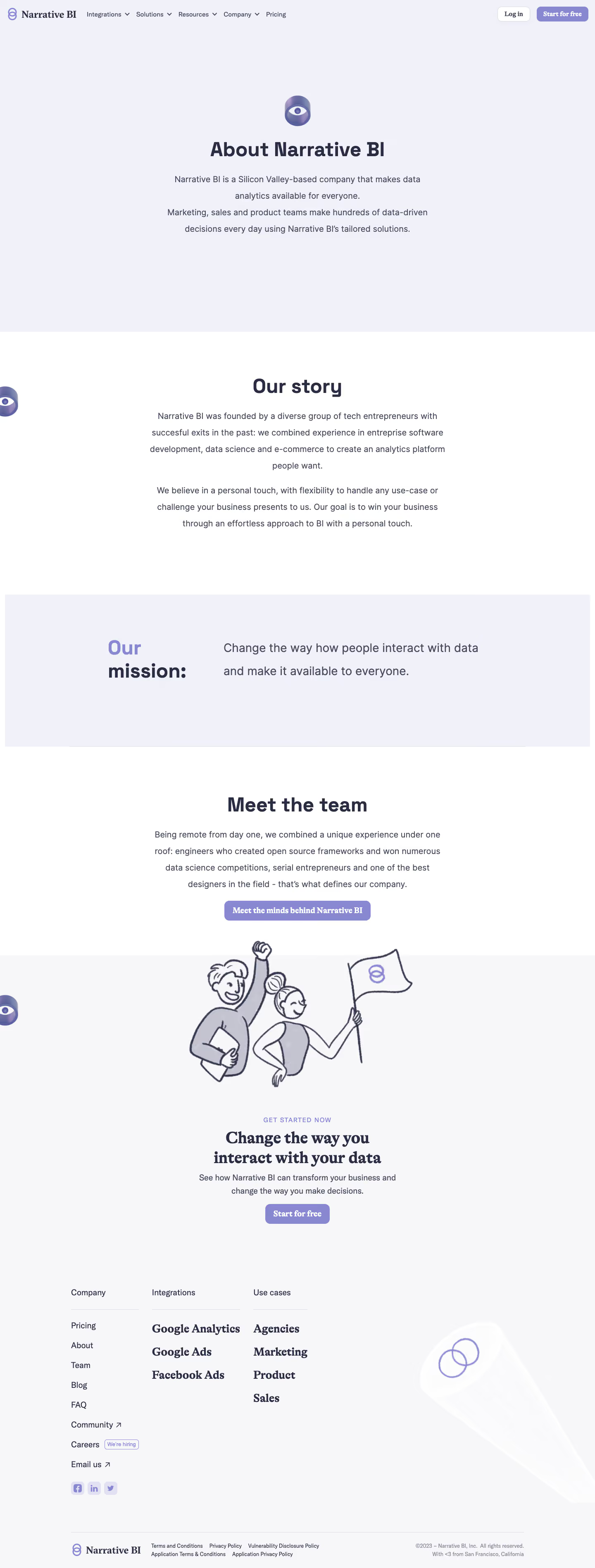
Narrative BI’s About page exemplifies a modern, minimalist SaaS aesthetic, exuding a professional yet approachable vibe. Generous white space keeps the page airy, while crisp alignments and subtle color pops project clarity and trust. Rounded shapes, soft gradients, and gentle microinteractions reinforce an innovative, user-friendly atmosphere without overwhelming visitors. Layout and Structure
The structure is intuitive and easy to scan: a clear hero section introduces the brand vision, followed by sequential story-driven content blocks. Instead of overwhelming visitors with numerous sections, the page is concise—skipping lengthy testimonials or pricing in favor of team introductions and the origins of their product. The footer elegantly wraps up the page, providing essential navigation and social links. Visual Elements
Custom SVG illustrations are sprinkled throughout, adding personality and visual interest while supporting the narrative. There’s restrained use of icons; instead, bold brand-centric graphics and a standout team section—featuring friendly, consistent staff portraits—build human connection. Subtle animations on scroll bring energy, guiding users without distraction. Color Palette and Typography
The palette revolves around white, deep navy, and a signature bright blue, establishing brand recall and visual hierarchy. Typography leverages modern sans-serifs—headings are bold and pronounced, while body text remains light and highly readable. This typographic contrast enhances clarity and emphasizes key messages. User Experience Patterns & Unique Design Choices
Navigation is fixed, lightweight, and immediately accessible. Clear call-to-action buttons invite users to “Get Started,” while a straightforward layout helps visitors focus on the brand’s story. Notably, the About page doesn’t compete for attention—it’s purposefully simple, letting the visuals and content shine. The confident editorial tone and tight design cohesion inspire both trust and curiosity.