Overall Style and Aesthetic
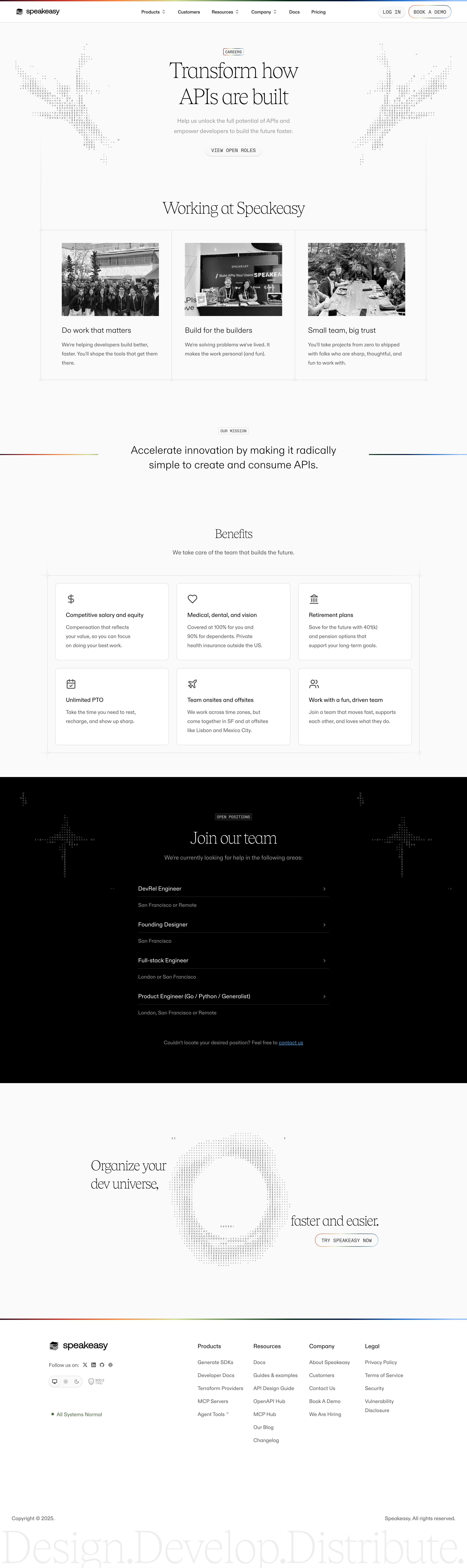
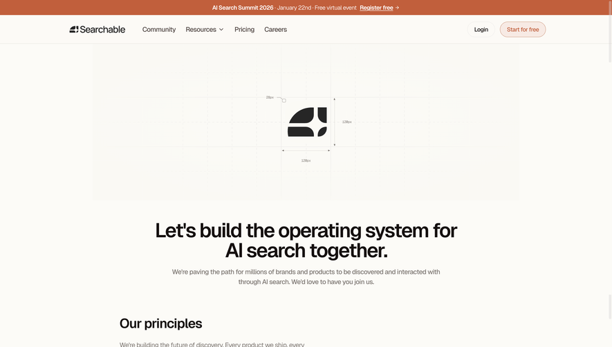
Speakeasy’s careers page exemplifies modern SaaS design—sleek, airy, and confident. The minimalist approach is elevated with a playful twist, featuring subtly animated geometric shapes and overlapping gradients that add motion and warmth without distracting from key content. The vibe is inviting yet professional, hinting at both cutting-edge technology and an inclusive, vibrant team culture. Layout and Structure
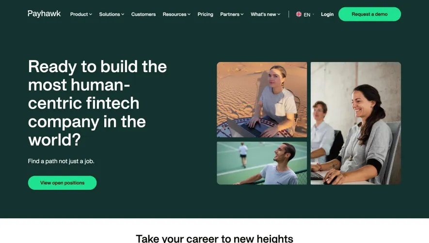
The page opens with a striking hero section: centered headline, brief description, and a prominent call-to-action button, all surrounded by whimsical background elements. Below, content flows in digestible sections—company values, perks, open roles—each with generous spacing and clear headings. There’s an absence of clutter; information is grouped logically, making navigation effortless whether skimming or reading in-depth. Visual Elements
Illustrations and icons bring warmth and identity, trading stock photography for custom vector artwork that echoes Speakeasy’s brand persona. Touches of animation enliven scroll interactions—a floating shape, a gentle slide—increasing user engagement. The animated details are tasteful, reinforcing a modern, forward-thinking brand feel rather than overwhelming the user. Color Palette and Typography
A rich, cool palette dominates—purples, blues, and teals—accented by hints of coral and soft off-whites. Clean, rounded sans-serif fonts balance professionalism with approachability, while bold headers and high-contrast CTAs ensure visual hierarchy and seamless scanning. The typography is cohesive, elegant, and easy to read across devices. User Experience Patterns & Unique Choices
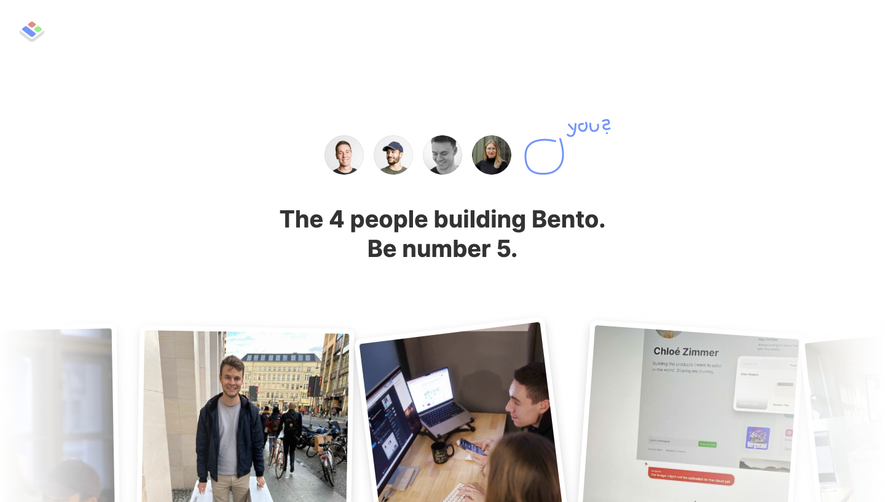
Sticky navigation, concise CTAs (“See open roles,” “Join our team”), and a simple accordion for job listings streamline the user journey. There’s a notable absence of generic stock images—everything feels curated. The entire tone is personable yet ambitious, making candidates feel welcome and excited to learn more. This page stands as a stellar example for SaaS teams seeking to fuse innovation with human-centered design.