 SaaSFrame

 Webflow
Websites 5
All websites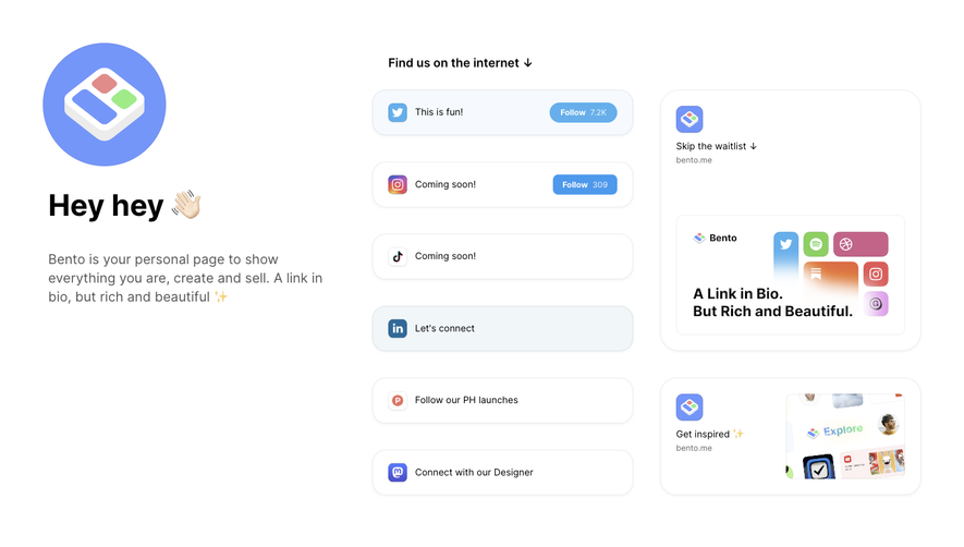
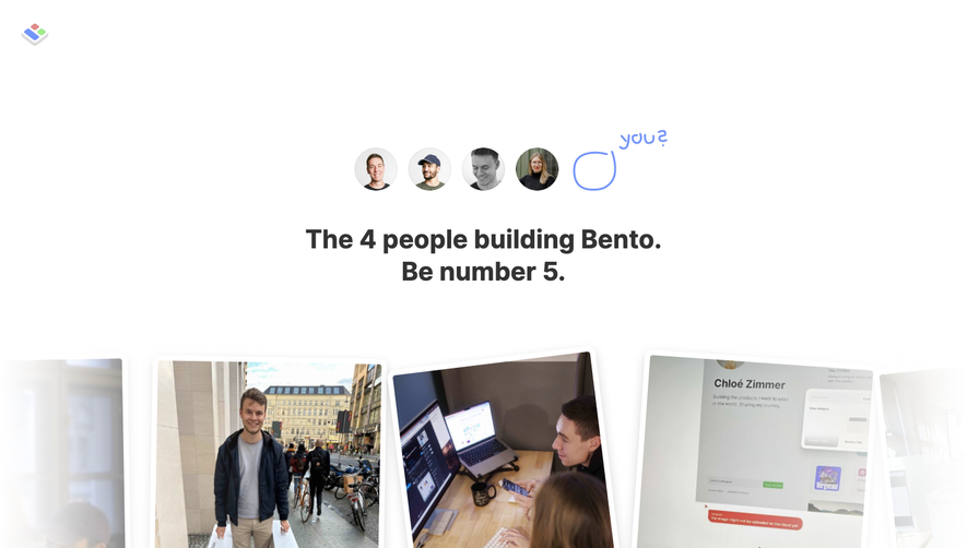
Index of all 5 Bento websites examples
Products 13
All products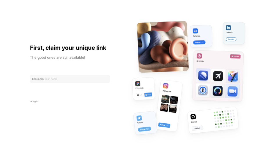
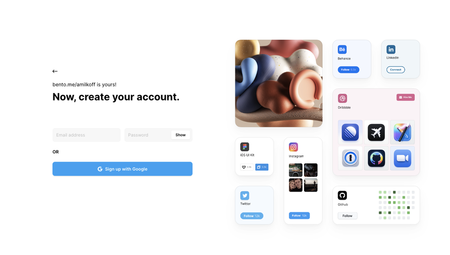
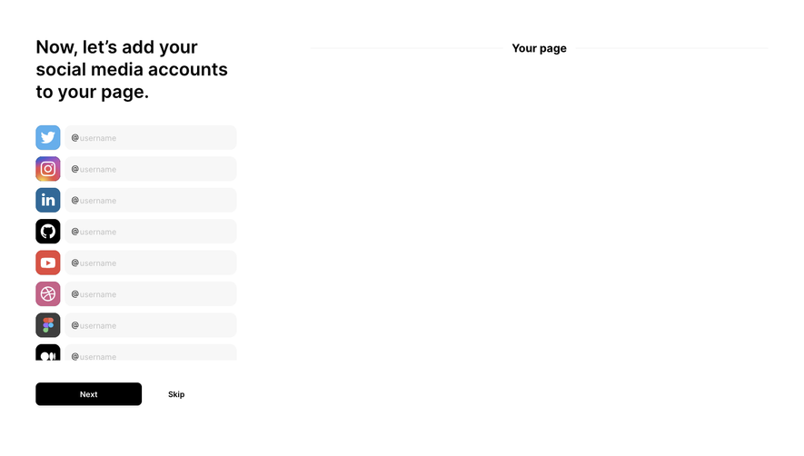
Flows 2
 Bento Add A Link
4 screens
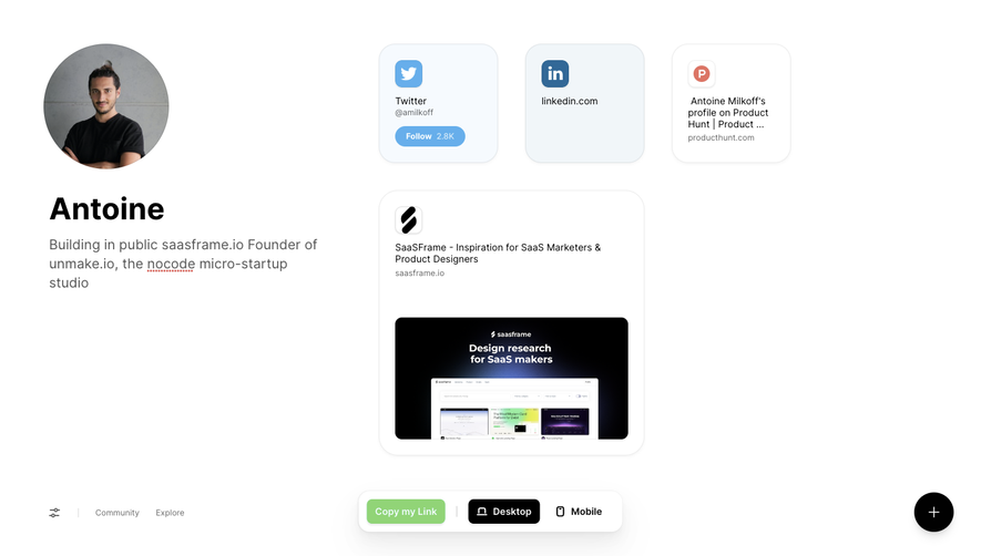
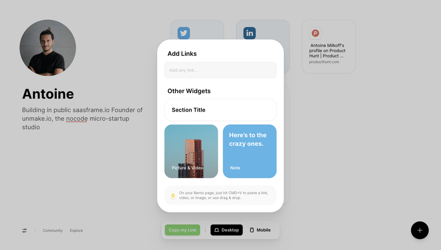
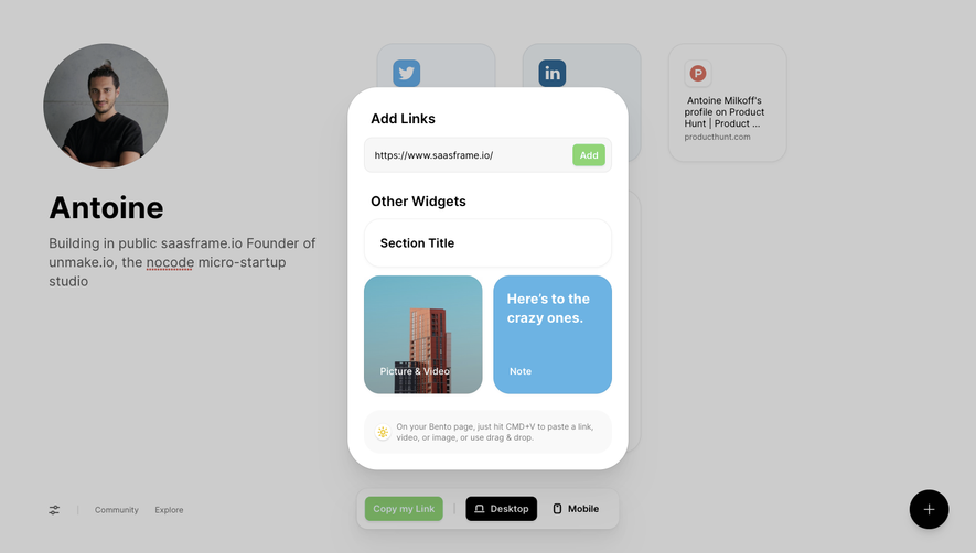
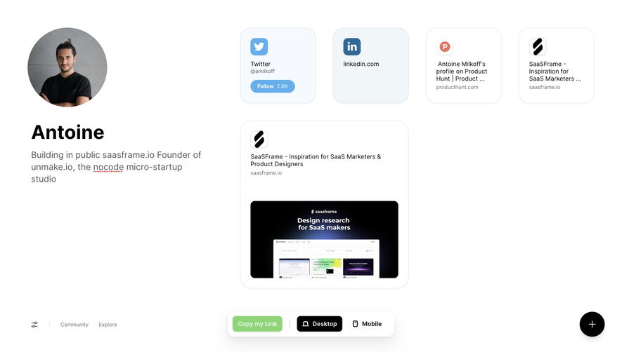

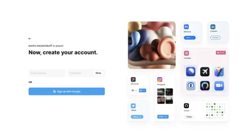
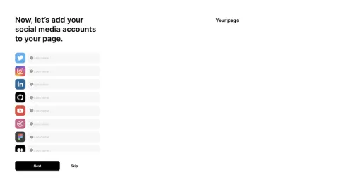
Design reference
Bento — design reference
Source: https://linktr.ee/. Extracted 2026-10-14. Scope: public marketing website CSS; declared styles, not computed browser values. This is an observed inventory, not an official internal design system.
Typography
font-family: var(--font-linksans)— selector.text-displayfont-family: var(--font-linksans)!important— selector.md:!text-h3font-size: clamp(40px,6.67vw,96px)— selector.text-displayfont-size: clamp(62px,6.28vw,90px)— selector.text-h1font-size: 64px— selector.text-h1-compactfont-size: clamp(20px,4vw,56px)— selector.text-h2font-size: clamp(24px,2.85vw,41px)— selector.text-h3font-size: clamp(18px,1.67vw,28px)— selector.text-h4font-weight: 800— selector.text-displayfont-weight: 700— selector.text-h2font-weight: 500— selector.text-h3font-weight: 400— selector.text-bodyfont-weight: 500!important— selector.md:!text-h3font-weight: var(--font-weight-medium)— selector.[&_a:not([data-help-cta])]:font-medium a:not([data-help-cta])font-weight: var(--font-weight-bold)— selector.[&_h2]:font-bold h2line-height: var(--leading-display)— selector.text-displayline-height: var(--leading-h1)— selector.text-h1line-height: var(--leading-h2)— selector.text-h2line-height: var(--leading-h3)— selector.text-h3line-height: var(--leading-body)— selector.text-bodyline-height: var(--tw-leading,1.4)— selector.text-report-bodyline-height: var(--tw-leading,1.04)— selector.text-report-displayline-height: var(--tw-leading,1.2)— selector.text-report-h3letter-spacing: -.02em— selectorp,h1,h2,h3,h4,h5,h6letter-spacing: var(--tracking-display)— selector.text-displayletter-spacing: -.01em— selector.text-h3letter-spacing: var(--tw-tracking,0em)— selector.text-report-bodyletter-spacing: var(--tw-tracking,-.02em)— selector.text-report-displayletter-spacing: var(--tw-tracking,-.04em)— selector.text-report-navletter-spacing: -.01em!important— selector.md:!text-h3
Colors and surfaces
color: #2665d6!important— selector.!text-hydrangeacolor: #1e2330!important— selector.!text-shadecolor: var(--callout-icon)— selector.text-(--callout-icon)color: #5c6568— selector.text-[#5c6568]color: #7d8087— selector.text-[#7d8087]color: #333— selector.text-[#333]color: #471e67— selector.text-[#471e67]background-color: #0000— selectorbutton,input,select,optgroup,textareabackground-color: var(--callout-card)— selector.bg-(--callout-card)background-color: #fff— selectorbody:has([data-treetop-page])
Components and layout
border-radius: 0— selectorbutton,input,select,optgroup,textareaborder-radius: 40px— selector.rounded-cardbox-shadow: var(--tw-inset-shadow), var(--tw-inset-ring-shadow), var(--tw-ring-offset-shadow), var(--tw-ring-shadow), var(--tw-shadow)— selector.shadow-(--pricing-card-compact-recommended-shadow)max-width: 480px— selector.containermax-width: 768px— selector.containermax-width: 992px— selector.containermax-width: 1280px— selector.containermax-width: 1440px— selector.containermax-width: 1920px— selector.containermax-width: 1504px— selector.containermax-width: none— selector.containerpadding: 0— selector::file-selector-buttonpadding: calc(var(--spacing) \* 0)— selector.[&_pre_code]:p-0 pre codegap: 5vw— selector.gap-editorial-hero-gapgap: 7.5vw— selector.max-sm:gap-editorial-hero-gap-smgap: 63.6px— selector.xl:gap-editorial-hero-gap-xlgap: 70px— selector.\32 xl:gap-editorial-hero-gap-2xltransition: border-color .2s,box-shadow .2s,--nav-surface-h .32s cubic-bezier(.32,.72,0,1)— selector.data-[morph=true]:[transition:border-color_200ms,box-shadow_200ms,--nav-surface-h_320ms_cubic-bezier(0.32,0.72,0,1)][data-morph=true]transition: transform .25s ease-out— selectorbody.all-features-active nav[role=navigation]
Responsive rules
(max-width:1439px)
(max-width:1279px)
(max-width:991px)
(min-width:480px)
(min-width:768px)
(min-width:992px)
(min-width:1280px)
(min-width:1440px)
(min-width:1920px)
(prefers-reduced-motion:reduce)
not all and (min-width:1440px)
not all and (min-width:1280px)
not all and (min-width:992px)
not all and (min-width:768px)
not all and (min-width:480px)
(orientation:landscape)
(max-width:479px)
(min-width:992px) and (max-width:1279px)
screen and (max-width:991px)
screen and (max-width:479px)
(prefers-reduced-motion:no-preference)