Generate a new design based on this screen using your own content.
Thank you! Your submission has been received!
Oops! Something went wrong while submitting the form.
# Design from Reference: Searchable Careers Page
Create an original, high-fidelity visual design inspired by the reference. Prioritize composition, typography, colors, spacing, and component styling over technical implementation.
## Reference
- **Product:** Searchable
- **Category:** Careers Page
- **Screenshot:** https://cdn.prod.website-files.com/5e9dc792e1210c5325f7ebbc/6acad397c2028efdec71ae2a_6acad113e575349288e3c0ff_cms-cf183c6eff26cc94193773d2.webp
Analyze the screenshot first. If inaccessible, request it rather than guessing.
## Content
{{content.instructions}}
{{content.data}}
Preserve essential messaging and factual accuracy. Adapt structure and copy length for visual balance; never invent product claims.
## Visual Design
Use this context to reproduce the reference's visual language: layout, typography, colors, spacing, borders, radii, and distinctive elements. The screenshot takes priority if descriptions conflict.
## Direction
{{preferences.fidelityInstructions}}
## Output
{{output.instructions}}
Deliver a polished, cohesive design with precise alignment, hierarchy, and spacing. Produce the requested visual artifact, not just a description. If unsupported, explain the limitation.
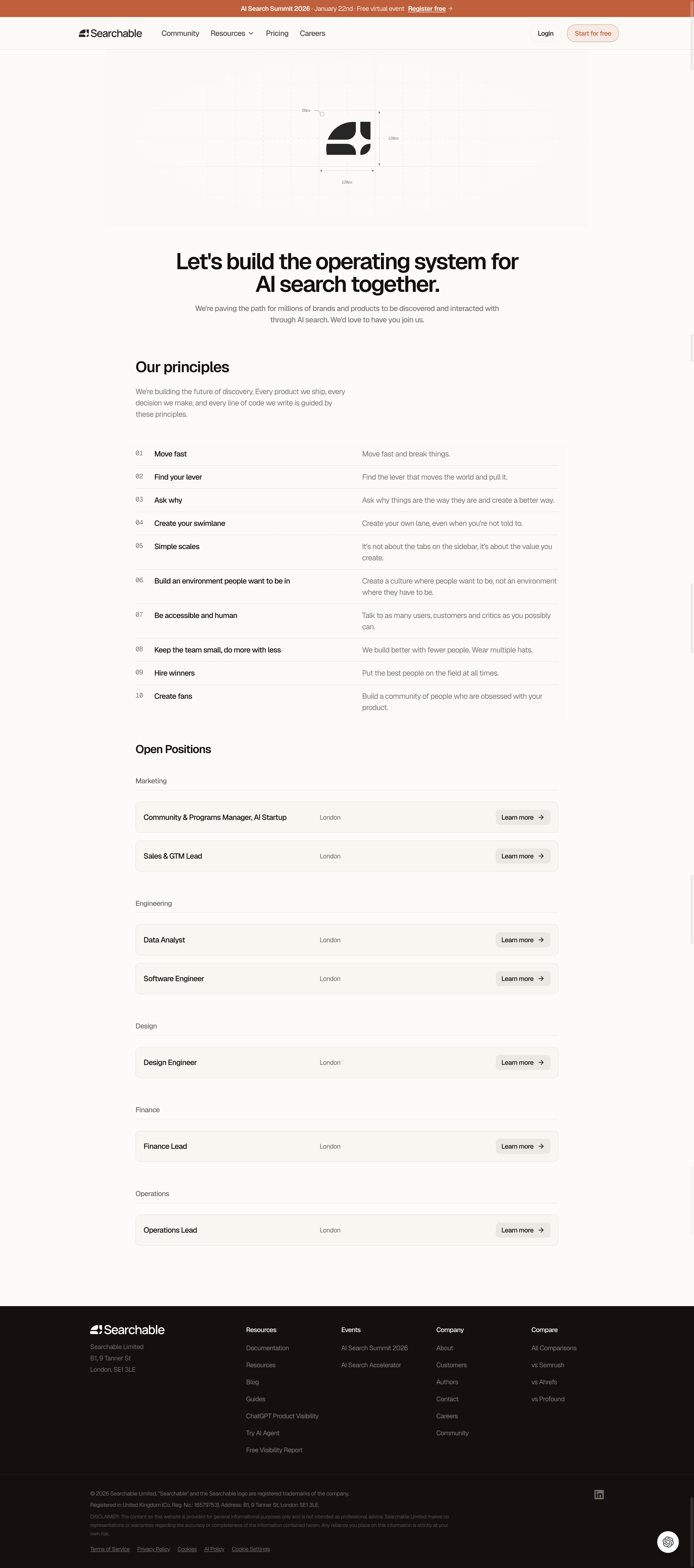
That technical drawing style hero illustration is doing a lot of heavy lifting here. It feels like an architectural blueprint of the Searchable logo, complete with dimension lines and measurements. Super distinctive and sets the tone immediately.
Principles That Actually Read Well
The numbered principles section is clean without being boring. Left-aligned numbers, bold titles, and lighter descriptions create a rhythm that's easy to scan. Ten principles could feel overwhelming but the consistent spacing and two-column layout keeps it digestible. "Move fast and break things" up top tells you exactly what kind of company this is.
Warm Minimalism
The palette is restrained. Mostly black and white with that burnt orange accent in the top banner and a few hover states. The typography is confident, large serif headings paired with smaller sans-serif body text. It works.
Jobs Board Done Right
The open positions section groups roles by department with clear location tags and "Learn more" CTAs. No unnecessary decoration. Each listing gets equal weight. The footer is dense but well-organized into logical columns. Everything here serves a purpose.