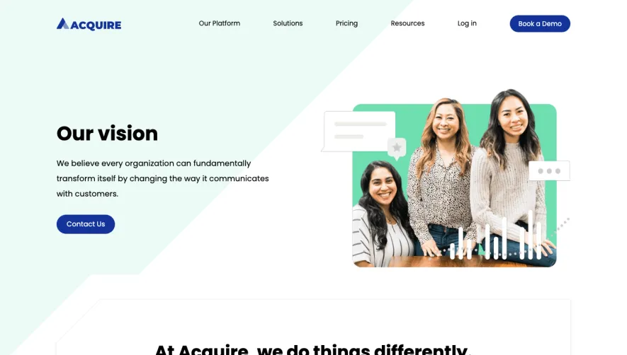
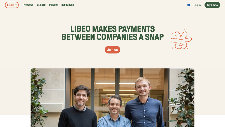
Generate a new design based on this screen using your own content.
Thank you! Your submission has been received!
Oops! Something went wrong while submitting the form.
# Design from Reference: Span About Page
Create an original, high-fidelity visual design inspired by the reference. Prioritize composition, typography, colors, spacing, and component styling over technical implementation.
## Reference
- **Product:** Span
- **Category:** About Page
- **Screenshot:** https://cdn.prod.website-files.com/5e9dc792e1210c5325f7ebbc/6acad39bc2028efdec71ae85_6acad11a5a5fdf4c302f8c40_cms-1264760d54a2522aca5d2f26.webp
Analyze the screenshot first. If inaccessible, request it rather than guessing.
## Content
{{content.instructions}}
{{content.data}}
Preserve essential messaging and factual accuracy. Adapt structure and copy length for visual balance; never invent product claims.
## Visual Design
Use this context to reproduce the reference's visual language: layout, typography, colors, spacing, borders, radii, and distinctive elements. The screenshot takes priority if descriptions conflict.
## Direction
{{preferences.fidelityInstructions}}
## Output
{{output.instructions}}
Deliver a polished, cohesive design with precise alignment, hierarchy, and spacing. Produce the requested visual artifact, not just a description. If unsupported, explain the limitation.
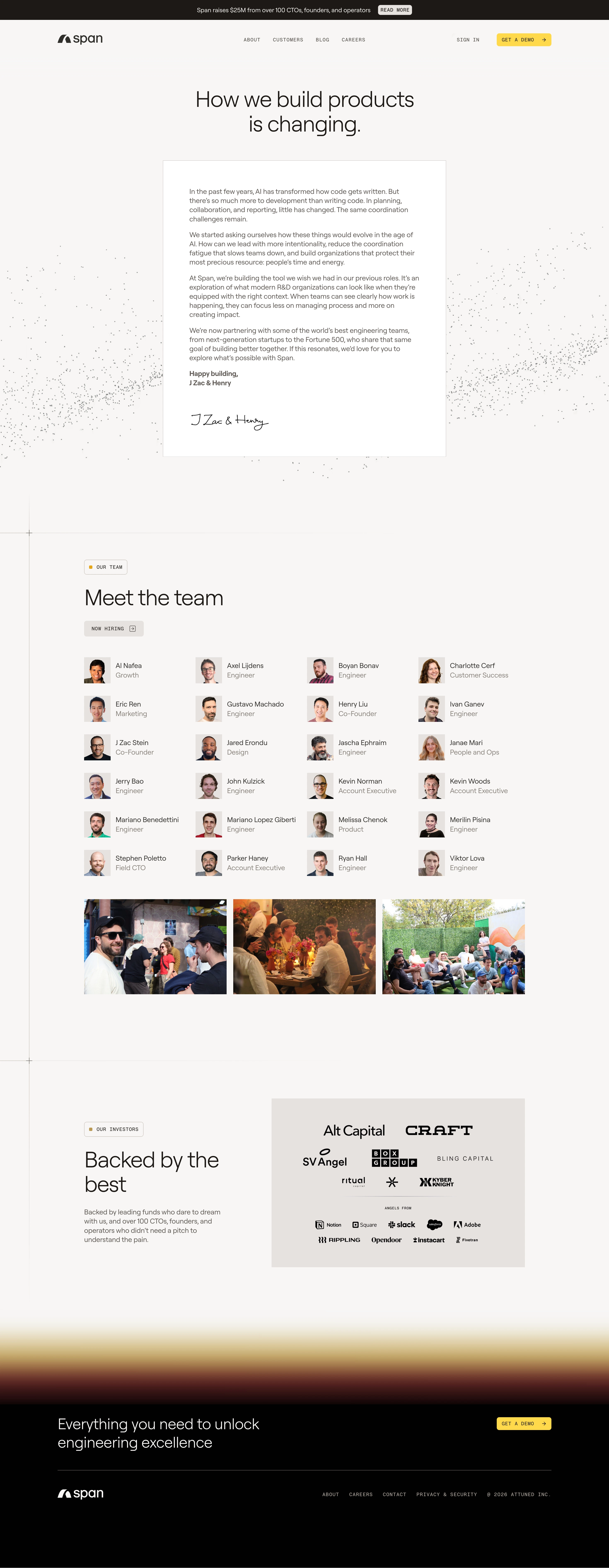
The first thing that hits you is how restrained everything is. Black, white, gold accents. That's it. Span's about page doesn't try to impress you with gradients or flashy illustrations. It earns trust through structure and whitespace instead.
The Letter Sets the Tone
That founder letter in the center is a smart move. It's styled like an actual note, complete with handwritten signatures from J Zac & Henry at the bottom. It makes a SaaS company feel personal. The typography is clean serif for headings and a readable sans-serif for body text. Nothing fancy, just intentional.
Team Grid Done Right
The team section is a simple four-column grid with circular headshots. No hover gimmicks. Real photos of the team hanging out sit below, adding warmth. The "Now Hiring" tag with a subtle arrow is a good touch for recruiting.
Investor Logos With Hierarchy
The investor section separates VC funds from angel-from companies like Notion, Slack, and Adobe. That distinction is uncommon and genuinely useful. Gold dot markers on section labels keep visual consistency throughout.