Design with AI
Generate a new design based on this screen using your own content.
# Design from Reference: Libeo About Page
Create an original, high-fidelity visual design inspired by the reference. Prioritize composition, typography, colors, spacing, and component styling over technical implementation.
## Reference
- **Product:** Libeo
- **Category:** About Page
- **Screenshot:** https://cdn.prod.website-files.com/5e9dc792e1210c5325f7ebbc/6acb72be018523cfee2da2b1_6acb70460e8221f13084986c_cms-0db91db0a02a0c389789a602.webp
Analyze the screenshot first. If inaccessible, request it rather than guessing.
## Content
{{content.instructions}}
{{content.data}}
Preserve essential messaging and factual accuracy. Adapt structure and copy length for visual balance; never invent product claims.
## Visual Design
### Overall aesthetic
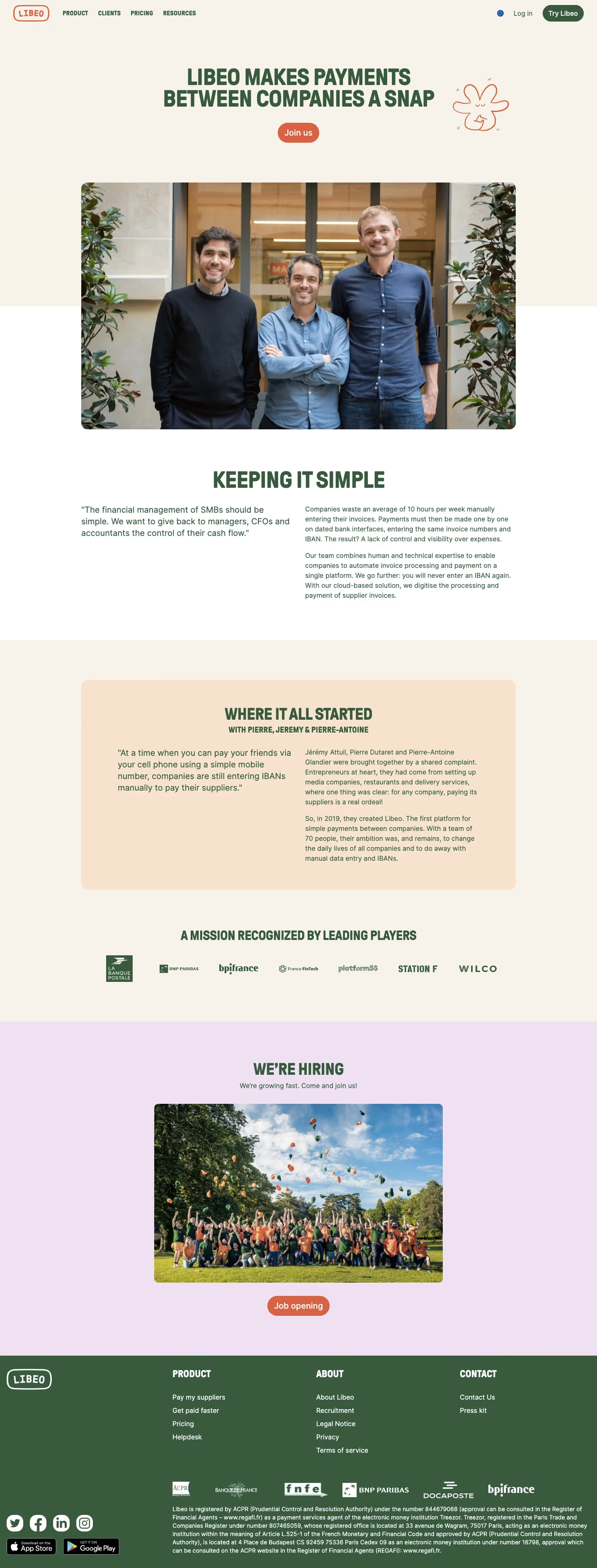
- **Character:** Warm, human company page with cream surfaces, forest-green condensed headlines and playful hand-drawn accents.
### Page composition
- **Capture:** 1440 × 3780 screenshot pixels; estimated CSS scale approximately 1×.
- **Structure:** Cream hero with centered statement and Join us pill, large founder photo crossing the background boundary, two-column mission copy, peach origin-story panel, partner logos, lavender recruiting block and green footer.
### Information hierarchy
- **Priority:** Uppercase mission headline and founder photograph establish personality. Story copy and recognition lead into the hiring photograph and job action.
### Typography
- **Families:** Bold condensed sans-serif display headings, regular sans-serif body and stamped-style logo; exact families unverified.
- **Estimated CSS sizes:** Hero/major headings 48–56px, smaller headings 32px, quote 20px and body 16–18px.
### Colors & surfaces
- **Measured palette:** Cream #F7F3EA, lavender #F1E1F2, white #FFFFFF, forest green #3A5A3D and peach #F8E4CE.
- **Accents:** Warm orange logo outline, doodle and rounded CTA buttons.
### Components
- **Elements:** Pill actions, wide rounded founder/team photos, open two-column story text, partner wordmarks and multi-column footer with social/store badges.
- **Estimated geometry:** Content approximately 1050px wide, photo/panel radii 14–16px, buttons 48px high and broad 80–96px section padding.
### Visual rhythm
- **Spacing:** Large photography alternates with short text sections and distinct pastel bands; condensed uppercase headings provide consistent anchors.
### Responsive
- **Suggested adaptation:** Stack narrative columns, reduce hero type to 32–40px, keep photos fluid and wrap logo/footer groups. Mobile layout is not shown.
### Adaptation guidance
- **Transfer:** Retain the warm palette, human photography and condensed display hierarchy. Substitute genuine company history, people and recognition.
Use this context to reproduce the reference's visual language: layout, typography, colors, spacing, borders, radii, and distinctive elements. The screenshot takes priority if descriptions conflict.
## Direction
{{preferences.fidelityInstructions}}
## Output
{{output.instructions}}
Deliver a polished, cohesive design with precise alignment, hierarchy, and spacing. Produce the requested visual artifact, not just a description. If unsupported, explain the limitation.