Prompt 1,204 words Copy
# Design from Reference: Acquire About Page

Create an original, high-fidelity visual design inspired by the reference. Prioritize composition, typography, colors, spacing, and component styling over technical implementation.

## Reference

- **Product:** Acquire
- **Category:** About Page
- **Screenshot:** attached to this message (also available at https://media.saasframe.io/o/9936ec65d62830587cf5.webp)
- **Source:** https://acquire.io/about-us/

Analyze the attached screenshot first. If no image is attached, open the screenshot link; if neither is accessible, ask for it rather than guessing.

## Visual Design Context

### Overall aesthetic

- **Style:** A long company page combines white and pale mint surfaces, bold rounded-looking headings, blue capsule actions and human photography.
- **Character:** Blue-outline/mint-fill illustrations, diagonal background cuts and clipped-corner panels create a coherent branded story.

### Page composition

- **Capture:** The source measures 1440 × 12124 pixels. Dimensions below approximate image pixels; CSS scale is unverified.
- **Header and hero:** A centered roughly 1180-pixel container holds navigation. Vision copy and contact action sit left; a three-person photo collage with communication graphics sits right over mint geometry.
- **Mission panel:** A broad white clipped-corner panel contains a centered heading, introduction, three illustrated propositions and three large mint statistics beneath a divider.
- **Origin story:** A two-column region pairs a large heading and several paragraphs left with a founders photograph right.
- **Values:** Five illustrated statements form three columns in the first row and two centered columns below.
- **Careers:** A centered white clipped-corner card sits over a diagonal mint band with illustration, heading and action.
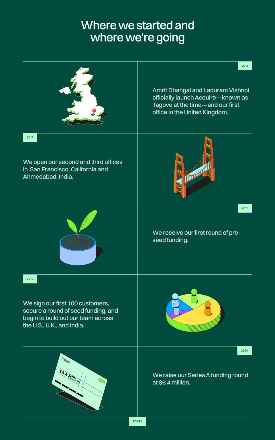
- **History:** A very tall central timeline alternates five dated milestones left/right, with illustrations, short text and occasional photo/product collages.
- **Newsroom:** A broad clipped-corner panel presents a centered introduction and three publication columns with logos, headlines and actions.
- **Team:** A mint region shows five leaders in a four-plus-one arrangement, five advisors in one row and three backer marks.
- **Footer:** Brand/download/social controls precede five link groups, compliance badges and a legal row. A blue cookie capsule and chat launcher overlay the lower edge.

### Information hierarchy

- **Major headings:** Heavy black display text introduces each company-story chapter.
- **Mission structure:** Three short propositions lead into large numerical highlights.
- **Timeline:** Oversized mint years dominate, followed by concise milestone explanations.
- **People:** Large portraits lead into bold names and smaller role lines; grayscale advisor photos distinguish that group.
- **Actions:** Blue capsules consistently identify contact, demo, careers and newsroom routes.

### Typography

- **Family:** A geometric-looking sans serif with rounded forms is visible; exact identity is unverified.
- **Display:** Approximately 44–48 pixels, very bold, with compact 52–56-pixel leading.
- **Body:** Around 18 pixels with spacious 32–34-pixel leading.
- **Values and names:** Around 22–24 pixels, bold; roles around 16 pixels.
- **Timeline years:** Approximately 84 pixels, regular weight and mint color.
- **Eyebrows:** Small uppercase labels around 20 pixels, bold. Footer links are around 14 pixels.

### Colors & surfaces

- **Measured base:** White #FFFFFF and pale mint #ECFBF6 dominate.
- **Accent:** Mint #6FDFB0 and dark blue #14339A appear in illustrations, large statistics and controls.
- **Ink:** Black #000000 supplies strong headings and body text.
- **Photography:** Color portraits and founder imagery contrast with grayscale historical and advisor photos.
- **Depth:** Thin pale outlines and soft shadows lift clipped-corner panels and photo collages; most content remains unboxed.

### Components

- **Blue actions:** Fully rounded capsules around 44 pixels high use white labels and occasional right chevrons.
- **Hero collage:** A rounded mint-backed photograph is overlaid with pale speech bubbles, a star badge and white chart-like marks.
- **Mission panel:** Roughly 1180 pixels wide, clipped diagonally at opposing corners, with vertical dividers between three content columns.
- **Value items:** Blue/mint line illustrations sit above centered bold statements; fine vertical rules separate adjacent items.
- **Timeline:** A fine central gray line with blue circular nodes and short horizontal connectors anchors alternating milestones.
- **Media cards:** Three columns use publication logos, thin dividers, bold multiline headlines and blue Read More capsules; two small pagination dots sit below.
- **People cards:** Rounded rectangular portraits have text centered directly beneath, without enclosing card backgrounds.
- **Footer overlays:** A long blue cookie capsule includes a lighter Got it action; a separate circular chat control sits right.

### Visual rhythm

- **Section spacing:** Large 100–180-pixel gaps create distinct chapters across the unusually long page.
- **Timeline cadence:** Milestones have exceptionally generous vertical spacing, making the history the page's longest region.
- **Alignment:** Alternating left/right narrative sections contrast with centered values, careers and people groups.
- **Brand repetition:** Diagonal mint cuts, blue/mint icons and clipped white panels recur at major transitions.

### Responsive

- **Evidence:** Only desktop is observed; timeline animation, carousel and mobile behavior are unverified.
- **Recommended grids:** Stack narrative columns and reduce three/four/five-column groups progressively.
- **Timeline recommendation:** Move the line to one side on mobile and place milestones in a single chronological column.
- **Typography:** Reduce large headings toward 32–36 pixels and maintain readable body leading.
- **Overlays:** Reflow cookie controls so they do not cover navigation or chat access.

### Adaptation guidance

- **Preserve:** Keep the mint/blue system, human imagery, bold headings and alternating history structure.
- **Build:** Separate mission, origin, values, careers, timeline, newsroom, team and footer components.
- **Fidelity:** Use supplied company dates, team identities and funding information; visible claims are not independently verified facts.
- **Artwork:** Reuse a consistent blue-outline/mint-fill icon style rather than introducing unrelated illustrations.
- **Behavior:** Define media pagination, links and consent controls explicitly; only their visual states are established.

## Content

**Instructions:**

Generate realistic example content that fits the selected design reference.

Create appropriate headlines, descriptions, labels, buttons, and supporting copy based on the type of interface being designed.

If a product or business description is provided, use it to guide the content.

Otherwise, invent a plausible fictional SaaS product appropriate for the reference.

Keep the content concise, coherent, and visually balanced.

Do not present fictional statistics, customer names, or testimonials as verified facts.

## Design Direction

**Instructions:**

Use the reference screenshot as the main source of visual inspiration rather than a strict layout template.

Preserve its most distinctive design characteristics, such as typography, visual rhythm, color relationships, component treatments, and overall aesthetic.

Feel free to modify section arrangements, proportions, spacing, and individual components to better suit my content.

Introduce original design decisions where they improve usability, composition, or brand consistency.

The result should clearly reflect the reference's visual language without looking like a direct reproduction.

Follow the visual identity of the reference design.

Use its typography, color palette, component styling, and overall aesthetic as the primary design direction.

Do not introduce an unrelated visual identity.

## Output

**Instructions:**

Generate a high-fidelity visual mockup of the requested interface.

Present the design as a polished, realistic website or product UI screenshot.

Prioritize visual composition, typography, spacing, colors, alignment, and component details.

Use the available image-generation or visual-design capabilities.

Do not replace the mockup with source code, a written design specification, or a textual description.

If direct visual generation is unavailable, clearly explain the limitation.

## Constraints

- Use the actual screenshot as the primary visual reference.
- Preserve essential messaging and factual accuracy.
- Prioritize visual quality and consistency.
- Do not invent unsupported product claims.
- Adapt structure and copy length for visual balance.
Reference image Long pages get scaled down: a section works better. Open in ChatGPT ↗ Open in Claude ↗
Build it in Lovable ↗ v0 ↗ Figma Make ↗
Opening a tool copies the screenshot so you can paste it with your prompt.
 SaaSFrame