
Thank you! Your submission has been received!
Oops! Something went wrong while submitting the form.
Get SaaSFrame Pro
Monthly
$18
Quarterly
$48
Yearly
$180
Upgrade to access this feature
Browse all screens & flows
Filter and search screens & flows
Access Figma files
Access mobile versions
Bookmark screens & flows
Join now
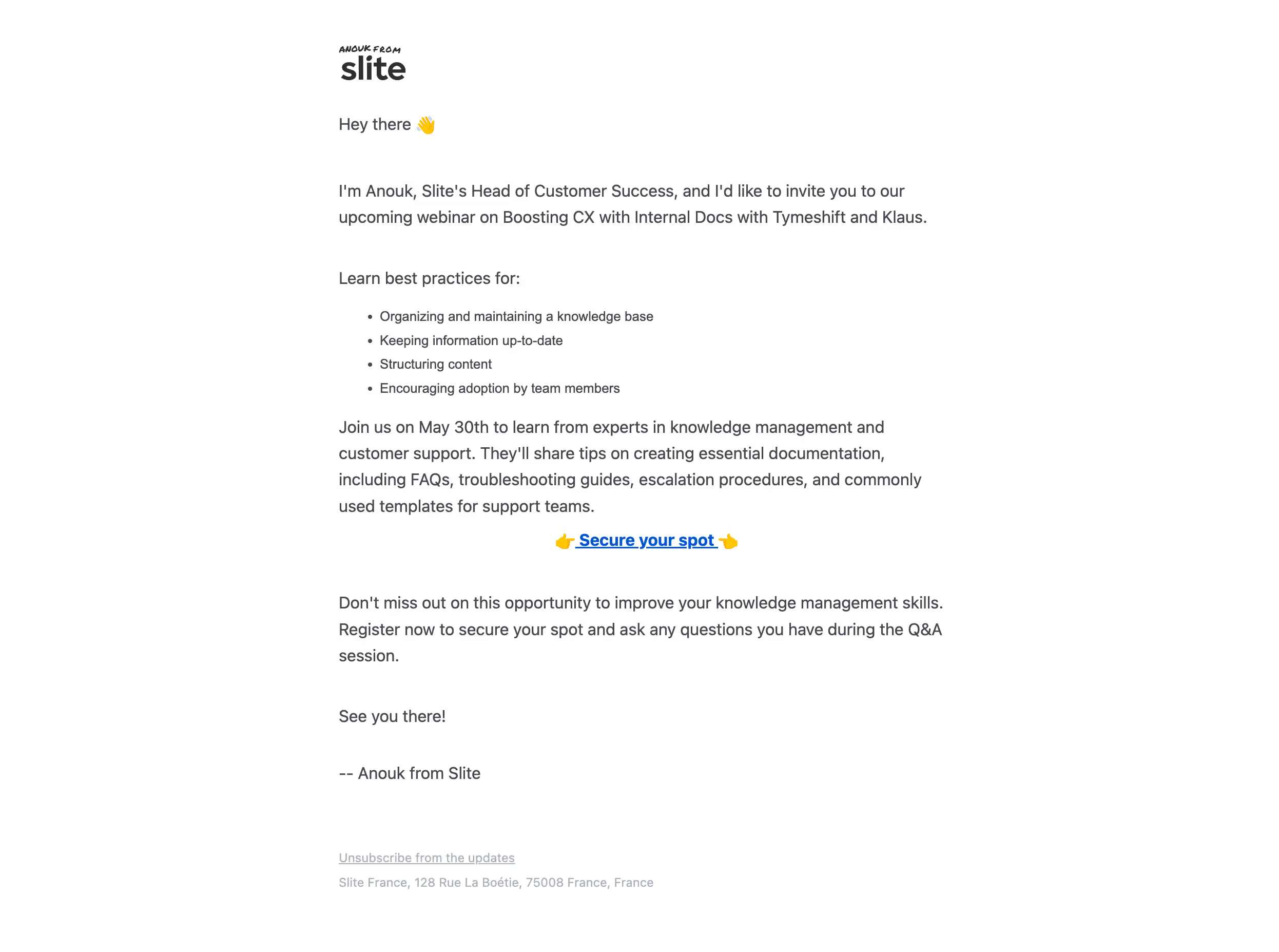
Slite Webinar Invite Email

Slite
Note tool
Designed by
No items found.

Bookmark
Bookmark

Design with AI
Thank you! Your submission has been received!
Oops! Something went wrong while submitting the form.
# Design from Reference: Slite Webinar Invite Email
Create an original, high-fidelity visual design inspired by the reference. Prioritize composition, typography, colors, spacing, and component styling over technical implementation.
## Reference
- **Product:** Slite
- **Category:** Webinars Emails
- **Screenshot:** https://cdn.prod.website-files.com/5e9dc792e1210c5325f7ebbc/6acb645ab206c0d3f8f064df_6acb62c4b5df5d2dd4cda585_cms-c4276b43085e331d41eec88b.webp
Analyze the screenshot first. If inaccessible, request it rather than guessing.
## Content
{{content.instructions}}
{{content.data}}
Preserve essential messaging and factual accuracy. Adapt structure and copy length for visual balance; never invent product claims.
## Visual Design
### Overall aesthetic
- **Character:** Personal, text-led webinar invitation email with abundant white space, dark-gray copy and a single blue registration link.
- **Evidence and scale:** Screenshot measures 2492 × 1854 image pixels. Capture scale and email CSS width are unverified; measurements below refer to the raster and relative proportions.
### Page composition
- **Reading column:** A centered column roughly 1180px wide in the original raster begins around x660px, with all regular copy left aligned.
- **Brand/greeting:** Small black sender/brand treatment sits above a short greeting with waving-hand emoji.
- **Body:** Invitation paragraph, short introduction and four-item bullet list precede a longer event-description paragraph.
- **Action/close:** A centered bold registration link with pointing emoji separates the main invitation from closing encouragement, sign-off and muted unsubscribe/address footer.
### Information hierarchy
- **Personal opening:** Sender identity and greeting give the message a conversational tone rather than a marketing-banner structure.
- **Scannable agenda:** Four compact bullets provide the clearest content summary.
- **Single conversion:** The centered blue underlined “Secure your spot” link is the only strongly emphasized action.
- **Footer:** Pale unsubscribe and address text stays distinct from the invitation content.
### Typography
- **Body:** Neutral sans-serif, approximately 30–34px in the original captured image with 48–50px leading; these are raster values, not asserted CSS sizes.
- **Bullets:** Slightly smaller than body paragraphs, with compact regular spacing and hanging indents.
- **Action:** Bold blue text at body scale, underlined and flanked by emoji rather than placed inside a button.
- **Brand/footer:** Small expressive handwritten-looking sender caption sits above a heavier wordmark. Footer is smaller and lighter; exact font identities remain unverified.
### Colors & surfaces
- **Measured foundation:** White #FFFFFF fills almost all of the email.
- **Measured text:** Gray #46474F dominates body copy, with darker #2F2F30 in branding.
- **Measured accents:** Blue #0057D4 appears in the registration link; yellow #FFC700 appears in emoji details.
- **Measured footer:** Muted #ABB1BA supports footer text. No large colored panel or card surface is visible.
### Components
- **Brand lockup:** Small black sender caption over a lowercase wordmark, aligned to the copy column.
- **Agenda list:** Four simple round bullets, no icons, boxes or numbered steps.
- **Registration link:** Content-width centered text treatment with underline, bold weight and two pointing-hand emoji.
- **Footer controls:** One underlined unsubscribe link and a separate address line, without social icons or a heavy footer container.
### Visual rhythm
- **Paragraph spacing:** Large blank intervals separate greeting, introduction, agenda, event explanation and closing.
- **Action isolation:** Generous whitespace above/below the centered link makes it stand out despite having no filled background.
- **Alignment:** A consistent left edge organizes all text except the registration action; wide outer margins reinforce the personal-email feel.
### Responsive
- **Observed limit:** Only one email rendering is visible; mobile wrapping, link targets and client behavior are unobserved.
- **Recommended sizing:** Use a fluid capped column with comfortable mobile padding, retaining real text rather than a screenshot.
- **Recommended reading:** Preserve paragraph breaks and agenda bullets, allow the CTA to wrap safely and choose CSS type sizes through readability testing.
### Adaptation guidance
- **Preserve the voice:** Use a brief personal introduction, clear agenda and one obvious registration route.
- **Keep restraint:** White ground, dark copy and a single blue link are sufficient; avoid adding unnecessary cards or decorative banners.
- **Implementation:** Use email-safe layout, meaningful link text and accessible list markup. Event date, speaker roles and agenda are historical captured content and require separate verification before reuse.
Use this context to reproduce the reference's visual language: layout, typography, colors, spacing, borders, radii, and distinctive elements. The screenshot takes priority if descriptions conflict.
## Direction
{{preferences.fidelityInstructions}}
## Output
{{output.instructions}}
Deliver a polished, cohesive design with precise alignment, hierarchy, and spacing. Produce the requested visual artifact, not just a description. If unsupported, explain the limitation.


Category
Patterns
No items found.
Tech Stack

Added on
July 25, 2023
Similar screens
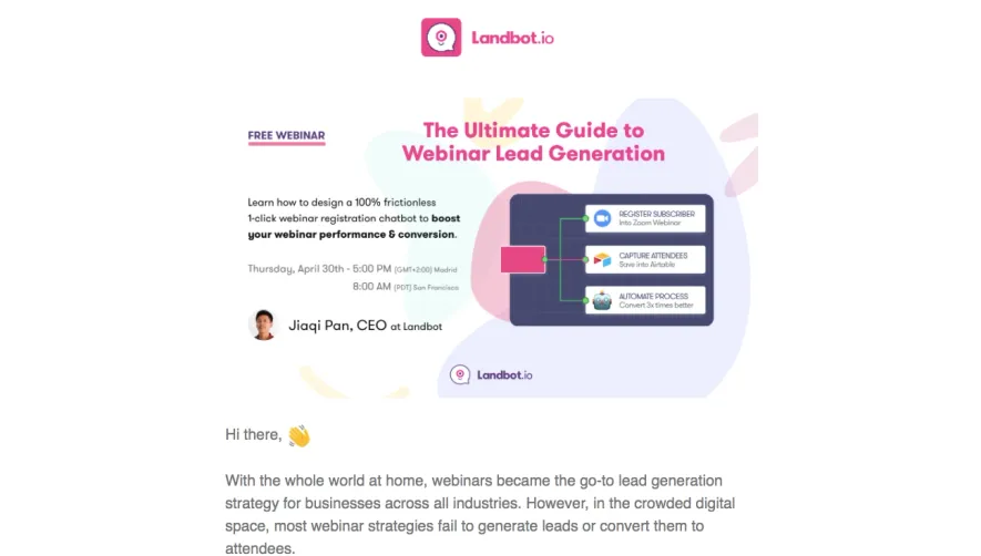




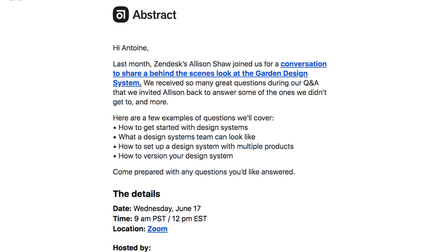

Upgrade to SaaSFrame Pro now to see similar examples.
Monthly
$18 /month
Billed $18 monthly
Browse all screens & flows
Filter and search screens & flows
Search text in screenshots
Access Figma files
Access mobile versions
Join now
Quarterly
$16 /month
Billed $48 quarterly
Browse all screens & flows
Filter and search screens & flows
Search text in screenshots
Access Figma files
Access mobile versions
Join now
Yearly
$15 /month
Billed $180 yearly
Browse all screens & flows
Filter and search screens & flows
Search text in screenshots
Access Figma files
Access mobile versions
Join now