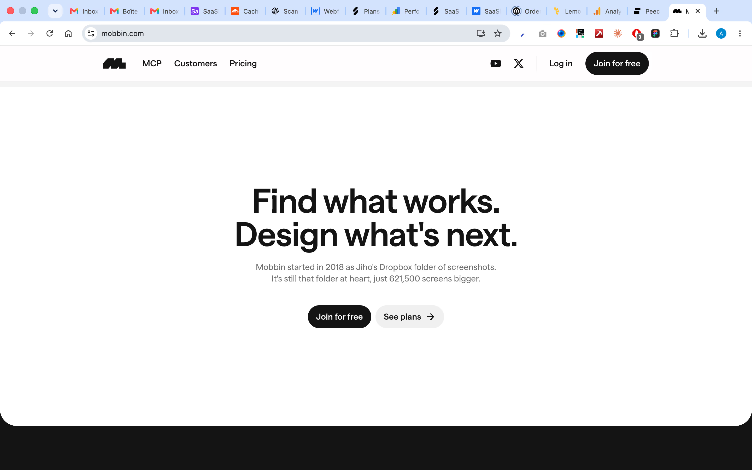
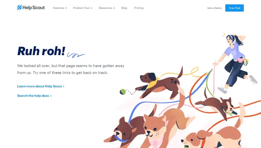
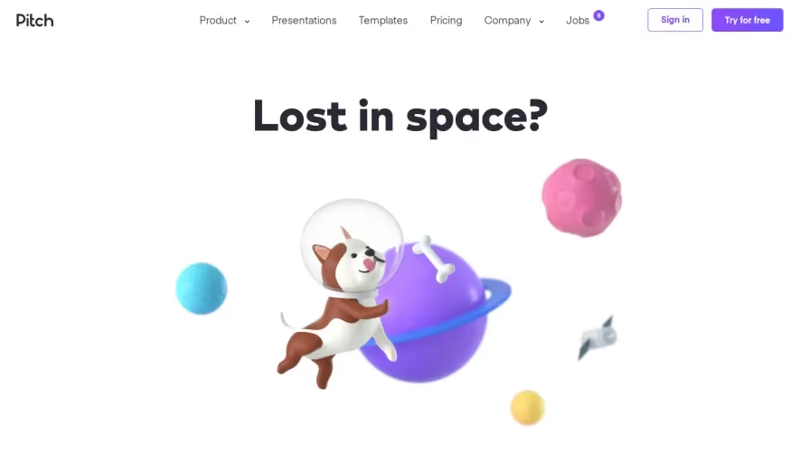
Generate a new design based on this screen using your own content.
Thank you! Your submission has been received!
Oops! Something went wrong while submitting the form.
# Design from Reference: Senja 404 Page
Create an original, high-fidelity visual design inspired by the reference. Prioritize composition, typography, colors, spacing, and component styling over technical implementation.
## Reference
- **Product:** Senja
- **Category:** 404 Page
- **Screenshot:** https://cdn.prod.website-files.com/5e9dc792e1210c5325f7ebbc/6acb6c095391d62536b670a7_6acb6a9a27f191c7ced07553_cms-9494d081e42211d9ae35d379.webp
Analyze the screenshot first. If inaccessible, request it rather than guessing.
## Content
{{content.instructions}}
{{content.data}}
Preserve essential messaging and factual accuracy. Adapt structure and copy length for visual balance; never invent product claims.
## Visual Design
Use this context to reproduce the reference's visual language: layout, typography, colors, spacing, borders, radii, and distinctive elements. The screenshot takes priority if descriptions conflict.
## Direction
{{preferences.fidelityInstructions}}
## Output
{{output.instructions}}
Deliver a polished, cohesive design with precise alignment, hierarchy, and spacing. Produce the requested visual artifact, not just a description. If unsupported, explain the limitation.
Senja’s 404 page leans into a playful, modern minimalism that instantly feels welcoming and brand-appropriate for SaaS. The page uses ample whitespace, bold yet friendly visuals, and approachable copy—striking a balance between cheerfulness and professionalism.
Layout and Structure
This page follows a focused, single-panel structure. The “hero” section dominates, with an expressive illustration taking center stage and clear, concise messaging above the fold. There are no distractions: key options are presented prominently, supported by a single clear Call to Action (CTA). The navigation bar at the top remains accessible, subtly guiding users back to core areas of the site.
Visual Elements
A custom, colorful illustration depicts a sunken ship, creatively tying into the “lost at sea” 404 concept. This memorable artwork uses gentle motion and quirky characters, making the error page feel lively instead of frustrating. There are no stock images or generic icons; every element is crafted to fit Senja’s brand personality.
Color Palette and Typography
The palette features soft violets, peach, and vibrant accent colors that inject energy without overwhelming. Headings use a bold, rounded sans-serif font, while body text remains legible and understated. Visual hierarchy is clear: the error message stands out, with supportive text and CTA easy to scan.
User Experience Patterns and Unique Choices
Senja’s 404 page turns a common frustration into a moment of delight with upbeat copy and a painless path back to productive action—most notably via a prominent “Go Home” button. The persistent top navigation keeps users oriented, while playfulness in text and visuals reduces error-fatigue. The blend of illustration, interaction, and tone exemplifies a SaaS brand ready to engage users, even in unexpected moments.