
Thank you! Your submission has been received!
Oops! Something went wrong while submitting the form.
Get SaaSFrame Pro
Monthly
$18
Quarterly
$48
Yearly
$180
Upgrade to access this feature
Browse all screens & flows
Filter and search screens & flows
Access Figma files
Access mobile versions
Bookmark screens & flows
Join now
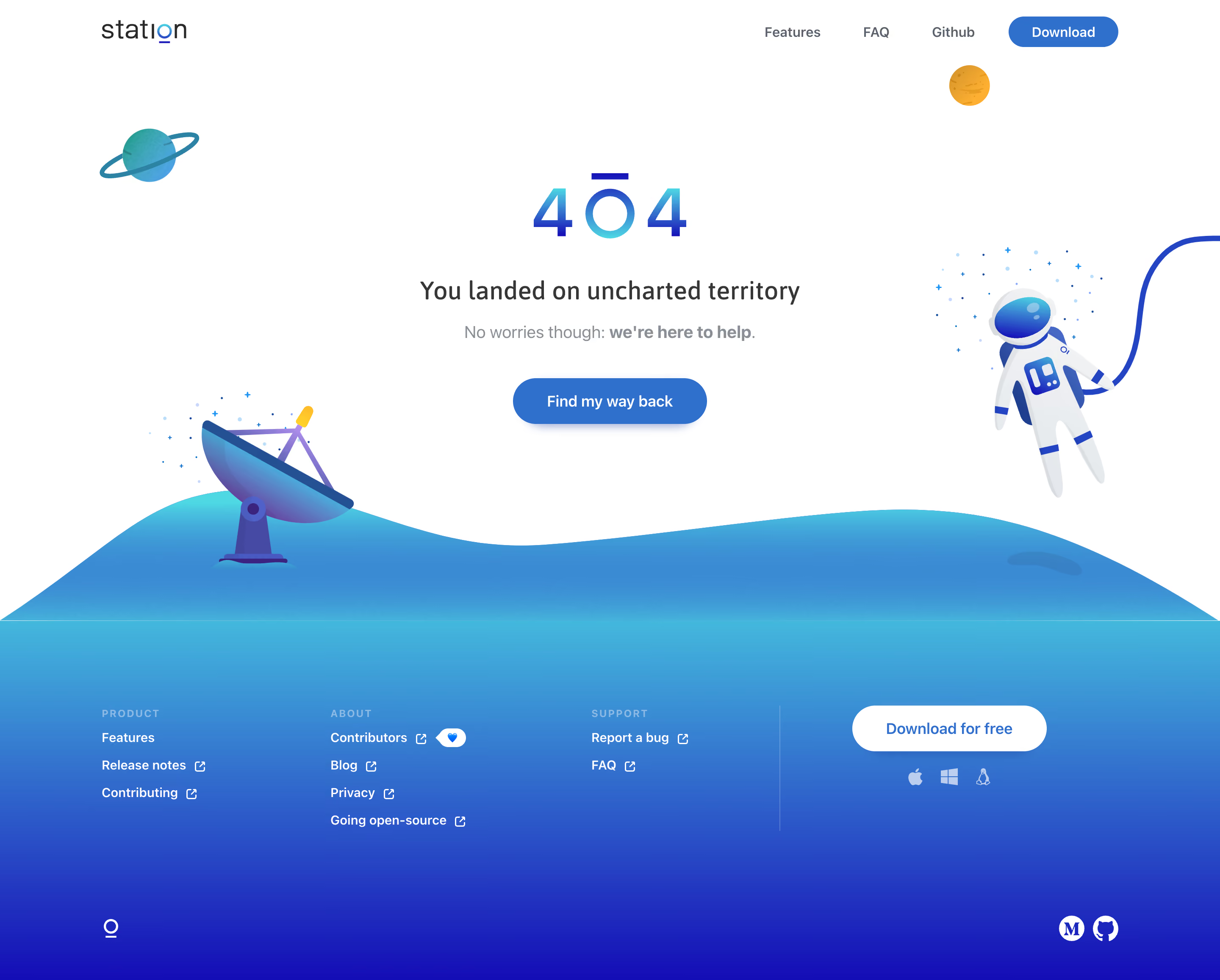

Station 404 Page

Station
One app to rule them all
Designed by
No items found.

Bookmark
Bookmark

Design with AI
Thank you! Your submission has been received!
Oops! Something went wrong while submitting the form.
# Design from Reference: Station 404 Page
Create an original, high-fidelity visual design inspired by the reference. Prioritize composition, typography, colors, spacing, and component styling over technical implementation.
## Reference
- **Product:** Station
- **Category:** 404 Page
- **Screenshot:** https://cdn.prod.website-files.com/5e9dc792e1210c5325f7ebbc/6acbd24bd69dbc5db10189b0_6acbd00c75891049b184752a_cms-096333cf63d85d5230bb73fc.webp
Analyze the screenshot first. If inaccessible, request it rather than guessing.
## Content
{{content.instructions}}
{{content.data}}
Preserve essential messaging and factual accuracy. Adapt structure and copy length for visual balance; never invent product claims.
## Visual Design
### Overall aesthetic
- **Character:** A friendly space-themed missing-page design uses an expansive white hero, blue-to-cyan gradients and a matching illustrated footer.
- **Capture scale:** The screenshot measures 2880 × 2314 image pixels. Approximate CSS dimensions assume a 1440px-wide viewport at 2× density; this is unverified.
- **Tone:** An astronaut, planets and a satellite dish turn a routine error into a lighthearted recovery screen.
### Page composition
- **Header:** A small Station wordmark sits left; Features, FAQ, GitHub and a blue Download pill align right.
- **Error region:** A large gradient 404 mark sits above a centered headline, secondary reassurance and recovery button.
- **Illustration frame:** Planets appear near the upper corners, a satellite dish occupies the lower left and a tethered astronaut floats at right.
- **Landscape transition:** A low blue/cyan illustrated horizon connects the white hero to the gradient footer.
- **Footer:** Three link groups sit left of a vertical separator; a white download action and platform icons occupy the right. Small brand and social marks anchor the bottom corners.
### Information hierarchy
- **Error identity:** The oversized 404 graphic establishes context before the explanatory heading.
- **Recovery:** A single blue Find my way back action is centered below the reassurance.
- **Supportive copy:** The second line is lighter gray with a bold phrase, reducing its prominence relative to the main heading.
- **Secondary action:** Download appears in both header and footer, separate from the recovery action.
- **Footer navigation:** Small uppercase group headings precede short lists of white links with external-link indicators.
### Typography
- **Family:** A rounded humanist sans-serif is visible; exact identity is unverified.
- **404:** Approximately 80px CSS graphic scale with a stylized central character and gradient fill.
- **Main heading:** Approximately 30–32px medium, with 38px line-height.
- **Supporting copy:** Approximately 20px regular, with a bold ending phrase.
- **Buttons and navigation:** Approximately 16–18px medium-to-semibold.
- **Footer:** Links are around 14–16px; group labels around 12px uppercase with wide tracking.
### Colors & surfaces
- **Canvas:** Sampled #FFFFFF supplies the main hero.
- **Blue action:** Sampled #2F70CD supplies the recovery/download accent.
- **Gradient tones:** Sampled #3B8BD4, #3B8CD4, #3E9BD7 and #3D97D6 occur in the cyan-to-blue landscape and footer.
- **Deep gradient:** Sampled #140EB7 contributes to the darker lower footer.
- **Text:** Dark gray headings and muted gray supporting text sit on white; white links contrast with the gradient footer.
- **Illustration accents:** Small orange planets and yellow telescope details complement the predominantly blue artwork.
### Components
- **Recovery button:** Approximately 230 × 54px CSS, blue fill, fully rounded ends, white label and a soft lower shadow.
- **Header download:** A smaller blue pill repeats the same basic action styling.
- **Illustrated assets:** Vector-like shapes, soft gradients and small star clusters form a unified space scene without enclosing the text.
- **Footer download:** A wide white pill has blue text and platform symbols beneath.
- **Footer links:** External-link icons sit directly after applicable labels; one contributor link includes a small heart badge.
- **Layout separator:** A faint vertical rule divides footer navigation from the download area.
### Visual rhythm
- **Centered hierarchy:** The 404, heading, reassurance and button share a central axis.
- **Whitespace:** Large gaps around the central message prevent the surrounding artwork from crowding it.
- **Asymmetry:** The dish and astronaut balance opposite sides at different heights.
- **Footer cadence:** Evenly spaced link rows and separated group headings create a compact navigation rhythm.
- **Continuous surface:** The horizon's gradient flows into the footer, avoiding a hard color break.
### Responsive
- **Evidence limit:** Only a desktop state is visible; recovery destinations and mobile layouts are unverified.
- **Illustration recommendation:** Reduce or reposition peripheral artwork on narrow screens, keeping the recovery message unobstructed.
- **Text recommendation:** Scale the heading and 404 mark while maintaining a readable supporting line.
- **Footer recommendation:** Stack link groups and download controls; retain sufficiently large touch targets.
### Adaptation guidance
- **Recovery clarity:** Keep the error explanation and one clear return action central.
- **Artwork system:** Reuse coherent gradient illustrations and avoid placing essential information inside decorative assets.
- **Brand continuity:** Carry the blue gradient, pill controls and rounded type into related error and support states.
- **Accessibility:** Treat decorative illustrations appropriately, give action links explicit destinations and provide visible keyboard focus.
Use this context to reproduce the reference's visual language: layout, typography, colors, spacing, borders, radii, and distinctive elements. The screenshot takes priority if descriptions conflict.
## Direction
{{preferences.fidelityInstructions}}
## Output
{{output.instructions}}
Deliver a polished, cohesive design with precise alignment, hierarchy, and spacing. Produce the requested visual artifact, not just a description. If unsupported, explain the limitation.


Category
Patterns
No items found.
Tech Stack



Added on
June 20, 2020
Similar screens
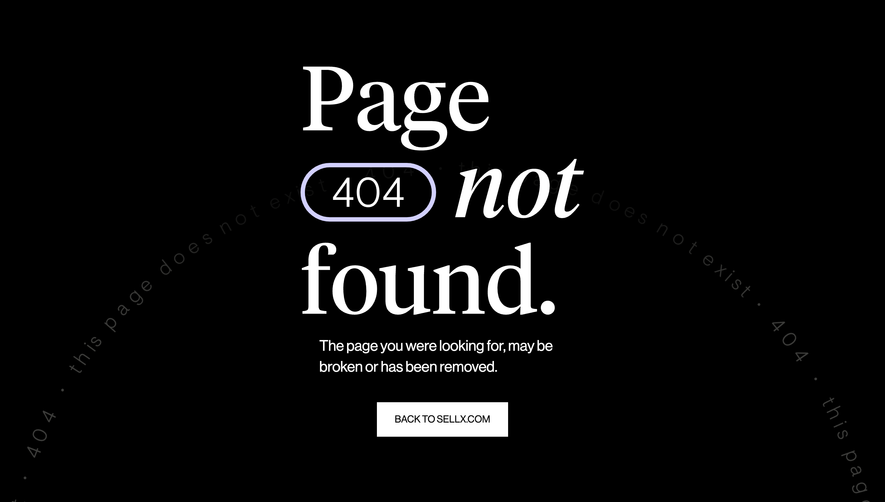


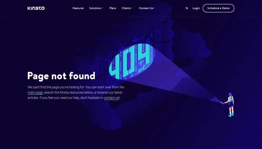

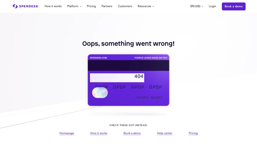

Upgrade to SaaSFrame Pro now to see similar examples.
Monthly
$18 /month
Billed $18 monthly
Browse all screens & flows
Filter and search screens & flows
Search text in screenshots
Access Figma files
Access mobile versions
Join now
Quarterly
$16 /month
Billed $48 quarterly
Browse all screens & flows
Filter and search screens & flows
Search text in screenshots
Access Figma files
Access mobile versions
Join now
Yearly
$15 /month
Billed $180 yearly
Browse all screens & flows
Filter and search screens & flows
Search text in screenshots
Access Figma files
Access mobile versions
Join now