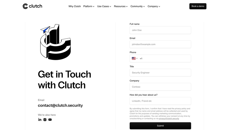
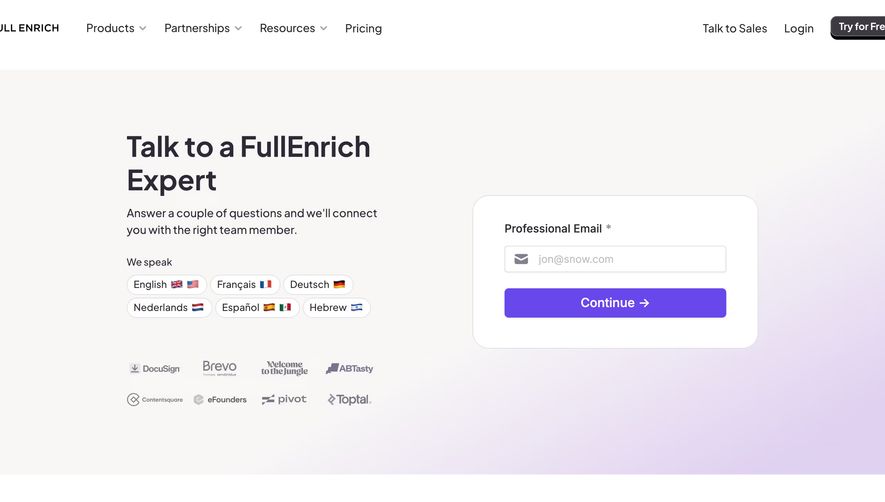
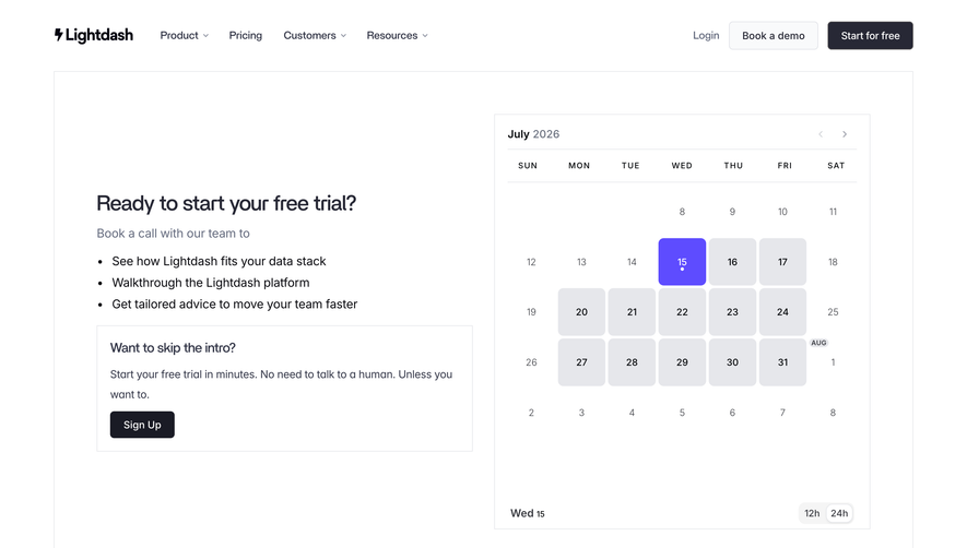
Overall Style and Aesthetic
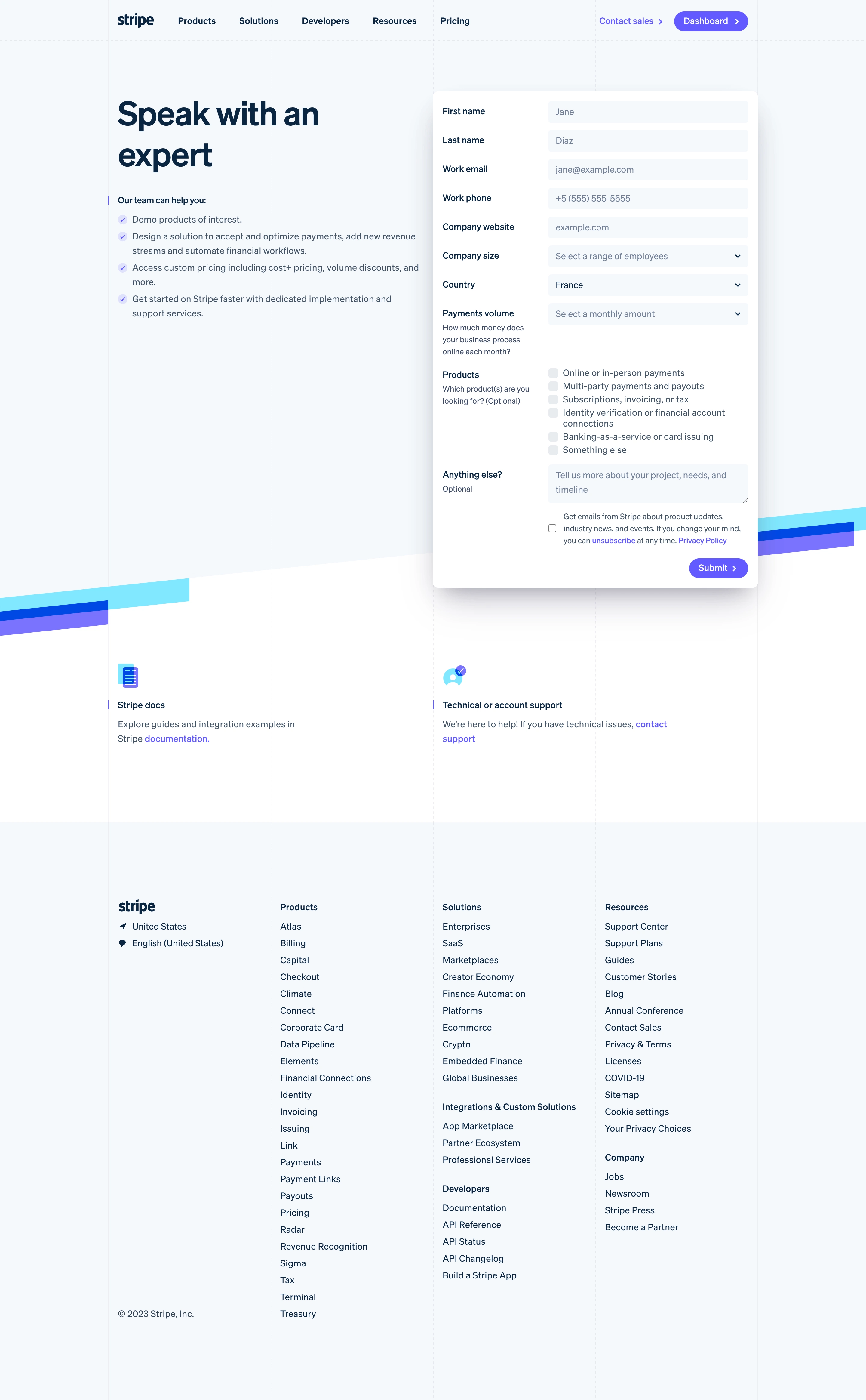
Stripe’s sales contact page embodies a minimalist, ultra-modern aesthetic. Its clean layout is grounded in generous white space, creating an uncluttered, polished environment that radiates professionalism and trust. Every element feels purposeful and thoughtfully spaced, enhancing the sense of clarity and focus that’s key for SaaS user experiences. Layout and Structure
The page leads with a compact hero section: direct headline, reassuring subtext, and a prominent form—all above the fold. Rather than distracting with secondary content, the structure gravitates around the primary goal—contact. There are no product features or testimonials here, just a streamlined path designed to reduce friction. The sticky site navigation remains minimal as well, fading gently into the background but easily accessible. Visual Elements
Visual cues are subtle yet sophisticated. There are no busy graphics, but the page leverages gentle gradients, soft drop shadows, and crisp iconography within the form fields to guide users’ attention. An understated animation in the Stripe logo reinforces brand identity without overpowering the content. Small visual “pops” signal interactivity and form focus, adding a dynamic, tactile feel. Color Palette and Typography
The design employs Stripe’s signature palette: deep indigo anchored by bright whites and muted neutrals, punctuated with accent blues and violets in CTAs. Sleek, geometric sans-serif fonts (like Stripe’s own font) deliver exceptional legibility and hierarchy, with heavier weights for headings and lighter for form labels. User Experience Patterns
Navigation is sticky but slim, letting the form take center stage. The concise contact form gently guides visitors via clear field labels and logical groupings. Strong, colored CTAs (“Contact Sales”) provide an unmistakable next step. Responsive animations offer feedback—like form field highlights—to reinforce user confidence. Unique or Notable Design Choices
Stripe showcases “restraint as a design tool”—eschewing distractions in favor of focus, making even complex tasks feel effortless. The microinteractions and seamless field transitions imbue the page with a sense of modernity and polish. Tone and Feel
Everything conveys reliability, sophistication, and forward-thinking confidence. The experience feels quietly energetic—innovative without fanfare—which is especially inspiring for SaaS teams seeking conversion-focused, user-first design.