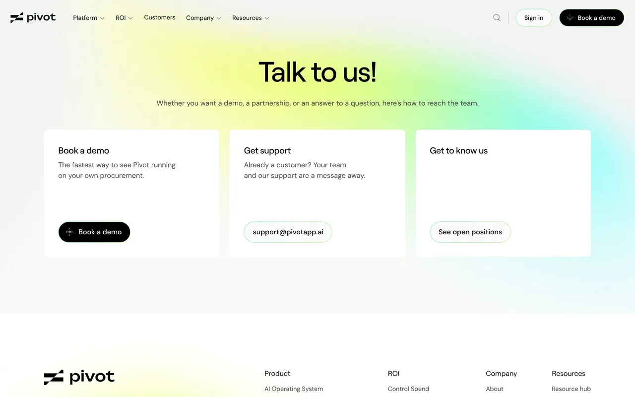
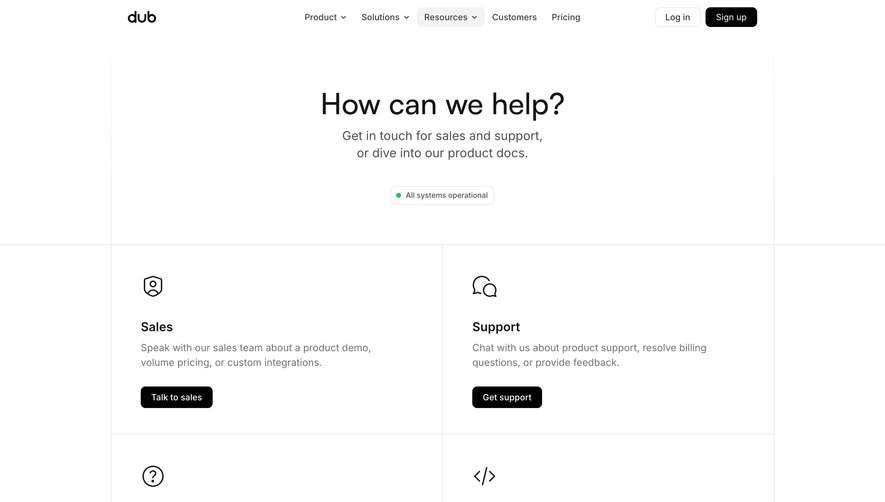
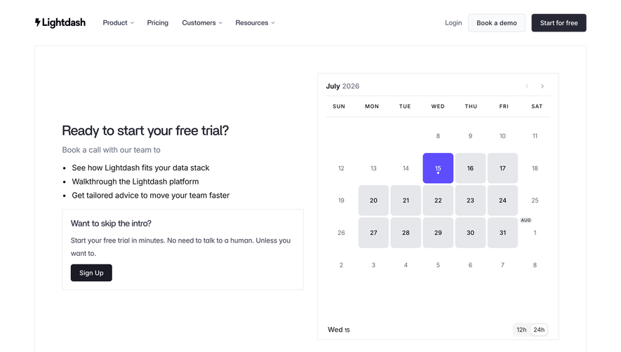
Prompt 1,343 words Copy
# Design from Reference: Linear Contact Page

Create an original, high-fidelity visual design inspired by the reference. Prioritize composition, typography, colors, spacing, and component styling over technical implementation.

## Reference

- **Product:** Linear
- **Category:** Contact Page
- **Screenshot:** attached to this message (also available at https://media.saasframe.io/v/a45908c8c8c48474ee1b-1600.webp)
- **Source:** https://linear.app/contact

Analyze the attached screenshot first. If no image is attached, open the screenshot link; if neither is accessible, ask for it rather than guessing.

## Visual Design Context

### Overall aesthetic

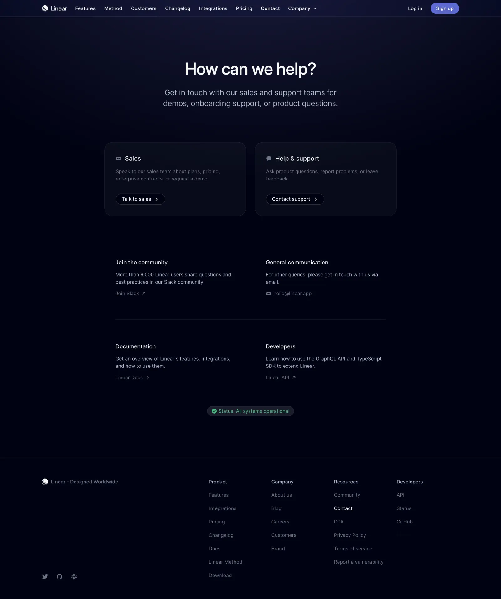
- **Style:** Dark, restrained contact hub with near-black navy surfaces, soft top illumination, fine outlines and spare typography.
- **Character:** The page feels technical and quiet; small icons, pill actions and a single green service-status indicator supply functional detail.
- **Capture:** The image measures 2880 × 3442 pixels. CSS estimates assume a 2× capture, equivalent to approximately 1440 × 1721 CSS pixels; actual scale and font identity are unverified.

### Page composition

- **Header:** A roughly 1200-pixel-wide navigation row sits in a 48-pixel-high top band, with logo and product links left, login and a violet signup pill right.
- **Hero:** A centered question heading appears around y178 CSS pixels, followed by a two-line explanation of sales and support access.
- **Primary contacts:** Two equal rounded cards form an approximately 840-pixel-wide row, beginning around x300 and y408.
- **Secondary contacts:** Community and general communication form an unboxed two-column row below the cards.
- **Resources:** A thin divider introduces documentation and developer resources in the same two-column alignment.
- **Status:** A compact green operational-status pill is centered beneath the resource grid.
- **Footer:** A full-width divider separates a broad footer with a brand statement at left, four link columns at right and small social icons near the lower left.

### Information hierarchy

- **Primary heading:** The large bright question leads, while the lighter gray explanation gives a concise scope.
- **Contact paths:** Sales and support receive bordered cards, icons and outlined pill actions, making them more prominent than secondary channels.
- **Secondary routes:** Community, email, documentation and developer resources use smaller plain headings and muted text links.
- **Operational reassurance:** The green status badge is isolated between contact content and footer.
- **Current-page cues:** Contact is brighter in the main navigation and footer resource list.
- **Footer density:** Category labels are brighter than links; the brand statement and social marks remain subdued.

### Typography

- **Family:** A neutral sans-serif is visible; exact font identity is unverified.
- **Hero heading:** Approximately 48-pixel CSS size, medium weight, around 58-pixel line height and tight tracking.
- **Hero description:** Approximately 24 pixels with 30-pixel line height, centered over a roughly 560-pixel measure.
- **Card headings:** Approximately 20 pixels with medium weight; body descriptions around 15 pixels with 21-pixel line height.
- **Resource headings:** Approximately 16 pixels, regular-to-medium weight; descriptions and links about 14–15 pixels.
- **Navigation and footer:** Approximately 14–15 pixels, with footer links separated by a relaxed 38–40-pixel rhythm.
- **Actions:** Compact pill labels are about 14 pixels and medium weight.

### Colors & surfaces

- **Measured base:** Near-black navy #000213 dominates the page.
- **Measured elevated tones:** Dark samples include #080A1A, #06081C, #080A1F and #080D22, reflecting cards and subtle upper-page illumination.
- **Text treatment:** Headings are near-white; secondary text is cool blue-gray, with lower-emphasis links darker still.
- **Accent roles:** A violet signup pill anchors the header action; bright green identifies the operational status.
- **Boundaries:** Hairline blue-gray rules and outlines define cards, header and footer without strong shadows.
- **Surface continuity:** The main content and footer share the dark base; hierarchy comes from spacing, brightness and slight card elevation.

### Components

- **Primary contact cards:** Each is approximately 408 × 214 CSS pixels, with about 24-pixel corners, fine outlines and 32-pixel padding.
- **Card icons:** Small muted envelope and conversation icons precede the Sales and Help & support titles.
- **Contact actions:** Thin outlined pills, around 32 pixels high, pair text with right chevrons.
- **Secondary blocks:** Unboxed text groups use a heading, two-line description and a muted destination link; external paths have small diagonal arrows.
- **Resource divider:** A thin horizontal line spans approximately 776 pixels between the two secondary rows.
- **Status badge:** Approximately 250 × 28 pixels, dark-gray rounded fill, green check icon and explicit operational text.
- **Signup:** A violet pill around 82 × 32 pixels carries a white label.
- **Footer:** Four columns organize Product, Company, Resources and Developers, beside a wider brand zone; compact social icons align at the bottom left.
- **State scope:** No contact form, dropdown, hover or expanded state is displayed.

### Visual rhythm

- **Centered measure:** The primary contact region uses a narrower 840-pixel width than the 1200-pixel header and footer.
- **Hero breathing room:** Large vertical gaps isolate the heading and explanation from the contact cards.
- **Two-column rhythm:** Cards and unboxed resources maintain a consistent central gutter and paired reading structure.
- **Section breaks:** Roughly 100–130-pixel gaps distinguish cards, secondary contacts and status/footer areas.
- **Density transition:** Sparse primary content gives way to a denser but widely spaced footer, retaining the same quiet dark treatment.

### Responsive

- **Recommendation — header:** Collapse the long navigation while keeping login, signup and current contact context accessible.
- **Recommendation — contact grid:** Stack sales and support cards on small screens, followed by the secondary resource blocks.
- **Recommendation — typography:** Scale the hero heading and description with fluid sizing and maintain comfortable side gutters.
- **Recommendation — footer:** Wrap link columns into fewer columns and preserve readable link contrast.
- **Recommendation — status:** Keep the service-status label fully readable rather than relying only on the green check. No mobile layout is shown.

### Adaptation guidance

- **Preserve channel priority:** Give sales and support the strongest treatment, with community and self-service resources secondary.
- **Use subtle elevation:** Retain near-black navy surfaces, fine outlines and restrained brightness differences instead of heavy shadows.
- **Keep contact options concise:** Each block should explain its purpose and offer one clear destination.
- **Retain independent status:** Present operational health as its own small module below assistance routes.
- **Maintain accessible contrast:** Ensure muted descriptions and footer links remain readable against the dark base.
- **Define destination states separately:** Forms, support dialogs and navigation menus are outside the captured state and should not be inferred from this page.

## Content

**Instructions:**

Generate realistic example content that fits the selected design reference.

Create appropriate headlines, descriptions, labels, buttons, and supporting copy based on the type of interface being designed.

If a product or business description is provided, use it to guide the content.

Otherwise, invent a plausible fictional SaaS product appropriate for the reference.

Keep the content concise, coherent, and visually balanced.

Do not present fictional statistics, customer names, or testimonials as verified facts.

## Design Direction

**Instructions:**

Use the reference screenshot as the main source of visual inspiration rather than a strict layout template.

Preserve its most distinctive design characteristics, such as typography, visual rhythm, color relationships, component treatments, and overall aesthetic.

Feel free to modify section arrangements, proportions, spacing, and individual components to better suit my content.

Introduce original design decisions where they improve usability, composition, or brand consistency.

The result should clearly reflect the reference's visual language without looking like a direct reproduction.

Follow the visual identity of the reference design.

Use its typography, color palette, component styling, and overall aesthetic as the primary design direction.

Do not introduce an unrelated visual identity.

## Output

**Instructions:**

Generate a high-fidelity visual mockup of the requested interface.

Present the design as a polished, realistic website or product UI screenshot.

Prioritize visual composition, typography, spacing, colors, alignment, and component details.

Use the available image-generation or visual-design capabilities.

Do not replace the mockup with source code, a written design specification, or a textual description.

If direct visual generation is unavailable, clearly explain the limitation.

## Constraints

- Use the actual screenshot as the primary visual reference.
- Preserve essential messaging and factual accuracy.
- Prioritize visual quality and consistency.
- Do not invent unsupported product claims.
- Adapt structure and copy length for visual balance.
Reference image Attach it to your message: assistants can’t open image links. Open in ChatGPT ↗ Open in Claude ↗
Build it in Lovable ↗ v0 ↗ Figma Make ↗
Opening a tool copies the screenshot so you can paste it with your prompt.
 SaaSFrame