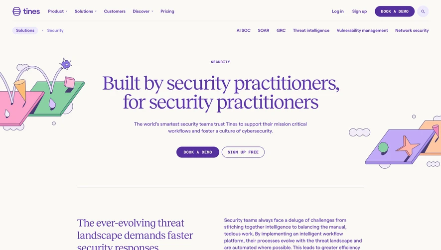
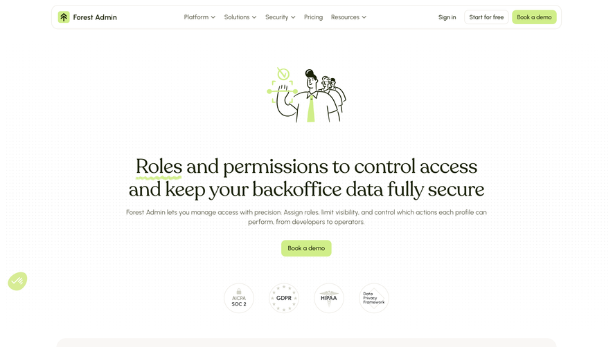
Overall Style and Aesthetic
Remote's Security & Compliance page exemplifies a sleek, modern professionalism. The design employs abundant white space, making content digestible and each element pop against the clean backdrop. Accents of deep purple and vibrant blue inject energy without overwhelming the senses, reinforcing a sense of trust and innovation demanded by an enterprise audience. Layout and Structure
The structure is straightforward yet strategic. A bold hero section with concise copy and a reassuring visual instantly conveys credibility. The features section is modular, with content blocks alternating alignment and color accents for a visually engaging rhythm. Process explanations and trust badges follow, capped by a focused call-to-action and minimal footer. Each section guides users smoothly toward conversion without distraction. Visual Elements
Custom illustrations—often abstracted locks, shields, and cloud motifs—communicate security concepts in a friendly, accessible way. Carefully chosen icons support quick scanning of features. Subtle micro-animations enhance interactivity without being intrusive, while client logos and certification badges bolster trust organically. Color Palette and Typography
The cool-toned palette centers on blues and purples paired with a crisp white background. This fosters clarity and highlights clickable elements. Typography leverages a geometric sans-serif font, delivering modernity and superb legibility. Headings are bold and prominent, subheadings provide clear structure, and body text sits comfortably for effortless reading. User Experience Patterns
Navigation is sticky and streamlined, with immediate CTAs (“Talk to an Expert,” “Get Started”). Section transitions feel polished, supporting easy vertical scanning. Trust signals—logos, certifications, security badges—are integrated naturally. Forms are minimal and inviting, reinforcing a frictionless, confidence-inspiring journey. Unique or Notable Design Choices
Standout elements include the prominent visual demonstration of Remote’s certifications, underscoring authority without visual clutter. Alternating content alignment and background shading subtly guide the eye and break monotony. The overall impression is one of reliability, clarity, and agility—a blueprint for SaaS security pages that must balance reassurance and innovation.