Overall Style and Aesthetic
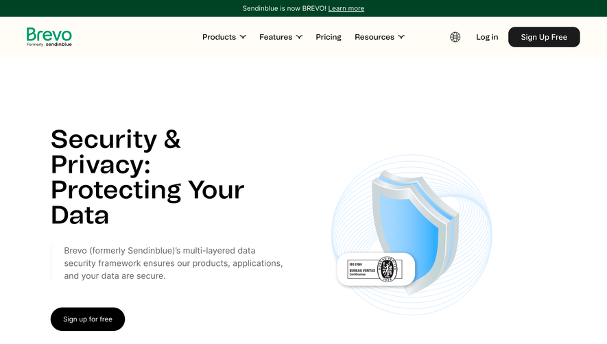
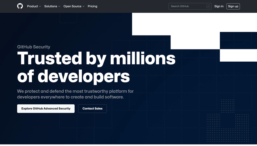
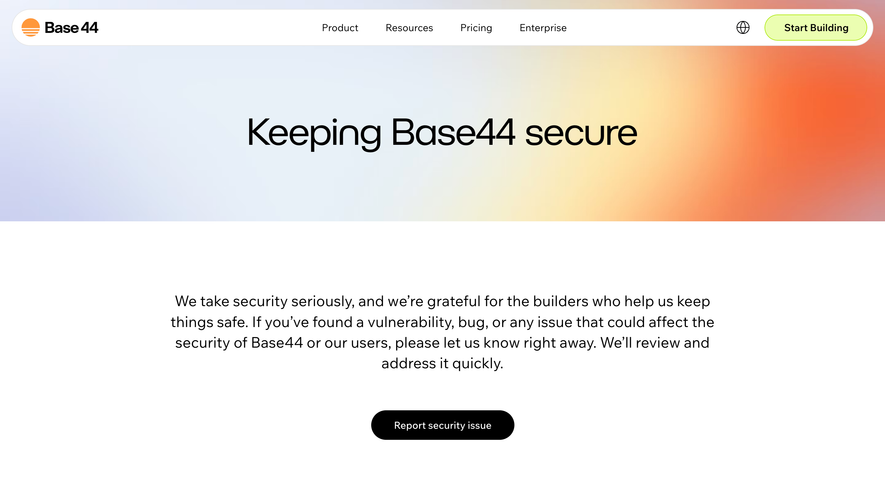
Spendesk’s security page embodies a crisp, modern professionalism infused with subtle warmth. The minimalist layout, generous whitespace, and rounded edges establish trust without feeling sterile, while gentle gradients and friendly graphics keep the page accessible and engaging. Layout and Structure
The structure is instantly clear: a reassuring hero section emphasizes security trustmarks, flanked by bold, legible headlines. The page flows into well-spaced feature blocks, each section broken up by smart use of columns and digestible icons. Each topic is anchored by a sticky, always-visible right-side menu for efficient navigation—ensuring users never feel lost, even on lengthy pages. Visual Elements
Custom vector illustrations and subtle animated accents reinforce key points, striking a balance between approachability and technical prowess. Key visuals combine abstract shapes with recognizable security cues—locks, shields, verification checkmarks—while looping video snippets add life to the narrative without overwhelming. Color Palette and Typography
A confident palette of deep blues, shades of aqua, and bursts of amber orange communicates reliability and action. Typography leans into modernity, pairing bold, rounded sans-serif headings with an ultra-readable body font. Clear visual hierarchy is achieved through weight, color, and size differences. User Experience Patterns
User journeys are intentional: strong CTAs appear at pivotal moments, and section-based navigation makes skimming and in-depth reading equally efficient. Smooth scrolling and subtle reveals create an effortless, engaging experience. Unique or Notable Design Choices
Notably, micro-interactions and the persistent navigation sidebar stand out. Animated trust badges draw attention without gimmicks, and the overall tone exudes confidence and clarity—ideal for engendering trust in a SaaS security context.