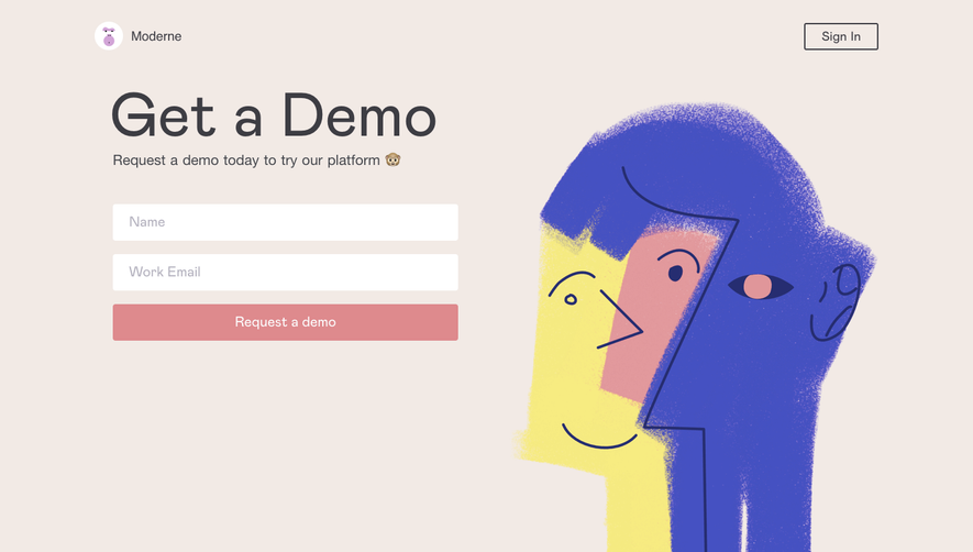
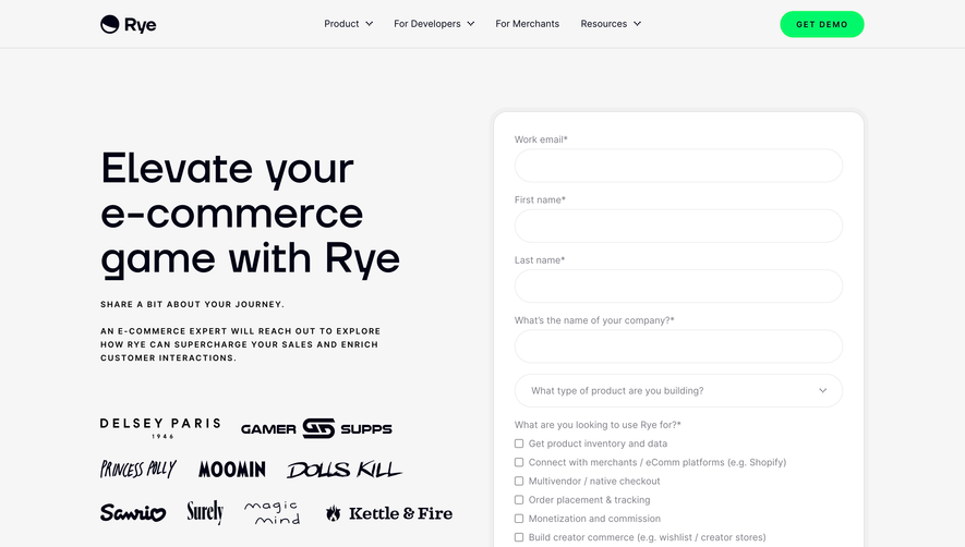
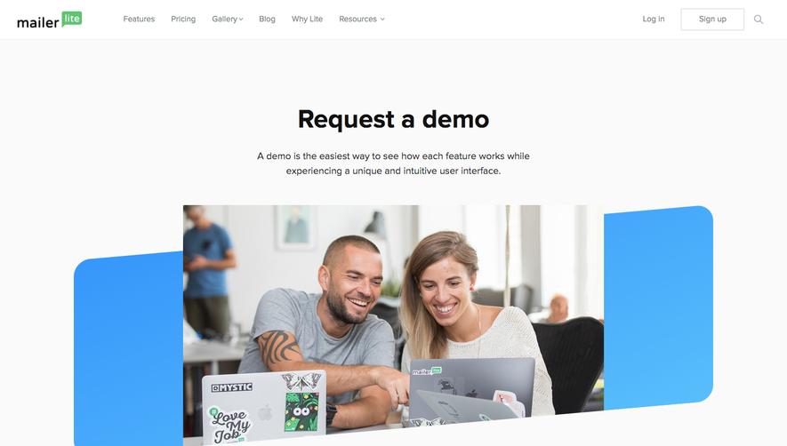
Generate a new design based on this screen using your own content.
Thank you! Your submission has been received!
Oops! Something went wrong while submitting the form.
# Design from Reference: PlanetScale Demo Request
Create an original, high-fidelity visual design inspired by the reference. Prioritize composition, typography, colors, spacing, and component styling over technical implementation.
## Reference
- **Product:** PlanetScale
- **Category:** Demo Request
- **Screenshot:** https://cdn.prod.website-files.com/5e9dc792e1210c5325f7ebbc/62ecbb583da29e052ef6c76d_1659680770853-screenshot-device-b182805c2881bcf8bb7bfd1b4a8f44fd-1659680306666.webp
Analyze the screenshot first. If inaccessible, request it rather than guessing.
## Content
{{content.instructions}}
{{content.data}}
Preserve essential messaging and factual accuracy. Adapt structure and copy length for visual balance; never invent product claims.
## Visual Design
Use this context to reproduce the reference's visual language: layout, typography, colors, spacing, borders, radii, and distinctive elements. The screenshot takes priority if descriptions conflict.
## Direction
{{preferences.fidelityInstructions}}
## Output
{{output.instructions}}
Deliver a polished, cohesive design with precise alignment, hierarchy, and spacing. Produce the requested visual artifact, not just a description. If unsupported, explain the limitation.
The PlanetScale contact page exemplifies a polished, minimalist aesthetic that radiates modern professionalism. White space is leveraged to perfection, ensuring that the interface feels uncluttered and inviting. The page emits confidence and innovation, anchored by subtle gradients and understated yet expressive visual elements.
Layout and Structure
The layout is refreshingly straightforward: a centered hero header welcomes visitors with a clear intent, followed by a cleanly framed contact form. Above the fold, crucial information is prioritized, minimizing distractions and streamlining user journeys. There’s no extraneous content—no testimonials, pricing, or large feature blocks—keeping the focus razor-sharp on connecting with the company.
Visual Elements
Elegant illustrations—such as the featured geometric planet icon—enhance brand identity without overwhelming. Micro-animations breathe life into icons and form fields, creating dynamic but unobtrusive visual feedback. No photography or video distracts from the interface’s purpose, while soft gradients and precise shadows subtly guide user attention.
Color Palette and Typography
A crisp palette of blues, purples, white, and charcoal underlines a feeling of technological sophistication. Pops of gradient blues evoke trust and energy. Typography is clean and readable, with prominent sans-serif headings establishing a clear hierarchy, while body text remains approachable and accessible.
User Experience Patterns & Standout Choices
Navigation is sticky, ultra-minimal, and easily accessible. CTAs are prominent but harmonious with the color scheme, while form fields employ smart validation and thoughtful spacing for painless input. Notably, the playful “planet” iconography humanizes the brand and sets a memorable visual tone. The entire experience demonstrates a meticulous balance between practicality and visual distinction, leaving users with an impression of reliability and cutting-edge innovation.