
Thank you! Your submission has been received!
Oops! Something went wrong while submitting the form.
Get SaaSFrame Pro
Monthly
$18
Quarterly
$48
Yearly
$180
Upgrade to access this feature
Browse all screens & flows
Filter and search screens & flows
Access Figma files
Access mobile versions
Bookmark screens & flows
Join now
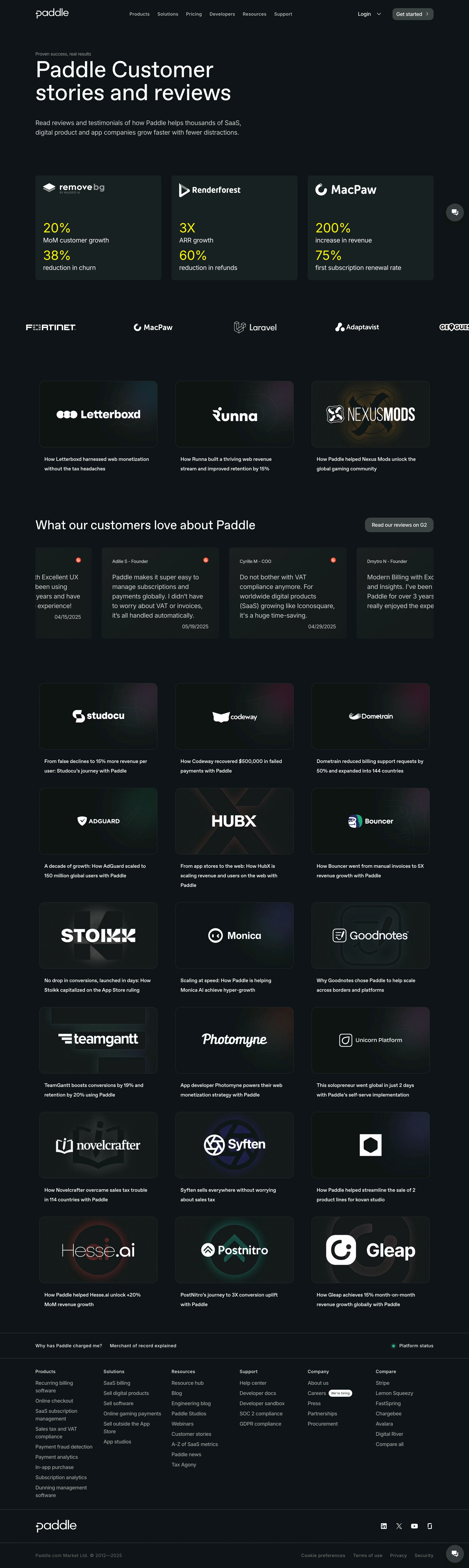
Paddle Customer Stories

Paddle
Put your billing operations on autopilot
Designed by
No items found.

Bookmark
Bookmark

Design with AI
Thank you! Your submission has been received!
Oops! Something went wrong while submitting the form.
# Design from Reference: Paddle Customer Stories
Create an original, high-fidelity visual design inspired by the reference. Prioritize composition, typography, colors, spacing, and component styling over technical implementation.
## Reference
- **Product:** Paddle
- **Category:** Customer Stories
- **Screenshot:** https://cdn.prod.website-files.com/5e9dc792e1210c5325f7ebbc/6acad3b1c2028efdec71b0ef_6acad166610f0f51f4ed825f_cms-edbc129895bf8599a2915c62.webp
Analyze the screenshot first. If inaccessible, request it rather than guessing.
## Content
{{content.instructions}}
{{content.data}}
Preserve essential messaging and factual accuracy. Adapt structure and copy length for visual balance; never invent product claims.
## Visual Design
### Overall aesthetic
- **Style:** Dark customer-proof directory with near-black green-tinted surfaces, oversized white editorial headings, yellow performance figures and luminous but subdued logo artwork.
- **Scale:** Source screenshot is 2734 × 9141px. Measurements below refer to screenshot pixels unless explicitly described as estimated proportions; CSS scale is unverified.
### Page composition
- **Header and hero:** A centered content region spans about 85% of the page. The header contains the Paddle mark, navigation, Login and a rounded Get started action. A left-aligned eyebrow introduces a large two-line title and two-line summary.
- **Proof overview:** Three equal metric cards sit beneath the hero, followed by a horizontal customer-logo strip with logos clipped at the right edge.
- **Story directory:** A three-column first story row precedes a review carousel. Six further rows of three logo-led stories follow, for 21 story tiles visible in total.
- **Footer:** A utility/status strip precedes six link columns, then a brand/social row and final legal row. Circular chat controls appear at the right edge.
### Information hierarchy
- **Metrics:** The three overview cards feature removebg, Renderforest and MacPaw logos above two bright-yellow figures and short white result labels each.
- **Stories:** Each story pairs a dark illustrated brand image with a short white outcome headline below. The first row features Letterboxd, Runna and Nexus Mods.
- **Reviews:** A large What our customers love about Paddle heading shares a row with a G2 review button; testimonial cards below show author, review copy and date, with partial cards visible at both edges.
### Typography
- **Family:** Clean sans-serif; exact identity is unverified.
- **Hero roles:** At full screenshot scale, the main title is approximately 126px with close line spacing and regular-to-medium weight; the summary is about 38px/56px. The small eyebrow is around 26px.
- **Directory roles:** Metric numbers are around 76px, accompanying labels around 38px. Story headlines are about 28–30px with generous 54px leading; footer links are around 30px. These are image-pixel estimates, not confirmed CSS sizes.
### Colors & surfaces
- **Sampled palette:** ICC-aware sRGB samples include dominant #0E1414, raised card #182222 and related dark tones #0E1314, #131919, #141A1A, #161C1C and #171D1D.
- **Contrast:** White logos and headings carry the content; softer gray body copy reduces emphasis. Acid-yellow metric figures are the clearest chromatic accent.
- **Artwork:** Story images layer faint oversized brand shapes with localized purple, green, blue or warm glows. Fine low-contrast borders distinguish tiles from the background.
### Components
- **Metric cards:** Three equal cards span roughly 316–320px each in the 1200px inspection preview, with about 26px gaps and 7px corners. Logos occupy the top; paired metric groups anchor the lower area.
- **Story tiles:** Image panels use an approximately 16:9 ratio, subtle borders and 14–16px corners in the inspection preview. Brand marks are centered; headlines sit outside the image with about 20px separation.
- **Review cards:** Dark rectangular cards with modest rounding, small red G2 marks at upper right, author labels at top and dates near the bottom. Their horizontal clipping communicates a carousel layout.
- **Navigation actions:** Get started and the G2 link are rounded gray filled buttons with white labels. Chat uses a dark circular surface and white speech icon. No hover or expanded navigation state is visible.
### Visual rhythm
- **Section spacing:** Large vertical pauses separate hero, metrics, logo strip, first stories, reviews and the extended directory.
- **Grid cadence:** Story panels keep consistent widths and image ratios; headlines wrap to two or three lines, with enough row spacing to preserve alignment.
- **Footer density:** Thin full-width rules break the footer into utility, links, brand and legal bands, creating a denser finish after the spacious story grid.
### Responsive
- **Recommended adaptation:** Only desktop is shown. Reduce metric and story grids to two columns and then one, with review cards remaining horizontally browsable.
- **Type scaling:** Scale headline sizes from the underlying CSS rather than copying the doubled-looking image measurements. Keep logo art and story titles legible at smaller widths.
### Adaptation guidance
- **Preserve:** Retain the dark tonal system, bright outcome metrics, brand-centered image cards and progression from summary proof to detailed stories.
- **Adapt honestly:** Use actual customer logos, approved testimonials and verified metrics. Match each card's artwork to its customer identity while keeping the subtle glow and border treatment consistent.
Use this context to reproduce the reference's visual language: layout, typography, colors, spacing, borders, radii, and distinctive elements. The screenshot takes priority if descriptions conflict.
## Direction
{{preferences.fidelityInstructions}}
## Output
{{output.instructions}}
Deliver a polished, cohesive design with precise alignment, hierarchy, and spacing. Produce the requested visual artifact, not just a description. If unsupported, explain the limitation.


Category
Patterns
No items found.
Tech Stack



Added on
January 7, 2026
Similar screens
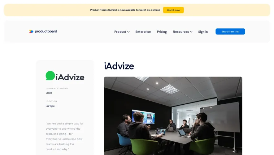




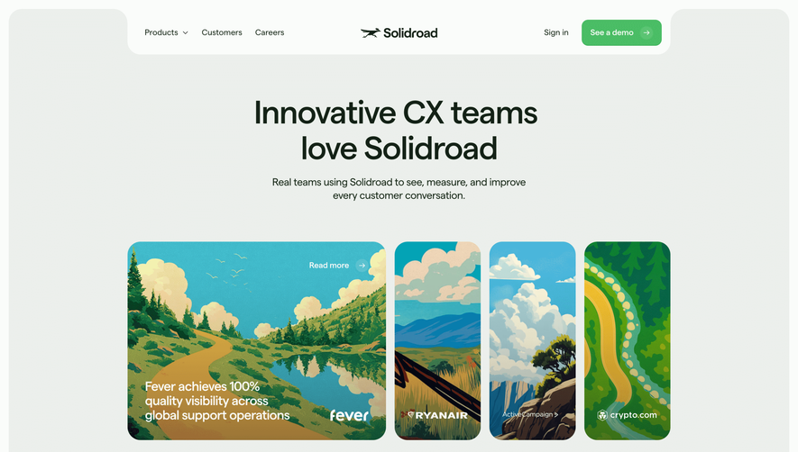

Upgrade to SaaSFrame Pro now to see similar examples.
Monthly
$18 /month
Billed $18 monthly
Browse all screens & flows
Filter and search screens & flows
Search text in screenshots
Access Figma files
Access mobile versions
Join now
Quarterly
$16 /month
Billed $48 quarterly
Browse all screens & flows
Filter and search screens & flows
Search text in screenshots
Access Figma files
Access mobile versions
Join now
Yearly
$15 /month
Billed $180 yearly
Browse all screens & flows
Filter and search screens & flows
Search text in screenshots
Access Figma files
Access mobile versions
Join now