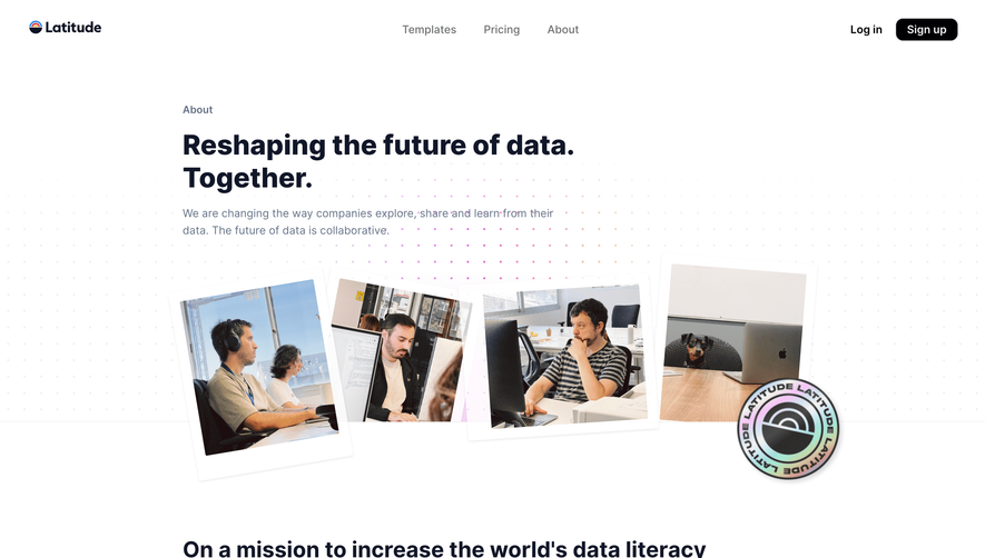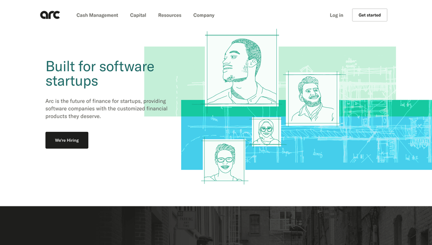
1. Header: At the top of the webpage, there is a header that includes a navigation menu, company logo, and social media icons. 2. Hero section: This is the main banner area, which includes a large full-screen image along with a headline, subheadline, and call-to-action button. The aim of this section is to grab the attention of visitors and encourage them to learn more about Monday.com. 3. Company Overview: Here, visitors can read more about Monday.com, including the company's mission, vision, customer base, and some interesting facts. 4. Team section: The team section features a number of smiling faces of the team members, each with their name and role at the company. Clicking on individual team members leads to their detailed profile. 5. Industry Recognition: Visitors can see a few awards the company has won along with some positive testimonials. 6. Product features: In this section, visitors can learn about what Monday.com has to offer. Different features are presented in slider format. 7. Case Studies: Here, several detailed case studies of how different clients have used Monday.com and how it has improved their work flow are presented. 8. Integrations: This section lists out all the different softwares and platforms that integrate with Monday.com. 9. Blog section: Visitors can access the company blog right from the home page, Upon clicking on the section, several recent articles will be displayed. 10. Footer: At the bottom of the webpage, there is a footer section, which includes links to additional resources, such as company information, customer support, and social media pages.


Monday About Page
Monday
The Work OS that powers remote teamwork
Designed by
No items found.
Category
Patterns
No items found.
Tech Stack
Added on
May 10, 2020