Prompt 1,294 words Copy
# Design from Reference: Clearbit About Page

Create an original, high-fidelity visual design inspired by the reference. Prioritize composition, typography, colors, spacing, and component styling over technical implementation.

## Reference

- **Product:** Clearbit
- **Category:** About Page
- **Screenshot:** attached to this message (also available at https://media.saasframe.io/o/661339614ad8b32c793e.webp)
- **Source:** https://clearbit.com/about

Analyze the attached screenshot first. If no image is attached, open the screenshot link; if neither is accessible, ask for it rather than guessing.

## Visual Design Context

### Overall aesthetic

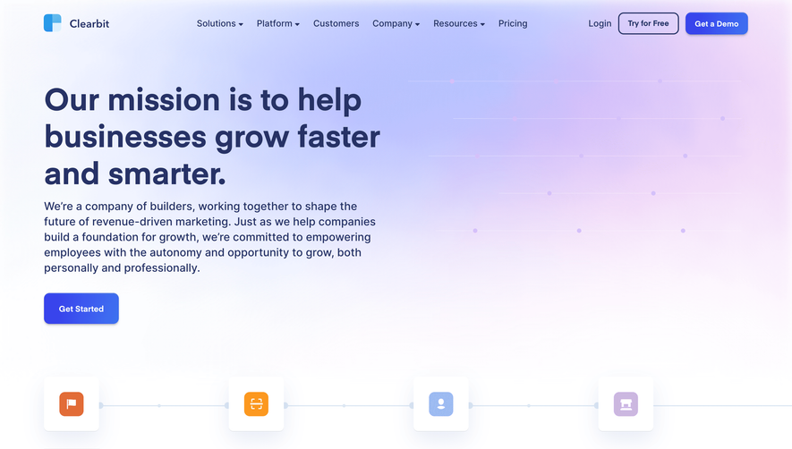
- **Style:** A company page uses a continuous blue-to-teal gradient behind white mission text and a very large people directory, followed by white conversion content and a dark navy footer.
- **Character:** Friendly circular portraits, office photography, small line icons and restrained blue actions make the page feel human and data-oriented.

### Page composition

- **Capture:** The source measures 1440 × 11158 pixels. Sizes below approximate image pixels; CSS scale is unverified. The entire long directory and footer were inspected.
- **Header:** A roughly 1280-pixel container holds the brand left, six navigation items centrally and login/outlined Get Started right.
- **Mission:** A large left-aligned three-line heading and paragraph sit on a blue gradient, opposite faint horizontal line/dot decoration.
- **Metrics:** Four evenly spaced icon-led facts form one row below the introduction.
- **Location:** Two large side-by-side panels pair a dark address/map card left with an office photograph right.
- **Hiring introduction:** Centered heading, short paragraph and outlined action precede the directory.
- **People directory:** Six columns of circular portraits, names and roles repeat across many rows over the changing teal gradient; the final row has only two entries.
- **Trust and careers:** A customer-logo strip ends the light gradient. A darker blue recruitment section follows with heading, copy, action, seven icon-led benefit items and a three-image collage.
- **Lower content:** Two white resource links precede a two-column contact section: demo form left and headline, copy and three award badges right.
- **Footer:** A dark navy region contains brand, three broad link columns with multiple groups, then legal and social rows.

### Information hierarchy

- **Mission:** Large white display type establishes the opening message.
- **Facts:** Small uppercase metrics lead lighter explanations beneath circular icons.
- **People:** Bold names precede smaller role labels; portraits remain consistent in scale regardless of seniority.
- **Recruitment:** Large heading and vivid blue action lead into compact benefit statements.
- **Contact:** The form and oversized chat heading share priority, while award badges provide supporting proof.
- **Footer:** Muted group headings and rules separate brighter links.

### Typography

- **Family:** Neutral sans serif throughout; exact identity is unverified.
- **Hero:** Approximately 56 pixels, bold, with about 66-pixel line height.
- **Major sections:** Roughly 48 pixels bold for hiring, location and careers headings; contact heading around 56 pixels.
- **Introductory copy:** Around 20 pixels with 28-pixel leading.
- **Directory:** Names approximately 14 pixels bold; roles around 13 pixels with 18-pixel leading.
- **Utilities:** Metric labels around 14 pixels uppercase; footer links around 14 pixels, semibold.

### Colors & surfaces

- **Measured light:** White #FFFFFF defines text and lower-page surfaces.
- **Gradient samples:** Blue #8BBDD7 and teal variants #78B7AD, #79B7B6 and #79B7B4 occur in the large gradient field. These are sampled pixels, not verified CSS gradient stops.
- **Footer:** Dark navy #131832 is sampled in the footer.
- **Actions:** Saturated blue/violet gradients fill the careers and demo buttons; exact stops are unverified.
- **Depth:** Location and form panels have soft shadows; portraits have subtle edge/shadow definition. Fine low-contrast rules structure directory rows and footer groups.

### Components

- **Header action:** A white outlined rounded rectangle around 120 × 46 pixels.
- **Metric units:** Small pale-blue circular icon discs sit above uppercase labels and short descriptions.
- **Location card:** A large dark-teal rounded panel contains a multiline heading and an inset map/address card.
- **Office photograph:** A broad landscape image aligns with the location panel and uses roughly 12-pixel corners.
- **Directory entries:** Circular portraits around 64 pixels wide sit above centered name/role text, within evenly spaced roughly 200-pixel columns.
- **Hiring actions:** An outlined button introduces the directory; a larger filled blue-gradient button appears in the darker careers section.
- **Culture collage:** One wide office photo and two narrower images form a three-column row that overlaps the transition to white.
- **Demo form:** A softly shadowed rounded outer panel encloses a pale form surface, brand mark, title, email field, message area, full-width button and legal/account links.
- **Award badges:** Three shield-shaped graphics align in a row with short category labels below.
- **Footer groups:** Thin top rules, muted headings and compact bright links create a dense multi-group navigation system.

### Visual rhythm

- **Top spacing:** Broad gaps separate mission, metrics, location and hiring introduction.
- **Directory cadence:** Repeated portrait rows use roughly 150-pixel vertical pitch, with subtle horizontal separators.
- **Density shift:** The extensive directory is followed by larger recruitment regions and substantial whitespace around resources/contact.
- **Color progression:** Blue gradually shifts through teal and lighter blue before a distinct darker careers band and final navy footer.

### Responsive

- **Evidence:** Only desktop is shown; mobile navigation, directory filtering and form behavior are unverified.
- **Recommended grids:** Reduce six directory columns to three, two and one as needed, preserving portrait/text relationships.
- **Recommended reflow:** Stack location panels, metric groups and contact columns; wrap benefit items and customer logos.
- **Typography:** Reduce large headings toward 34–40 pixels while maintaining readable directory roles.
- **Forms:** Keep labels and controls accessible, with explicit focus, validation and submission feedback.

### Adaptation guidance

- **Preserve:** Keep the gradient-led company narrative, uniform circular people directory, office photography and clear recruitment/contact transitions.
- **Build:** Use data-driven profile entries and reusable metric, benefit and resource components.
- **Scale:** Use flexible page sections rather than reproducing the screenshot's fixed long height.
- **Content fidelity:** Use supplied staff, customer, metric and award information; the captured page does not establish current company facts.
- **Interaction:** Define menus, careers links and demo submission explicitly; only visual states are observed.

## Content

**Instructions:**

Generate realistic example content that fits the selected design reference.

Create appropriate headlines, descriptions, labels, buttons, and supporting copy based on the type of interface being designed.

If a product or business description is provided, use it to guide the content.

Otherwise, invent a plausible fictional SaaS product appropriate for the reference.

Keep the content concise, coherent, and visually balanced.

Do not present fictional statistics, customer names, or testimonials as verified facts.

## Design Direction

**Instructions:**

Use the reference screenshot as the main source of visual inspiration rather than a strict layout template.

Preserve its most distinctive design characteristics, such as typography, visual rhythm, color relationships, component treatments, and overall aesthetic.

Feel free to modify section arrangements, proportions, spacing, and individual components to better suit my content.

Introduce original design decisions where they improve usability, composition, or brand consistency.

The result should clearly reflect the reference's visual language without looking like a direct reproduction.

Follow the visual identity of the reference design.

Use its typography, color palette, component styling, and overall aesthetic as the primary design direction.

Do not introduce an unrelated visual identity.

## Output

**Instructions:**

Generate a high-fidelity visual mockup of the requested interface.

Present the design as a polished, realistic website or product UI screenshot.

Prioritize visual composition, typography, spacing, colors, alignment, and component details.

Use the available image-generation or visual-design capabilities.

Do not replace the mockup with source code, a written design specification, or a textual description.

If direct visual generation is unavailable, clearly explain the limitation.

## Constraints

- Use the actual screenshot as the primary visual reference.
- Preserve essential messaging and factual accuracy.
- Prioritize visual quality and consistency.
- Do not invent unsupported product claims.
- Adapt structure and copy length for visual balance.
Reference image Attach it to your message: assistants can’t open image links. Open in ChatGPT ↗ Open in Claude ↗
Build it in Lovable ↗ v0 ↗ Figma Make ↗
Opening a tool copies the screenshot so you can paste it with your prompt.
 SaaSFrame