Overall Style and Aesthetic
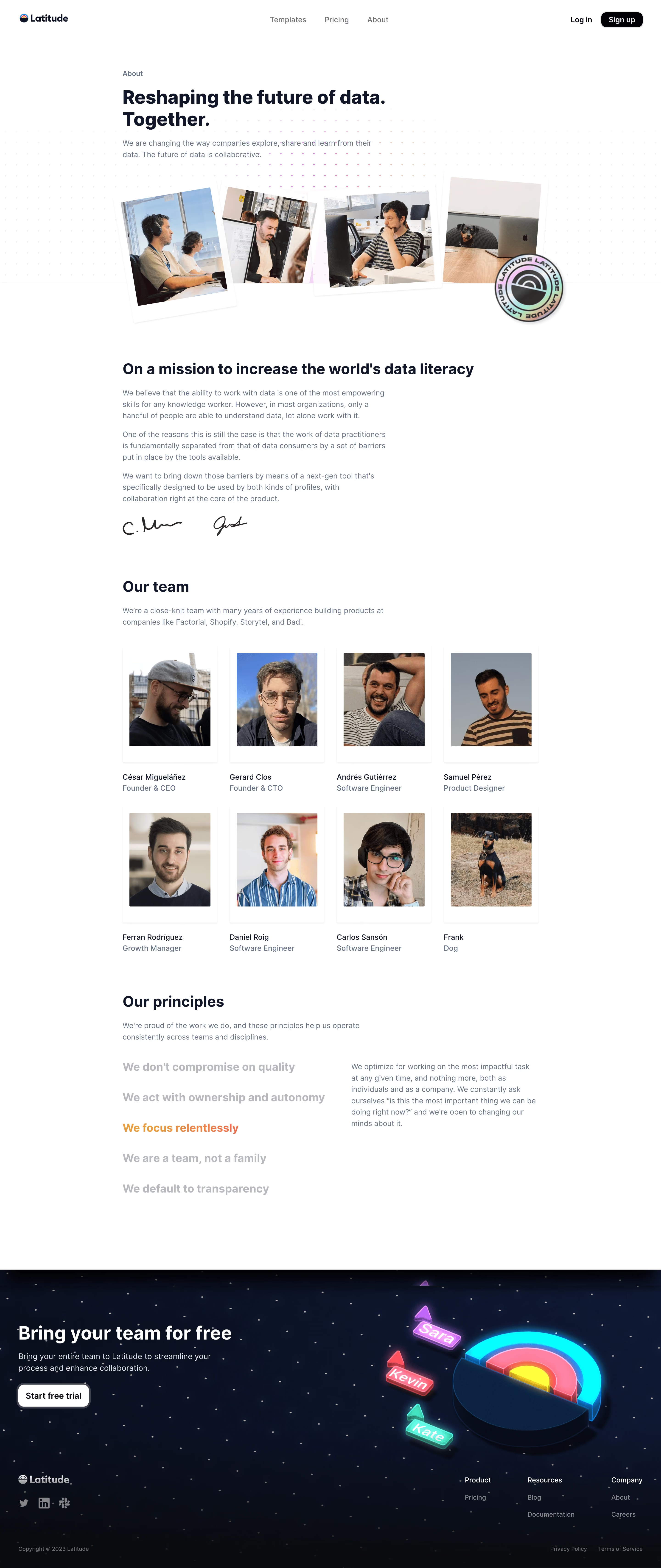
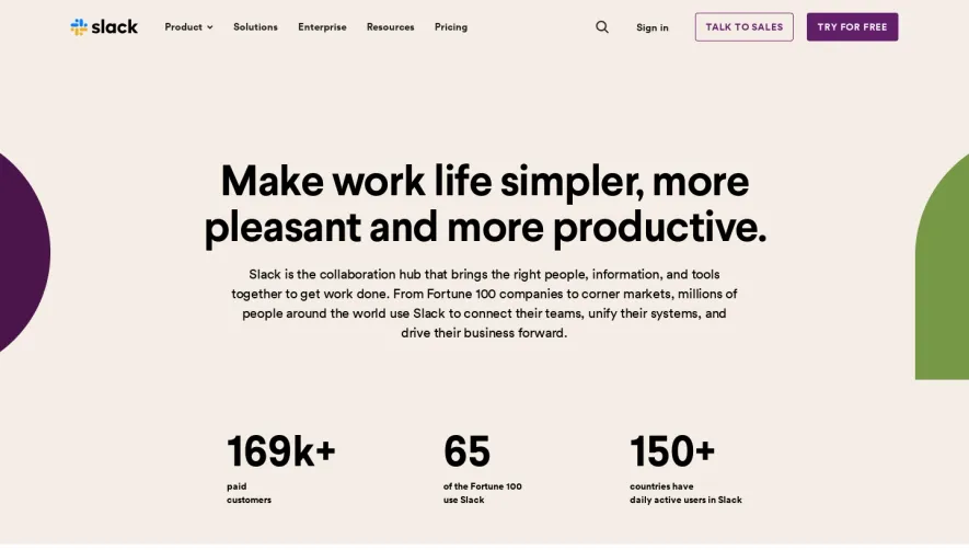
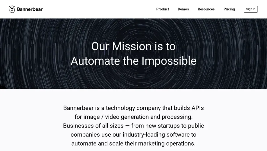
Latitude’s About page embraces a distinctly minimalist yet modern style, balancing generous white space with purposeful, vibrant accents. The design radiates confidence and trustworthiness, presenting the brand as innovative but approachable—perfectly aligned with SaaS sensibilities. Everything feels uncluttered and intentional, allowing key messages and visuals to shine. Layout and Structure
The structure is clean and familiar: a bold hero section introduces Latitude’s mission and identity, establishing credibility. Below, a clear narrative unfolds via focused sections about the team, vision, and values—each with ample breathing room and clear separation. The absence of unnecessary clutter helps guide the user’s eye along a logical, story-driven progression, culminating in a friendly, understated footer. Visual Elements
Custom illustrations—geometric, line-drawn, and gradient-enhanced—inject personality and visual interest without overpowering content. Subtle animations and hover effects create a sense of interactivity and polish, adding to the page’s modern feel. Photographic elements are used sparingly, ensuring illustrations remain the visual centerpiece. Color Palette and Typography
A calming, contemporary color palette centers on off-white backgrounds, charcoal text, and splashes of energetic teal and blue—signaling innovation and reliability. Typeface choices are straightforward and elegant: a sans-serif primary font ensures clarity and modernity, with distinct weight variation providing clear hierarchy and easy reading. User Experience Patterns
Sticky header navigation keeps the site accessible as users scroll. Section-based CTAs are subtle yet inviting, ensuring calls to action never disrupt the user’s journey. Scrolling reveals content with fluid transitions, while interactive elements reinforce usability without distracting from the focus. Every pattern is designed for clarity and efficiency. Unique or Notable Design Choices
Notably, Latitude uses playful background gradients and movement within illustrations, adding dynamism while maintaining a professional tone. The storytelling structure, combined with highly curated visuals, delivers a memorable, inspiring browsing experience—ideal for anyone seeking SaaS web design inspiration that balances restraint, character, and clarity.