Design with AI
Generate a new design based on this screen using your own content.
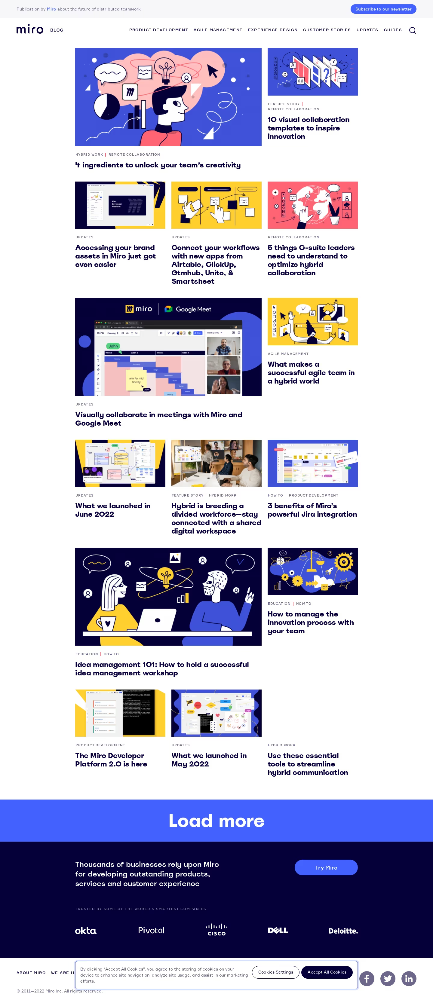
# Design from Reference: Miro Blog Feed
Create an original, high-fidelity visual design inspired by the reference. Prioritize composition, typography, colors, spacing, and component styling over technical implementation.
## Reference
- **Product:** Miro
- **Category:** Blog Feed
- **Screenshot:** https://cdn.prod.website-files.com/5e9dc792e1210c5325f7ebbc/62ec9c8abf75bb380dce6ead_1659625349157-screenshot-device-ab62cba33d316f4024f9ca30dc41bbd0-1659605597125.webp
Analyze the screenshot first. If inaccessible, request it rather than guessing.
## Content
{{content.instructions}}
{{content.data}}
Preserve essential messaging and factual accuracy. Adapt structure and copy length for visual balance; never invent product claims.
## Visual Design
### Overall aesthetic
- **Style:** Colorful editorial blog with bold navy typography and illustrated story cards.
- **Character:** White reading surface, cobalt and yellow imagery, occasional coral, and a dark conversion footer.
### Page composition
- **Canvas:** 1440 × 3307 screenshot px.
- **Header:** Thin publication/subscription strip followed by logo, category navigation, and search.
- **Grid:** Approximately 940px wide, centered with about 250px side margins.
- **Pattern:** Repeated two-thirds-width lead story plus one-third-width companion, alternating with three equal cards.
- **Cards:** Images above uppercase category labels and bold titles; no surrounding card borders.
- **Bottom:** Full-width blue Load more band, dark conversion/trust section, legal footer, and cookie notice overlay.
### Information hierarchy
- **Primary:** Large featured illustrations and heavy navy article titles.
- **Secondary:** Small uppercase categories establish topic context.
- **Grid hierarchy:** Two-column-span stories create clear visual anchors among smaller cards.
- **Conversion:** Large Load more text precedes the dark Try Miro band.
### Typography
- **Family:** Rounded geometric-looking sans serif for titles, with compact sans-serif labels; exact families unverified.
- **Article titles:** Approximately 23–25 screenshot px, weight 700–800, line-height 27px.
- **Category labels:** Approximately 11–12px, uppercase with increased tracking.
- **Header navigation:** Approximately 12–13px, uppercase.
- **Load more:** Approximately 56px, bold.
- **Footer conversion copy:** Approximately 24px, semibold.
- **Precision:** Font sizes are screenshot estimates, not extracted CSS.
### Colors & surfaces
- **Canvas:** #FFFFFF.
- **Primary navy:** #050039; nearby screenshot shade #040037 also occurs.
- **Cobalt action band:** Approximately #4261FF.
- **Illustration blues:** #3E51D8 and #3F52D9.
- **Illustration yellow:** #FECF2D.
- **Header pale surface:** #F7F6F9.
- **Neutral gray:** #F1F1F1.
- **Palette:** Coral, pink, and yellow are concentrated in artwork; navy remains the main text color.
- **Precision:** WebP compression and embedded artwork create shade variations.
### Components
- **Story cards:** Borderless, with rectangular landscape images around 1.9:1 aspect ratio.
- **Grid gutters:** Approximately 20px horizontally; larger vertical spacing between rows.
- **Lead images:** Approximately 620px wide; small images approximately 300px wide.
- **Newsletter action:** Compact blue pill in the top strip.
- **Load more:** Full-width blue band with centered white label.
- **Trust block:** Dark navy surface, white copy, blue pill CTA, and customer marks.
- **Cookie notice:** White bordered overlay with two pill actions above the lower footer.
### Visual rhythm
- **Rhythm:** Alternating lead and three-card rows breaks up repetition.
- **Spacing:** Tight image/category/title grouping, broad gaps between story rows.
- **Alignment:** Images and titles share left edges across all column spans.
- **Footer:** Strong blue and navy bands mark the transition away from the editorial feed.
### Responsive
- **Observed:** Desktop only.
- **Recommendation:** Collapse to two then one column, preserve lead-story emphasis, and simplify category navigation.
- **Images:** Keep readable aspect ratios and prevent title truncation.
- **Overlays:** Cookie banner must remain within viewport and avoid obscuring essential actions.
### Adaptation guidance
- **Preserve:** Image-led grid, strong navy titles, uppercase metadata, and occasional wide lead stories.
- **Content:** Use supplied editorial assets and categories; do not copy customer logos or claims without source content.
- **Brand:** Keep a limited structural palette while allowing illustrations to carry richer color.
- **Behavior:** Load-more and cookie interactions are not demonstrated by this static capture.
Use this context to reproduce the reference's visual language: layout, typography, colors, spacing, borders, radii, and distinctive elements. The screenshot takes priority if descriptions conflict.
## Direction
{{preferences.fidelityInstructions}}
## Output
{{output.instructions}}
Deliver a polished, cohesive design with precise alignment, hierarchy, and spacing. Produce the requested visual artifact, not just a description. If unsupported, explain the limitation.