
Thank you! Your submission has been received!
Oops! Something went wrong while submitting the form.
Get SaaSFrame Pro
Monthly
$18
Quarterly
$48
Yearly
$180
Upgrade to access this feature
Browse all screens & flows
Filter and search screens & flows
Access Figma files
Access mobile versions
Bookmark screens & flows
Join now
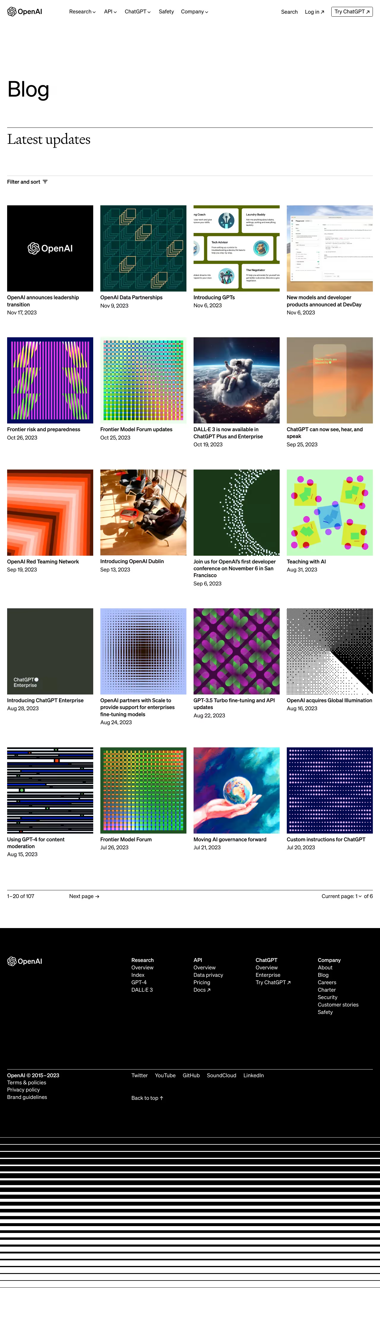
OpenAI Blog Feed

OpenAI
Creating safe AGI
Designed by
No items found.

Bookmark
Bookmark

Design with AI
Thank you! Your submission has been received!
Oops! Something went wrong while submitting the form.
# Design from Reference: OpenAI Blog Feed
Create an original, high-fidelity visual design inspired by the reference. Prioritize composition, typography, colors, spacing, and component styling over technical implementation.
## Reference
- **Product:** OpenAI
- **Category:** Blog Feed
- **Screenshot:** https://cdn.prod.website-files.com/5e9dc792e1210c5325f7ebbc/65646fa0288e718f1068ae7e_IKPpd_9JlgHpGOMhfI0FhOHECXWqV5U6hRw07MsygU0.webp
Analyze the screenshot first. If inaccessible, request it rather than guessing.
## Content
{{content.instructions}}
{{content.data}}
Preserve essential messaging and factual accuracy. Adapt structure and copy length for visual balance; never invent product claims.
## Visual Design
### Overall aesthetic
- **Character:** A stark editorial blog index uses black-and-white structure, very large whitespace and square artwork.
- **Contrast:** Sans-serif navigation/titles pair with a serif section heading; the colorful article imagery supplies nearly all chromatic variation.
### Page composition
- **Capture:** The original is 1280 × 4452 image pixels, inspected throughout. Measurements are image-pixel estimates; CSS scale is unverified.
- **Header:** Brand and corporate navigation span the top, with search/account actions and an outlined external CTA on the right.
- **Introduction:** A large Blog title sits within a tall white region, followed by a black rule and serif Latest updates heading.
- **Controls and grid:** A light rule precedes Filter and sort. Twenty articles form five rows of four columns.
- **Pagination:** A thin black rule introduces count, next-page action and current-page selector.
- **Footer:** A large black region contains brand, four link groups, legal/social rows and back-to-top action; repeated horizontal black/white stripes close the capture.
### Information hierarchy
- **Editorial framing:** The oversized page title establishes context before the smaller section heading and filtering control.
- **Article scanning:** Square images lead each entry, followed by bold title and regular date; there are no enclosing card surfaces.
- **Navigation:** Pagination sits apart from the grid, while the footer reverses contrast to white-on-black.
### Typography
- **Families:** Main interface/content uses sans serif; the section heading uses a high-contrast serif. Exact identities are unverified.
- **Display:** Blog is approximately 72 pixels, regular weight; Latest updates is around 48 pixels in serif.
- **Article roles:** Titles and dates are approximately 18 pixels with 24-pixel leading; titles are bold and dates regular.
- **Navigation/footer:** Around 18 pixels, with compact line spacing and stronger group labels.
### Colors & surfaces
- **Measured structure:** White #FFFFFF and black #000000 dominate canvas, type, rules, footer and stripes.
- **Measured artwork tones:** Dark olive #353A30 and forest #1A3817 occur within article imagery; near-white #FEFEFE/#FDFDFD appears in image details.
- **Color relationship:** Vivid grids, abstract patterns, photography and illustration remain inside article squares rather than extending into page chrome.
### Components
- **Article entries:** Approximately 290-pixel square images align above unboxed text, with no radius, border or shadow.
- **Grid:** Four equal columns use roughly 24-pixel horizontal gutters and large vertical row gaps.
- **Filter control:** Bold text and a compact filter icon sit directly below a pale horizontal rule.
- **Pagination row:** Count aligns left, Next page sits farther right and page selection aligns to the far right.
- **Header CTA:** A thin black outlined rectangle with a small radius includes an external-link arrow.
- **Footer system:** Brand and link groups share a broad grid; a thin white rule separates legal/social links from upper navigation.
### Visual rhythm
- **Margins:** Approximately 24-pixel side gutters align header, rules, article grid and footer content.
- **Whitespace:** Tall blank intervals separate navigation, page title, section heading and the first article row.
- **Image cadence:** Identical square crops create a rigid editorial rhythm despite differing title lengths.
- **Ending:** Horizontal black/white stripes form a visible graphic continuation below the footer.
### Responsive
- **Observed state:** Only a desktop index is supplied; mobile layout and filter interactions are unverified.
- **Recommended grid:** Reduce from four columns to two and then one, preserving square crops and title/date associations.
- **Recommended navigation:** Collapse corporate links and wrap pagination without hiding next-page access.
- **Recommended typography:** Scale oversized title and serif heading fluidly while maintaining distinct roles.
### Adaptation guidance
- **Preserve editorial restraint:** Keep article entries unboxed and let imagery contrast with monochrome structure.
- **Maintain rhythm:** Reuse consistent square images, thin rules and large section gaps.
- **State fidelity:** Treat visible article dates, counts and titles as an archival captured state rather than current news.
- **Accessibility:** Use descriptive article links, meaningful image alternatives and labeled filter/page controls.
Use this context to reproduce the reference's visual language: layout, typography, colors, spacing, borders, radii, and distinctive elements. The screenshot takes priority if descriptions conflict.
## Direction
{{preferences.fidelityInstructions}}
## Output
{{output.instructions}}
Deliver a polished, cohesive design with precise alignment, hierarchy, and spacing. Produce the requested visual artifact, not just a description. If unsupported, explain the limitation.


Category
Patterns
No items found.
Tech Stack



Added on
November 27, 2023
Similar screens




Upgrade to SaaSFrame Pro now to see similar examples.
Monthly
$18 /month
Billed $18 monthly
Browse all screens & flows
Filter and search screens & flows
Search text in screenshots
Access Figma files
Access mobile versions
Join now
Quarterly
$16 /month
Billed $48 quarterly
Browse all screens & flows
Filter and search screens & flows
Search text in screenshots
Access Figma files
Access mobile versions
Join now
Yearly
$15 /month
Billed $180 yearly
Browse all screens & flows
Filter and search screens & flows
Search text in screenshots
Access Figma files
Access mobile versions
Join now