Generate a new design based on this screen using your own content.
Thank you! Your submission has been received!
Oops! Something went wrong while submitting the form.
# Design from Reference: Clutch Blog Feed
Create an original, high-fidelity visual design inspired by the reference. Prioritize composition, typography, colors, spacing, and component styling over technical implementation.
## Reference
- **Product:** Clutch
- **Category:** Blog Feed
- **Screenshot:** https://cdn.prod.website-files.com/5e9dc792e1210c5325f7ebbc/6acad45b886583e9d96b6dd2_6acad3017796407cec14ea73_cms-ad5e3cf73787822b71b360e3.webp
Analyze the screenshot first. If inaccessible, request it rather than guessing.
## Content
{{content.instructions}}
{{content.data}}
Preserve essential messaging and factual accuracy. Adapt structure and copy length for visual balance; never invent product claims.
## Visual Design
Use this context to reproduce the reference's visual language: layout, typography, colors, spacing, borders, radii, and distinctive elements. The screenshot takes priority if descriptions conflict.
## Direction
{{preferences.fidelityInstructions}}
## Output
{{output.instructions}}
Deliver a polished, cohesive design with precise alignment, hierarchy, and spacing. Produce the requested visual artifact, not just a description. If unsupported, explain the limitation.
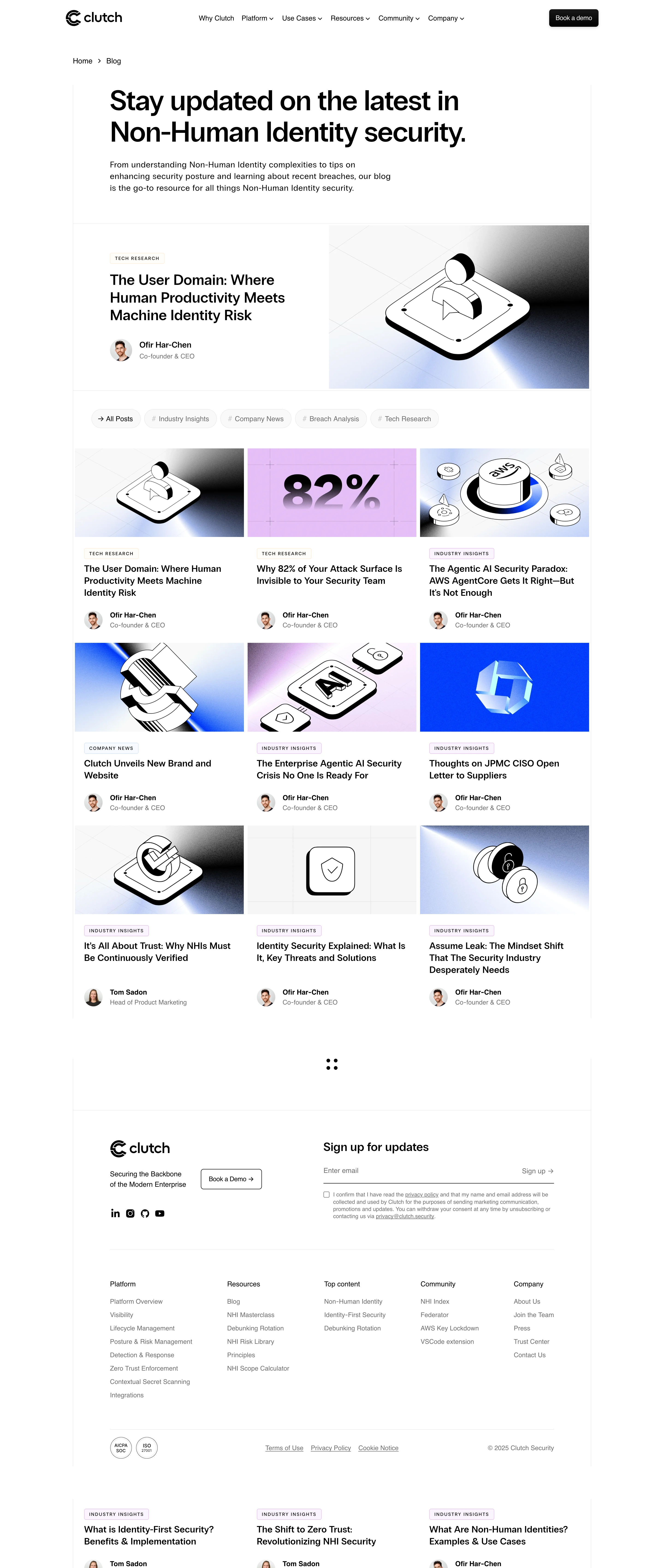
Clutch Security’s blog page embodies a modern minimalist approach, projecting professionalism and trustworthiness while remaining visually engaging. Ample whitespace balances crisp, purposeful content blocks, and subtle depth via gentle drop shadows and section separation adds sophistication without clutter. The tone feels authoritative yet approachable, with visual cues supporting a sense of innovation—ideal for SaaS security.
Layout and Structure
The page opens with a compact hero banner featuring the blog title and a brief tagline, instantly orienting visitors. Content is organized in a grid layout, with sizeable blog cards showcasing each post’s featured image, title, excerpt, and publication date. Filters or search aren’t immediately present, emphasizing simplicity and encouraging exploration. The clean footer offers company details and essential links, supporting intuitive site navigation.
Visual Elements
Custom illustrations and SVG graphics add personality without overwhelming; sleek iconography subtly highlights categories or actions. Blog post images integrate tech-inspired visuals, reinforcing relevance to cybersecurity. Visual consistency is maintained across all cards, with clean thumbnails and uniform spacing enhancing scannability.
Color Palette and Typography
A professional, cool-toned palette features deep navy blues contrasted with cyber-inspired aquas and fresh whites, strengthening brand recognition. Typography is streamlined, likely sans-serif (such as Inter or similar), using bold weights for headings and lighter bodies for easy reading. Clear hierarchy directs the user’s attention from post titles to meta details and CTAs.
User Experience Patterns and Standouts
Sticky, compact navigation aids seamless exploration across the site, while clear “Read More” CTAs on cards ensure next steps are never ambiguous. Subtle hover effects on interactive elements invite engagement. Notably, the interface forgoes unnecessary distractions, optimizing for content discovery while reflecting an authentic sense of reliability and forward-thinking design—a strong source of inspiration for SaaS and tech-centric projects.