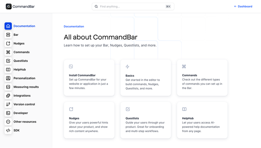
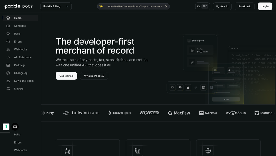
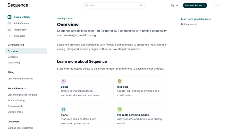
Overall Style and Aesthetic
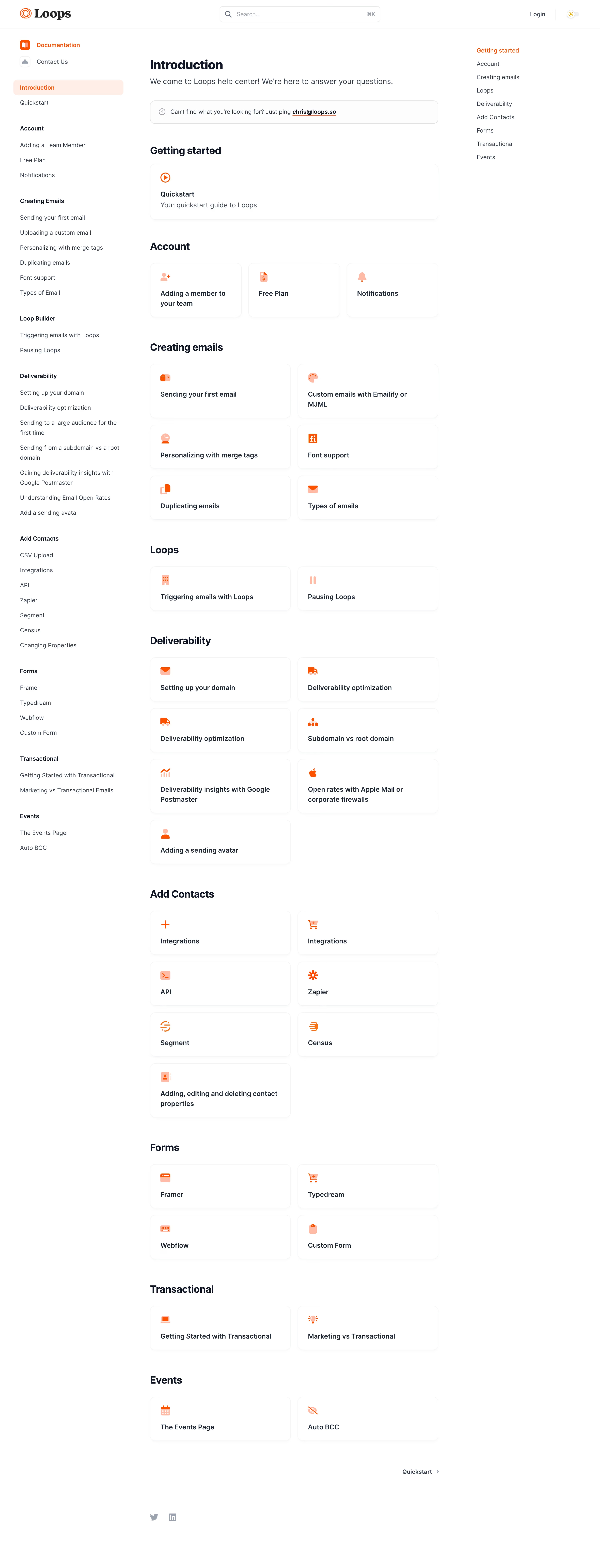
Loops.so’s documentation page leans fully into a minimalist, modern SaaS aesthetic—clean whites dominate, with judicious use of accent color for clarity. The tone feels fresh and professional but approachable, blending subtle whimsy (rounded corners, gentle shadows) with trustworthiness. Layout and Structure
The structure is streamlined for user efficiency. A sticky sidebar nav on the left provides intuitive, persistent access to doc sections, while the main content area uses generous spacing for breathability. Top of the page offers a concise hero with the product logo and crisp introduction, skipping heavy visuals to focus attention on usability and concise text. No testimonials or pricing distract—this is pure product guidance. Visual Elements
Visuals are purposefully restrained. Monochrome line icons support key points, lending clarity without distraction. Callouts (tips, warnings) use colored boxes for emphasis, breaking the content flow strategically. Animations and video are omitted in favor of laser-focused legibility. Color Palette and Typography
Typography is contemporary yet readable (likely Inter or a similar sans-serif), with strong hierarchy—bold headers, medium-weight subheads, generously sized body text. The color palette: cool whites, subtle greys, and soft purples/indigo for CTAs and highlights, providing just enough vibrance. User Experience Patterns
Navigation shines—sidebar always visible, active section highlighted, seamless scroll between topics. Sticky elements aid orientation, while CTAs (e.g., “Get Started”) are clear but never pushy. Search is integrated for fast answers, enhancing self-service UX. Unique or Notable Design Choices
The notable choice is unapologetic focus: minimalist, documentation-first design. It evades traditional page bloat—no imagery overload, just fast, pleasant readability. The result is a documentation experience that feels innovative in its restraint and deeply user-centered.