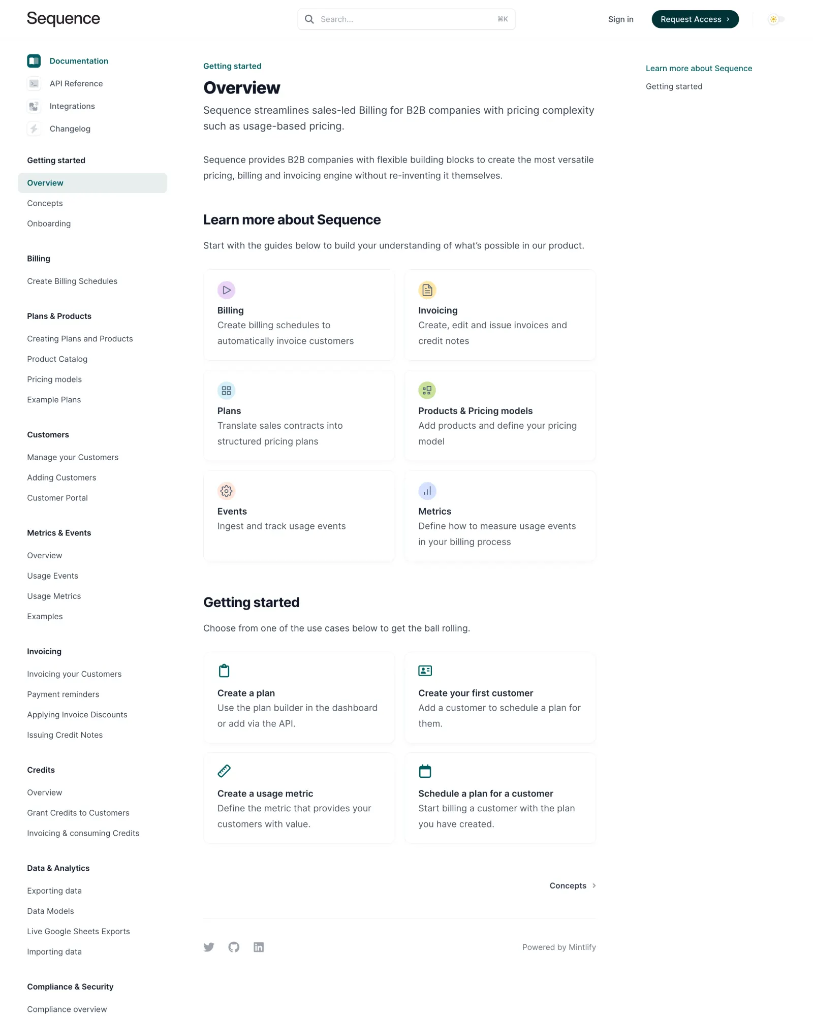
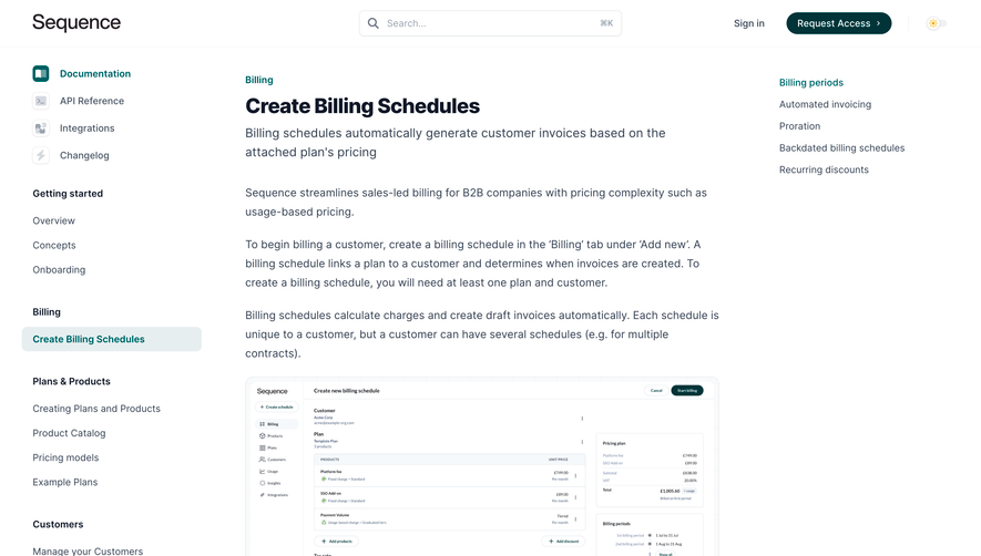
Sequence nails the developer documentation look without feeling sterile. The left sidebar navigation is well organized with clear category headers like "Getting started," "Billing," and "Metrics & Events" in bold, making scanning effortless. That teal highlight on the active nav item is subtle but effective.
Cards that actually help
The six feature cards in the middle section are the visual anchor here. Each one pairs a colored circular icon with a short description. They use a soft border treatment that keeps things light. The icons feel custom and consistent, mixing teal, green, and warm tones without clashing. It's a smart way to break up what could be a wall of text.
Typography pulls its weight
The type hierarchy is doing a lot of heavy lifting. "Overview" in that large serif-ish heading contrasts well against the smaller sans-serif body text. Section headers like "Learn more about Sequence" and "Getting started" create natural breathing room.
What stands out
The bottom "Getting started" cards with action-oriented titles like "Create a plan" and "Schedule a plan for a customer" give users an immediate on-ramp. Practical and focused. No fluff.
 SaaSFrame