
Thank you! Your submission has been received!
Oops! Something went wrong while submitting the form.
Get SaaSFrame Pro
Monthly
$18
Quarterly
$48
Yearly
$180
Upgrade to access this feature
Browse all screens & flows
Filter and search screens & flows
Access Figma files
Access mobile versions
Bookmark screens & flows
Join now
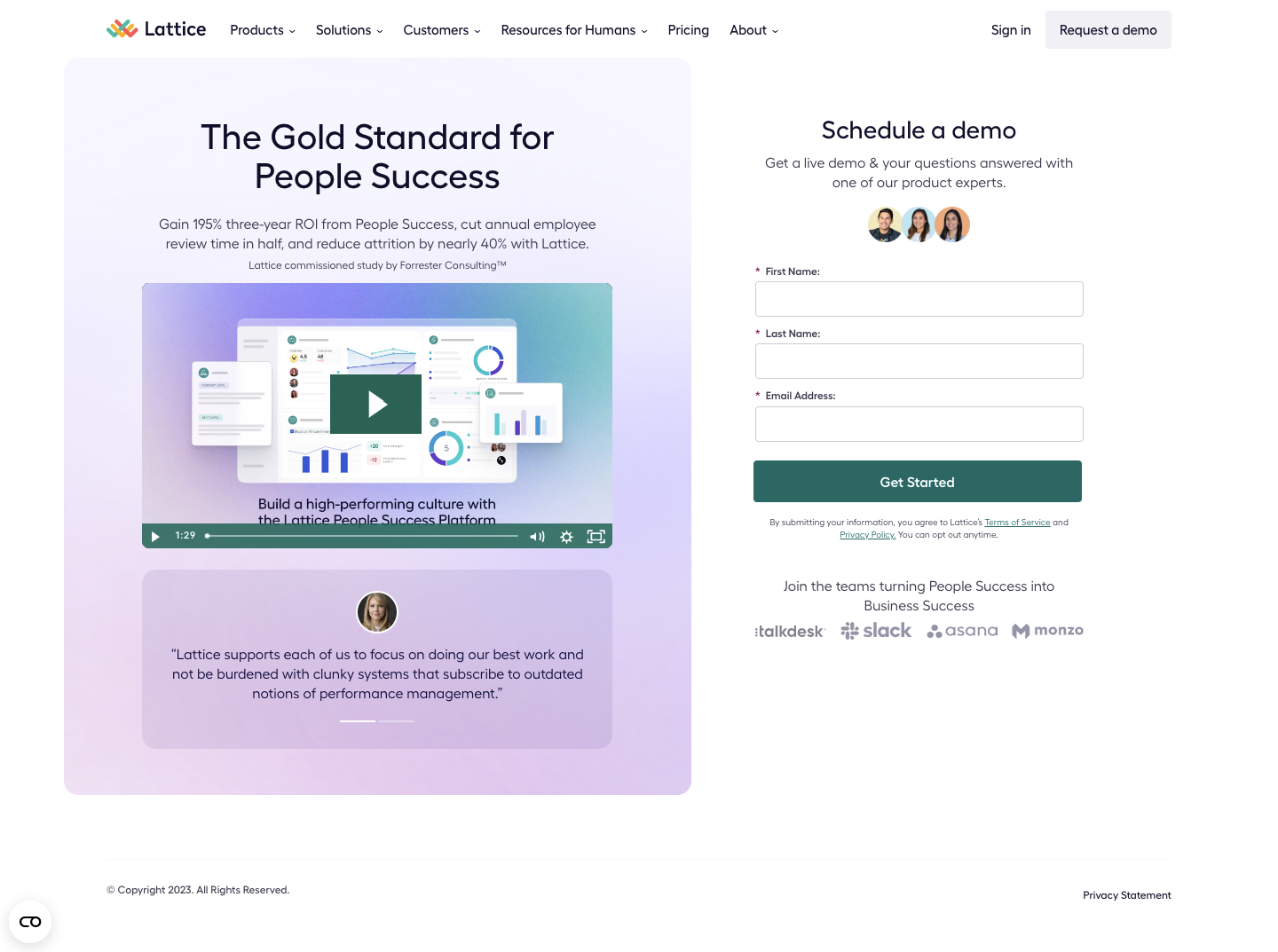

Lattice Demo Request

Lattice
People success platform
Designed by
No items found.

Bookmark
Bookmark

Design with AI
Thank you! Your submission has been received!
Oops! Something went wrong while submitting the form.
# Design from Reference: Lattice Demo Request
Create an original, high-fidelity visual design inspired by the reference. Prioritize composition, typography, colors, spacing, and component styling over technical implementation.
## Reference
- **Product:** Lattice
- **Category:** Demo Request
- **Screenshot:**
Analyze the screenshot first. If inaccessible, request it rather than guessing.
## Content
{{content.instructions}}
{{content.data}}
Preserve essential messaging and factual accuracy. Adapt structure and copy length for visual balance; never invent product claims.
## Visual Design
### Overall aesthetic
- **Character:** A polished demo-request page pairs soft lavender gradient marketing content with a simple white lead form. Dark navy typography and muted green conversion controls keep it restrained.
- **Evidence:** Source dimensions are 1440 × 1073 px, inspected at 1400 px width. Measurements below are approximate source pixels; CSS scale is unverified.
- **Balance:** The left panel supplies product proof and testimonial content, while the narrower right column emphasizes form completion.
### Page composition
- **Header:** Logo and product/navigation links align left across a white bar, with sign-in and a pale demo action at right.
- **Left panel:** A rounded gradient rectangle approximately 707 × 830 px contains a centered two-line headline, supporting claim/citation, video preview, and testimonial panel.
- **Right column:** A centered demo heading, two-line explanation, three portrait thumbnails, three required inputs, and a full-width green action form a vertical stack.
- **Proof beneath form:** Small consent text and a customer-logo strip sit below the action.
- **Footer:** A thin horizontal rule precedes copyright and privacy text. A small circular utility launcher appears at lower left.
### Information hierarchy
- **Marketing headline:** Large centered text is followed by a smaller results-oriented paragraph and a tiny study citation.
- **Product media:** A large video preview shows layered dashboard panels and a prominent play control.
- **Form:** The demo heading introduces a short required-field form for first name, last name, and email address.
- **Trust:** Portraits, testimonial copy, carousel indicators, and a row of muted customer logos support the primary form action.
### Typography
- **Family:** A rounded geometric-looking sans serif is used throughout; exact identity is unverified.
- **Headline:** Approximately 40 px, medium weight, with around 44 px line-height.
- **Form title:** Approximately 28–30 px, medium weight; helper copy and testimonial text are around 15–16 px with 22 px leading.
- **Field labels:** Approximately 11–12 px medium to semibold, with colored required asterisks.
- **Utility:** Citation, consent, and footer copy are approximately 10–12 px; button text is around 15 px semibold.
### Colors & surfaces
- **Measured source colors:** Frequent samples include white #FFFFFF, pale lavender #F5F6FF, #F6F7FF, #F4F5FE, #F7F8FF, and muted green #3D6562.
- **Semantic use:** White grounds the form; pale lavender/blue/pink gradients distinguish the marketing panel. Dark navy carries headings.
- **Actions:** Muted green fills the form submit action and video controls. Customer marks and small copy use muted gray-purple.
- **Depth:** The video artwork includes layered white interface cards and soft shadows. The testimonial region uses a darker translucent lavender surface.
### Components
- **Marketing panel:** Approximately 16 px corner radii with large internal spacing and a diffuse pastel gradient.
- **Video player:** Approximately 530 × 300 px, with a large centered green play rectangle, lower timeline, time label, audio/settings/fullscreen icons, and rounded lower corners.
- **Testimonial:** A broad rounded panel around 530 × 200 px contains a small circular portrait, centered quote, and two short carousel indicators.
- **Inputs:** Approximately 370 × 40 px, white with thin gray outlines and 4 px radii. Each has a visible label above it.
- **Submit action:** A green full-width rectangle about 370 × 47 px, with small corner radii and centered white text.
- **Portrait and logo proof:** Three small circular faces form a compact centered cluster; four muted customer marks share one line beneath the consent text.
### Visual rhythm
- **Columns:** A wider visual-proof column and narrower form column are separated by a generous white gap.
- **Form spacing:** Roughly 14 px separates field labels from the next group; larger pauses distinguish title, portraits, fields, and trust content.
- **Marketing cadence:** Headline/copy, video, and testimonial form three clear blocks within the gradient panel.
- **Footer space:** A large lower gap separates the main content from the small legal footer.
### Responsive
- **Observed limit:** Only desktop is visible; mobile layout and form/video behavior are unverified.
- **Recommended stacking:** Place the demo form prominently on narrow screens, then marketing media and proof in a logical reading order.
- **Recommended sizing:** Make inputs and video fluid, reduce headline size, and use 20–24 CSS px side gutters.
- **Recommended accessibility:** Keep labels visible, preserve touch targets, provide captions for video, and prevent utility controls from covering content.
### Adaptation guidance
- **Preserve:** Retain the contrast between pastel product proof and a clear unboxed form, with one primary green action.
- **Build:** Use reusable field groups, proof blocks, and video/testimonial components. Keep consent text associated with submission.
- **Assets:** Use actual product imagery and customer marks; treat results claims as observed screenshot copy rather than verified current evidence.
- **Validate:** Confirm fonts, CSS scale, form errors/loading, video controls, carousel behavior, and responsive order. No submitted state is shown.
Use this context to reproduce the reference's visual language: layout, typography, colors, spacing, borders, radii, and distinctive elements. The screenshot takes priority if descriptions conflict.
## Direction
{{preferences.fidelityInstructions}}
## Output
{{output.instructions}}
Deliver a polished, cohesive design with precise alignment, hierarchy, and spacing. Produce the requested visual artifact, not just a description. If unsupported, explain the limitation.


Category
Patterns


Added on
April 4, 2023
Similar screens
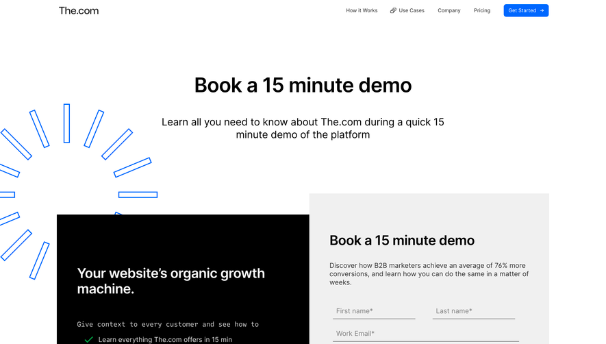

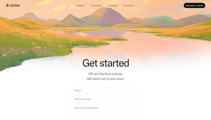


Upgrade to SaaSFrame Pro now to see similar examples.
Monthly
$18 /month
Billed $18 monthly
Browse all screens & flows
Filter and search screens & flows
Search text in screenshots
Access Figma files
Access mobile versions
Join now
Quarterly
$16 /month
Billed $48 quarterly
Browse all screens & flows
Filter and search screens & flows
Search text in screenshots
Access Figma files
Access mobile versions
Join now
Yearly
$15 /month
Billed $180 yearly
Browse all screens & flows
Filter and search screens & flows
Search text in screenshots
Access Figma files
Access mobile versions
Join now