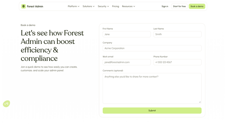
Generate a new design based on this screen using your own content.
Thank you! Your submission has been received!
Oops! Something went wrong while submitting the form.
# Design from Reference: The.com Demo Request
Create an original, high-fidelity visual design inspired by the reference. Prioritize composition, typography, colors, spacing, and component styling over technical implementation.
## Reference
- **Product:** The.com
- **Category:** Demo Request
- **Screenshot:** https://cdn.prod.website-files.com/5e9dc792e1210c5325f7ebbc/6acb723910423f7ec1f651f7_6acb70b5994832179b589f41_cms-a0ffd1506ad9b73c89440d64.webp
Analyze the screenshot first. If inaccessible, request it rather than guessing.
## Content
{{content.instructions}}
{{content.data}}
Preserve essential messaging and factual accuracy. Adapt structure and copy length for visual balance; never invent product claims.
## Visual Design
Use this context to reproduce the reference's visual language: layout, typography, colors, spacing, borders, radii, and distinctive elements. The screenshot takes priority if descriptions conflict.
## Direction
{{preferences.fidelityInstructions}}
## Output
{{output.instructions}}
Deliver a polished, cohesive design with precise alignment, hierarchy, and spacing. Produce the requested visual artifact, not just a description. If unsupported, explain the limitation.
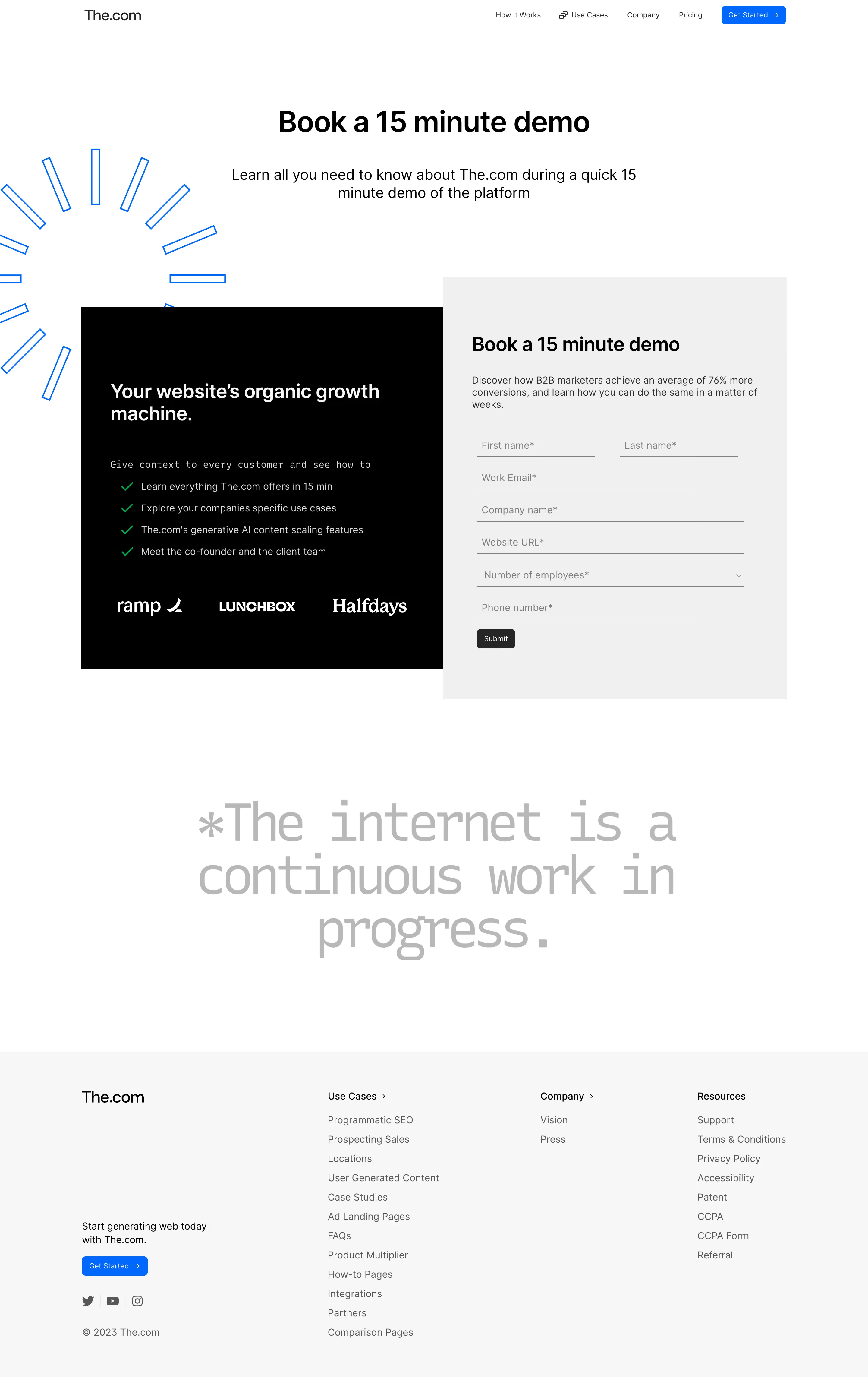
The signup page of the.com exemplifies a bold, modern SaaS aesthetic, balancing playfulness with professionalism. The design exudes confidence, thanks to its ample white space, uncluttered layout, and strategic use of vibrant accent colors. The vibe is approachable yet forward-thinking—perfect for innovative digital tools.
Layout and Structure
Centrally focused, the page uses a single-column layout to keep all attention on the signup form. Absent are distracting elements like navigation bars or footers—the minimalist approach removes friction for conversion, encouraging users to complete the process. Supporting text offers concise value propositions, reinforcing trust and clarity without overwhelming.
Visual Elements
A standout animated hero illustration instantly draws users in, blending playful geometric shapes and subtle motion. Custom icons inline with the brand style bring energy and personality, supporting the main message. The visual hierarchy is strong—visuals direct the eye to the primary form while guiding users with subtle motion and soft shadow effects.
Color Palette and Typography
A crisp white background keeps focus on interactive elements, while a distinctive, saturated accent (a deep indigo-violet) highlights calls-to-action and input fields. Friendly sans-serif typography feels both modern and approachable, with bold weights for headings and lighter text for form fields, ensuring clarity.
User Experience Patterns & Unique Choices
The page distinguishes itself with minimal friction: prominent “Sign Up” CTAs, clear input fields, and a visually simplified form. Animations are purposeful, aiding clarity without distraction. This focus on usability, combined with confident branding, gives the page a trustworthy yet energetic flair, setting a strong example for conversion-focused SaaS design.