
Thank you! Your submission has been received!
Oops! Something went wrong while submitting the form.
Get SaaSFrame Pro
Monthly
$18
Quarterly
$48
Yearly
$180
Upgrade to access this feature
Browse all screens & flows
Filter and search screens & flows
Access Figma files
Access mobile versions
Bookmark screens & flows
Join now
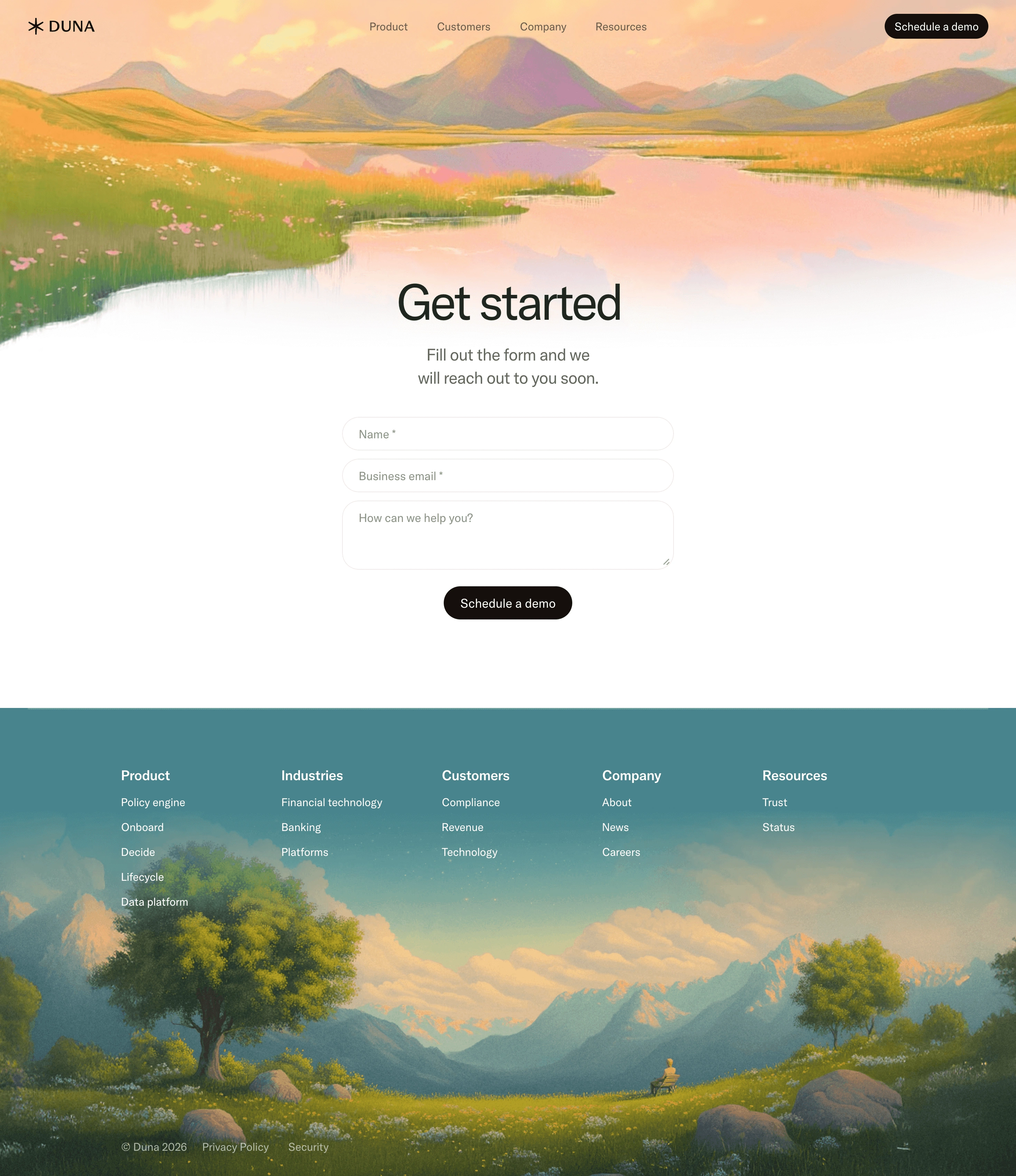

Duna Demo Request

Duna
AI-native compliance platform
Designed by
No items found.

Bookmark
Bookmark

Design with AI
Thank you! Your submission has been received!
Oops! Something went wrong while submitting the form.
# Design from Reference: Duna Demo Request
Create an original, high-fidelity visual design inspired by the reference. Prioritize composition, typography, colors, spacing, and component styling over technical implementation.
## Reference
- **Product:** Duna
- **Category:** Demo Request
- **Screenshot:** https://cdn.prod.website-files.com/5e9dc792e1210c5325f7ebbc/6acad3b2c2028efdec71b109_6acad160b3daa04f54266176_cms-60661a16c70cd92b7ec5cbb3.webp
Analyze the screenshot first. If inaccessible, request it rather than guessing.
## Content
{{content.instructions}}
{{content.data}}
Preserve essential messaging and factual accuracy. Adapt structure and copy length for visual balance; never invent product claims.
## Visual Design
### Overall aesthetic
- **Style:** Calm, art-directed demo-request page combining a minimal centered form with expansive painterly landscapes.
- **Character:** Warm peach skies, meadow greens, reflective water and distant mountains soften the functional white form area. Dark brown-black pill buttons provide a restrained conversion accent.
- **Surface treatment:** No enclosing form card. The hero landscape fades into white, while the footer moves from a flat teal upper region into a detailed landscape painting.
### Page composition
- **Capture scale:** 2940 × 3402 image px. CSS estimates assume an unverified 2× capture, corresponding to approximately 1470 × 1701 CSS px.
- **Header:** Transparent navigation overlays the top landscape. DUNA wordmark and star-like emblem sit left; four navigation links are centered; a dark Schedule a demo pill aligns right.
- **Hero landscape:** A full-width meadow and lake scene spans the upper page, with mountains along the horizon and a peach sky. Its lower edge blends into the white content rather than ending at a hard rectangular boundary.
- **Heading placement:** A centered Get started title sits around y=405 CSS px, overlapping the pale lake-to-white transition.
- **Supporting copy:** A centered two-line explanation sits below the title, with a compact line length.
- **Form:** Approximately 480 CSS px wide, centered. Name and business-email fields stack above a larger free-text area. A centered dark submission pill follows.
- **Whitespace:** The form ends well before the footer, leaving approximately 120 px of breathing room beneath the action.
- **Footer:** Begins around y=1025 CSS px. Five evenly distributed navigation columns sit on the teal upper region; a landscape with trees, mountains, flowers and a small seated figure fills the lower area.
- **Legal row:** Copyright, Privacy Policy and Security links appear near the lower-left area of the landscape rather than in a separate white band.
### Information hierarchy
- **Primary focus:** The large centered title leads directly into the explanation and short form. The scenic artwork frames the task without adding competing marketing copy.
- **Field hierarchy:** Two required single-line fields precede an open-ended request field. Required status is shown through visible asterisks in the placeholders.
- **Action consistency:** Header and form repeat Schedule a demo with matching dark pill styling.
- **Footer hierarchy:** Bold white group names distinguish Product, Industries, Customers, Company and Resources; smaller white links follow beneath.
- **Captured state:** Fields are empty. No validation messages, focus state, loading indicator or submission confirmation is visible.
### Typography
- **Family:** Clean proportional sans serif with rounded, restrained forms. Exact font identity is unverified.
- **Hero title:** Approximately 70–74 CSS px, regular or medium weight, with about 80 px leading and slightly negative tracking.
- **Supporting sentence:** Approximately 24 px with 32–34 px leading, centered and medium gray.
- **Navigation and inputs:** Approximately 16 px, regular weight. The form placeholders are muted rather than bold.
- **Buttons:** Approximately 17–18 px, regular to medium weight, centered within pill shapes.
- **Footer:** Group headings are approximately 20 px semibold; links are approximately 16 px with around 36 px vertical spacing.
- **Measurement qualification:** Sizes and weights are visual CSS estimates under the assumed 2× capture, not verified browser styles.
### Colors & surfaces
- **Form canvas:** Sampled sRGB #FFFFFF fills the central white content and input surfaces.
- **Footer teal:** Sampled #46838C is a dominant flat teal tone in the upper footer, related to sampled #4C898F.
- **Action ink:** Sampled #160F0C supplies the warm near-black tone of prominent dark elements.
- **Heading ink:** Sampled #222221 provides a neutral charcoal text reference.
- **Neutral detail:** Sampled #EDECE7 is a warm pale-neutral reference among the interface/image tones; input outlines remain visually very light.
- **Artwork palette:** Peach, yellow-green, muted violet and soft blue form a painterly spectrum across the landscape. These contain many textured pixel variations and should be treated as image colors rather than a small set of flat UI tokens.
- **Footer foreground:** White navigation text contrasts with teal; muted light legal text overlays the darker meadow near the bottom.
### Components
- **Header demo action:** Compact dark pill approximately 150 × 38 CSS px, with white text and generous horizontal padding.
- **Single-line fields:** Approximately 480 × 48 CSS px, thin warm-gray borders, white fills and fully rounded ends. Placeholder text is inset about 22–24 px.
- **Textarea:** Approximately 480 × 100 CSS px with about 24 px corner radii, matching border and generous padding. A small resize affordance is visible at its lower-right corner.
- **Form action:** Approximately 185 × 48 CSS px, centered beneath the textarea with around 24 px spacing.
- **Landscape assets:** Full-width textured illustrations with softly rendered mountains, flowers, trees and water. The upper scene uses a fade into white; the lower scene blends from teal into the painted sky.
- **Footer columns:** Five simple text groups without cards, borders or dropdown controls in the captured desktop view.
- **Brand mark:** Small black wordmark and asterisk-like symbol, aligned horizontally with the header links.
### Visual rhythm
- **Vertical progression:** Landscape introduction, centered form, open white gap and landscape footer create a gentle top-to-bottom sequence.
- **Form rhythm:** Closely spaced fields contrast with larger gaps around the heading and before the footer.
- **Alignment:** Heading, explanatory copy, form and submission button share a central axis. Header and footer use broader horizontal distribution.
- **Art/function balance:** Complex visual detail remains at the page's edges while the middle stays quiet and functional.
### Responsive
- **Evidence limit:** Only desktop is shown; the following are recommendations.
- **Header recommendation:** Collapse navigation while preserving a clearly accessible demo route.
- **Form recommendation:** Use full available width with 20–24 px side margins, maintaining at least 44–48 px control height.
- **Hero recommendation:** Reduce title to approximately 40–48 px and crop the landscape around its central lake/horizon without placing busy detail behind copy.
- **Footer recommendation:** Stack or arrange navigation groups in two columns, preserve readable contrast and move legal links onto a stable darker area if the image crop changes.
- **Image recommendation:** Keep landscape aspect ratios and art direction deliberate rather than stretching the paintings.
### Adaptation guidance
- **Preserve the calm task:** Use a concise headline, short explanation and only necessary contact fields.
- **Use coherent artwork:** Replace the landscapes with imagery matching the target brand while preserving soft transitions into the functional content.
- **Keep actions consistent:** Use the same wording and styling for repeated demo actions unless the target flow distinguishes them.
- **Avoid fabricated detail:** Populate footer destinations and legal information from the target business; do not copy reference-specific dates or claims.
- **Accessibility recommendation:** Provide persistent accessible labels for placeholder-led fields, announce required/error states and verify footer text contrast across image crops. These behaviors cannot be inferred from the static screenshot.
Use this context to reproduce the reference's visual language: layout, typography, colors, spacing, borders, radii, and distinctive elements. The screenshot takes priority if descriptions conflict.
## Direction
{{preferences.fidelityInstructions}}
## Output
{{output.instructions}}
Deliver a polished, cohesive design with precise alignment, hierarchy, and spacing. Produce the requested visual artifact, not just a description. If unsupported, explain the limitation.


Category
Patterns
No items found.


Added on
January 7, 2026
Similar screens
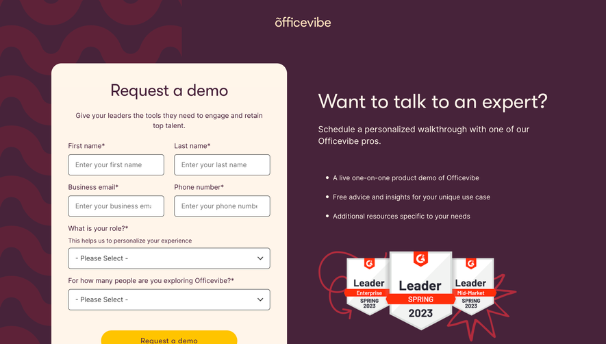


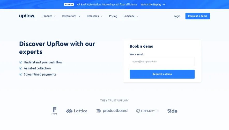

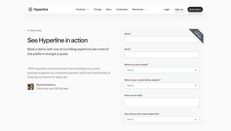

Upgrade to SaaSFrame Pro now to see similar examples.
Monthly
$18 /month
Billed $18 monthly
Browse all screens & flows
Filter and search screens & flows
Search text in screenshots
Access Figma files
Access mobile versions
Join now
Quarterly
$16 /month
Billed $48 quarterly
Browse all screens & flows
Filter and search screens & flows
Search text in screenshots
Access Figma files
Access mobile versions
Join now
Yearly
$15 /month
Billed $180 yearly
Browse all screens & flows
Filter and search screens & flows
Search text in screenshots
Access Figma files
Access mobile versions
Join now