
Thank you! Your submission has been received!
Oops! Something went wrong while submitting the form.
Get SaaSFrame Pro
Monthly
$18
Quarterly
$48
Yearly
$180
Upgrade to access this feature
Browse all screens & flows
Filter and search screens & flows
Access Figma files
Access mobile versions
Bookmark screens & flows
Join now


Hopscotch About Page

Hopscotch
All-in-one payments platform
Designed by
No items found.

Bookmark
Bookmark

Design with AI
Thank you! Your submission has been received!
Oops! Something went wrong while submitting the form.
# Design from Reference: Hopscotch About Page
Create an original, high-fidelity visual design inspired by the reference. Prioritize composition, typography, colors, spacing, and component styling over technical implementation.
## Reference
- **Product:** Hopscotch
- **Category:** About Page
- **Screenshot:** https://cdn.prod.website-files.com/5e9dc792e1210c5325f7ebbc/6acb65d4b206c0d3f8f0f8e2_6acb654b18ad202d01d6f2df_cms-405dac59728c570a9c877fab.webp
Analyze the screenshot first. If inaccessible, request it rather than guessing.
## Content
{{content.instructions}}
{{content.data}}
Preserve essential messaging and factual accuracy. Adapt structure and copy length for visual balance; never invent product claims.
## Visual Design
### Overall aesthetic
- **Style:** Bright company-about page with bold typography, large color-block sections, photography, and hand-drawn line illustrations.
- **Character:** Yellow hero, lavender values area, warm off-white team/investor sections, and near-black footer.
### Page composition
- **Canvas:** 2880 × 16770 image px; CSS estimates assume an unverified 2× capture.
- **Container:** Approximately 1200 CSS px wide with broad consistent insets.
- **Hero:** Full-width yellow navigation and large two-line left-aligned mission headline.
- **Story:** Two columns with heading left and explanatory paragraphs right.
- **Values:** Five white cards in a two-column grid on pale lavender; each pairs a short value with a dark illustrated tile.
- **Team:** Horizontal portrait carousel with white name/role overlays.
- **Press:** Two publication cards.
- **Careers:** Lavender split section with copy and photo/statistic collage.
- **Investors:** Three-column, two-row grid of marks and descriptions.
- **Closing:** Dark CTA band and a large rounded inset footer panel.
### Information hierarchy
- **Primary:** Heavy mission headline on saturated yellow.
- **Values:** Large centered heading followed by short bold principles.
- **People:** Photography and overlaid names humanize the page.
- **Proof:** Press and investors establish credibility.
- **Actions:** Small dark buttons early, bright yellow signup action in the closing dark band.
### Typography
- **Family:** Bold geometric-looking sans serif with rounded details; exact family unverified.
- **Hero:** Approximately 96–104 CSS px, weight 700, tight line-height under assumed 2×.
- **Section headings:** Approximately 48–52px, bold.
- **Values:** Approximately 32px, bold.
- **Body:** Approximately 20px with 30px line-height.
- **Card and portrait titles:** Approximately 22–24px.
- **Small labels/navigation:** Approximately 14–16px.
- **Precision:** Sizes are reconstruction estimates.
### Colors & surfaces
- **Hero yellow:** #FFF86C.
- **White surfaces:** #FFFFFF.
- **Warm pale background:** #F8F6F1.
- **Values lavender-blue:** #E1E7F8.
- **Careers lavender:** #F1E5FE; nearby #F0E6FE occurs.
- **Primary dark:** #1C1A1F.
- **Footer panel:** #2C282E.
- **Secondary body:** Muted gray.
- **Precision:** Flat colors sampled from screenshot; texture and compression add nearby shades.
### Components
- **Header action:** Dark rounded rectangle.
- **Value cards:** White rounded rectangles, roughly 580 × 350 CSS px under assumed 2×; dark square artwork sits on the right.
- **Illustrations:** Thin white hand-drawn outlines on dark tiles.
- **Team cards:** Tall portraits with small radius and inset white label.
- **Carousel controls:** Paired outlined square arrow buttons.
- **Press cards:** Publication image above label and headline.
- **Careers collage:** Rounded photos, dark illustration tile, and purple statistic tile.
- **Footer:** Large rounded dark panel with logo, links, social icons, and legal row.
### Visual rhythm
- **Section spacing:** Very generous vertical padding, often around 140–180 CSS px.
- **Color rhythm:** Full-width background changes distinguish company story, values, people, careers, and proof.
- **Grid:** Approximately 30px gutters under assumed 2×.
- **Headings:** Tight tracking and heavy weight balance large white spaces.
- **Motifs:** Subtle brush shapes repeat behind hero, values, and closing CTA.
### Responsive
- **Observed:** Desktop only.
- **Recommendation:** Stack story and careers columns, reduce large headlines, and collapse values/investors to fewer columns.
- **Team:** Preserve swipeable card proportions if carousel behavior is implemented.
- **Footer:** Stack link groups while retaining the CTA.
### Adaptation guidance
- **Preserve:** Color-block narrative, confident typography, playful value illustrations, and people-first imagery.
- **Content:** Use actual company values, team details, investor marks, and careers information.
- **Brand:** Adapt yellow/lavender consistently rather than adding many unrelated accents.
- **Behavior:** Carousel and load-more controls are visually present; their interaction is unverified.
Use this context to reproduce the reference's visual language: layout, typography, colors, spacing, borders, radii, and distinctive elements. The screenshot takes priority if descriptions conflict.
## Direction
{{preferences.fidelityInstructions}}
## Output
{{output.instructions}}
Deliver a polished, cohesive design with precise alignment, hierarchy, and spacing. Produce the requested visual artifact, not just a description. If unsupported, explain the limitation.


Category
Patterns
No items found.
Tech Stack
No items found.
Added on
June 23, 2023
Similar screens
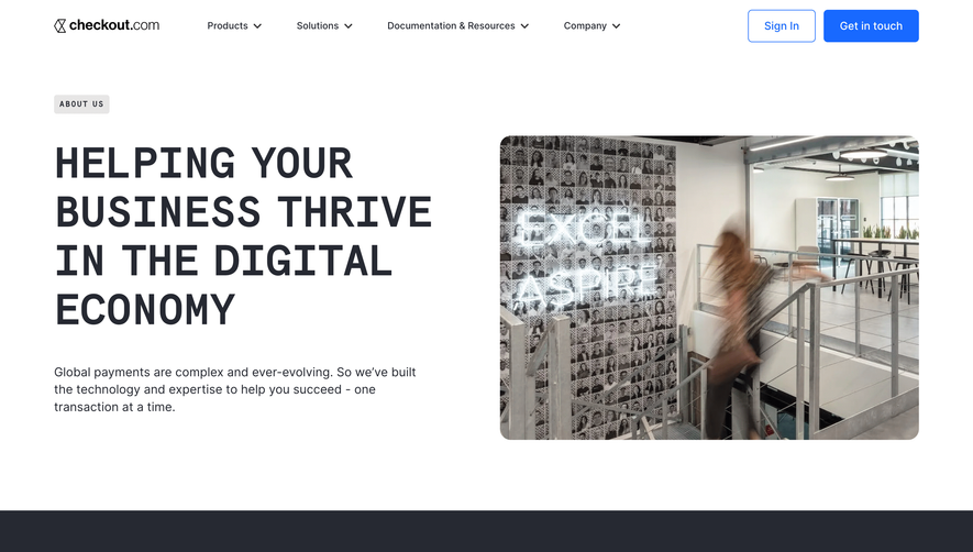


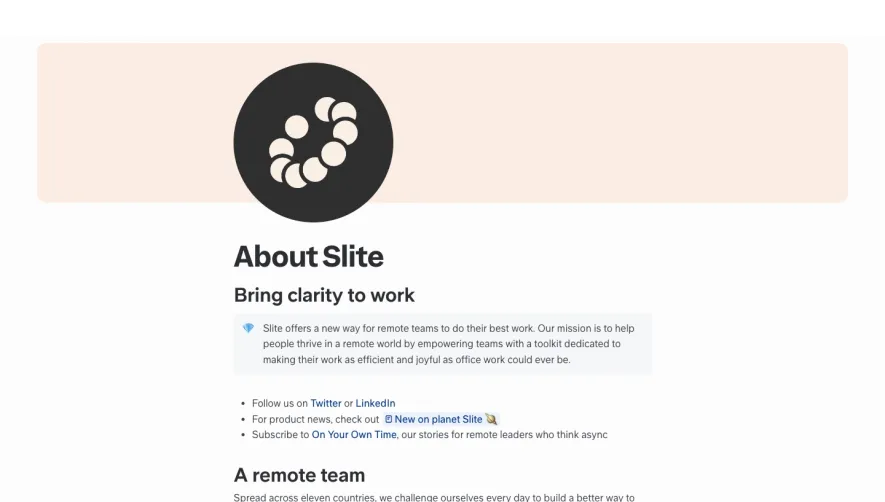

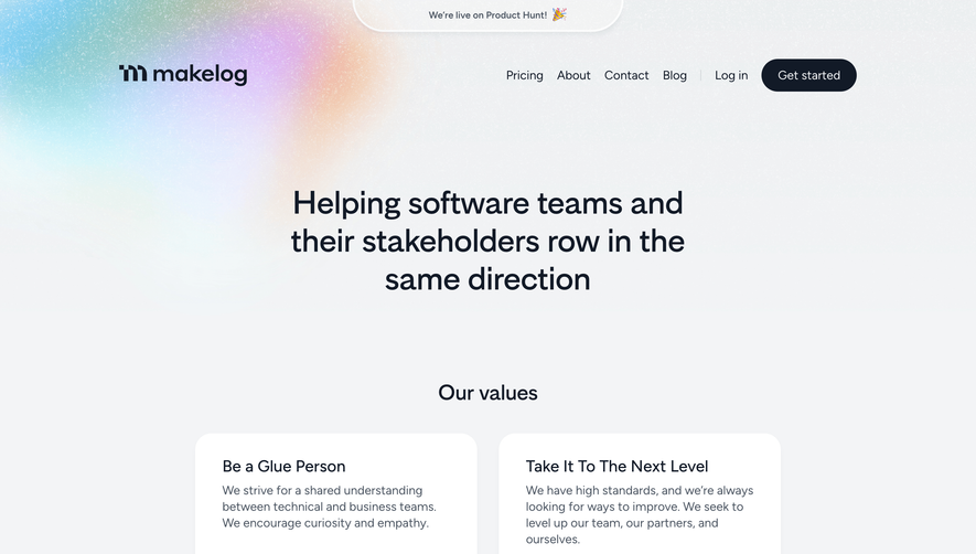

Upgrade to SaaSFrame Pro now to see similar examples.
Monthly
$18 /month
Billed $18 monthly
Browse all screens & flows
Filter and search screens & flows
Search text in screenshots
Access Figma files
Access mobile versions
Join now
Quarterly
$16 /month
Billed $48 quarterly
Browse all screens & flows
Filter and search screens & flows
Search text in screenshots
Access Figma files
Access mobile versions
Join now
Yearly
$15 /month
Billed $180 yearly
Browse all screens & flows
Filter and search screens & flows
Search text in screenshots
Access Figma files
Access mobile versions
Join now