Overall Style and Aesthetic
Slite’s “About” page radiates a modern minimalist sensibility, balancing generous whitespace with purposeful splashes of color. The interface is understated and clean, directing attention to content rather than interface elements. This visual restraint conveys professionalism while subtle, human touches—rounded corners, approachable iconography—soften the experience and invite exploration. Layout and Structure
The page is thoughtfully segmented: a straightforward hero section orients the visitor, followed by a sequential narrative divided into sections (e.g., mission, team, values). Each segment flows naturally into the next, with generous padding and clear visual breaks. There’s a notable absence of clutter—each area, from headings to calls-to-action, is given room to breathe, improving legibility and focus. Visual Elements
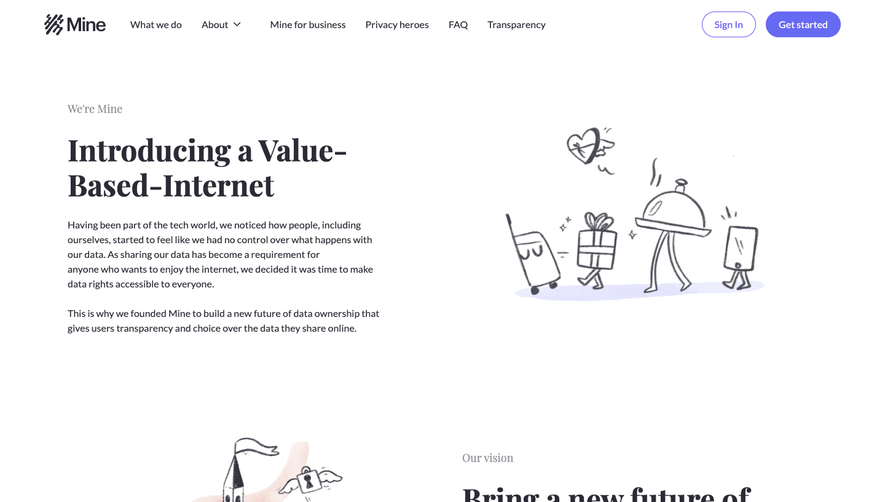
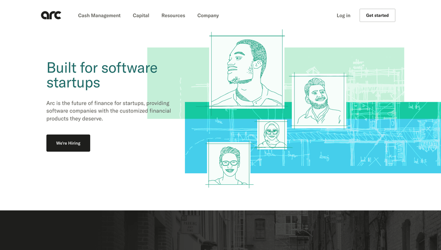
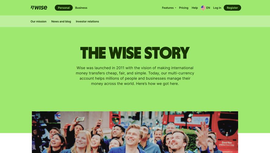
Instead of overwhelming imagery, Slite employs refined illustrations and color-blocked banners to emphasize key messages. Photographic team portraits create authenticity and warmth. Custom icons help navigate each section and offer visual cues without distraction. There’s a subtle interplay between flat-design elements and Shadow, keeping the visual tone cohesive yet lively. Color Palette and Typography
A soft, pastel-infused palette—mint greens, gentle purples, slate grays—constructs a calm, inviting backdrop. Typography is crisp and sans-serif, with clear hierarchies: bold headlines, medium-weight subheads, and readable body text. This structure ensures both scan-ability and a harmonious pace as users move through the page. User Experience Patterns
Navigation is intuitive: fixed or contextual links allow seamless movement. CTAs are gently accented, standing out through color contrast without dominating the page. Scrolling feels natural and undemanding, with thoughtful section dividers guiding the gaze. Subtle animations preview deeper content without unnecessary interruption. Unique or Notable Design Choices
A distinctive touch is the use of emoji and playful illustration within a professional grid—a blend that feels uniquely approachable and human. The inclusion of candid team visuals and personal statements builds trust and personality, fostering an immediate sense of connection and credibility. Tone and Feel
The overall impression is trustworthy yet fresh—innovative without sacrificing clarity. Slite’s page exudes confident simplicity, making it a compelling reference for designers seeking to balance utility with unique expression in SaaS environments.