Design with AI
Generate a new design based on this screen using your own content.
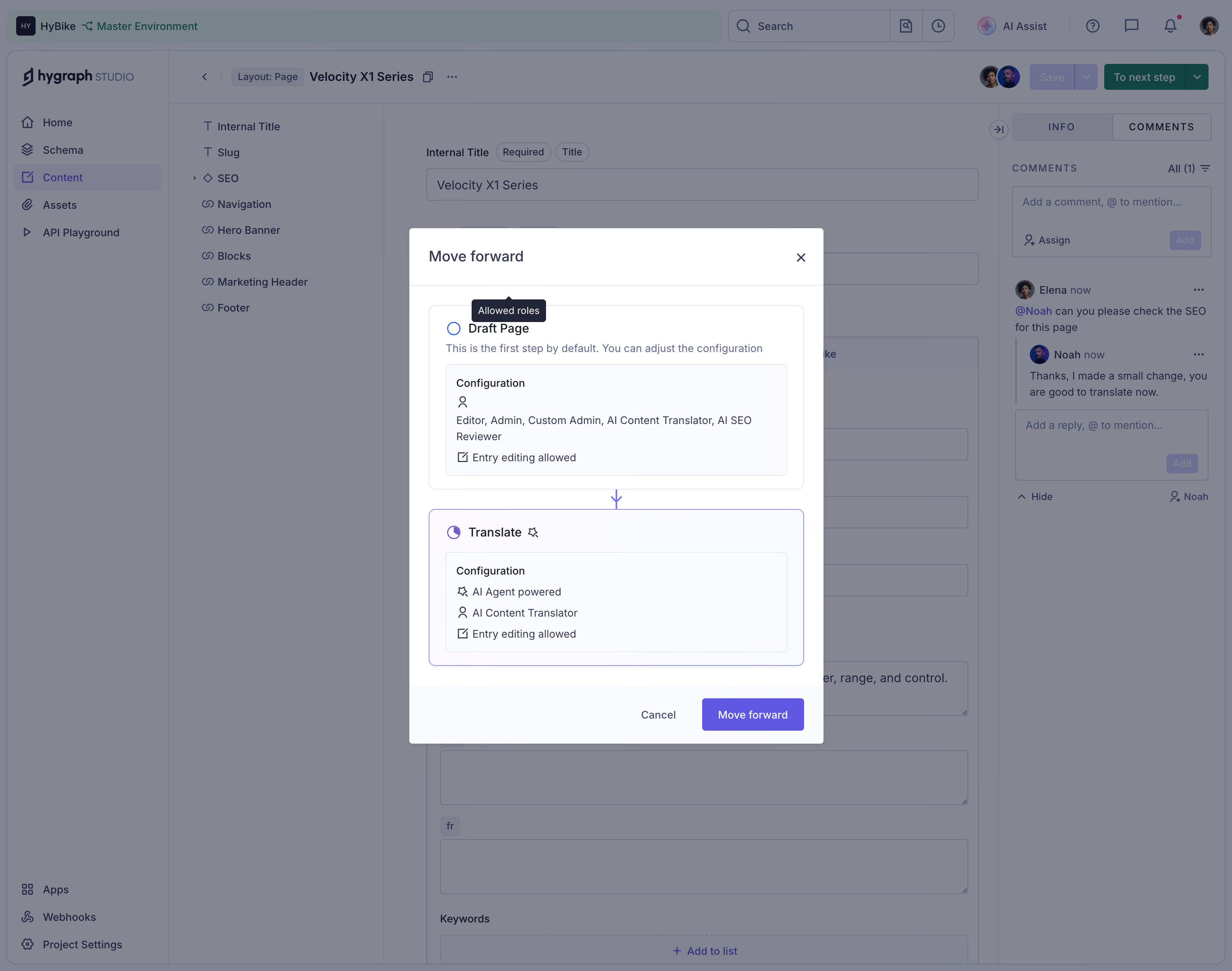
# Design from Reference: GraphCMS Move content entry modal
Create an original, high-fidelity visual design inspired by the reference. Prioritize composition, typography, colors, spacing, and component styling over technical implementation.
## Reference
- **Product:** GraphCMS
- **Category:** Add & Edit
- **Screenshot:** https://cdn.prod.website-files.com/5e9dc792e1210c5325f7ebbc/6acad09c51f927271bf81f1b_6acad0324d0bf53dfa2e55da_cms-892d377ec59f5bcb3288c804.webp
Analyze the screenshot first. If inaccessible, request it rather than guessing.
## Content
{{content.instructions}}
{{content.data}}
Preserve essential messaging and factual accuracy. Adapt structure and copy length for visual balance; never invent product claims.
## Visual Design
### Overall aesthetic
- **Character:** Dense CMS workspace dimmed beneath a focused workflow-transition modal.
### Page composition
- **Canvas:** 3046 × 2400 screenshot pixels; CSS estimates assume approximately 2× scale, with exact capture scale unverified.
- **Structure:** Central white modal over content editor, field navigation and comments rail. The dialog shows two vertically connected workflow-state cards.
### Information hierarchy
- **Priority:** Move forward title, current Draft Page state, destination Translate state and purple confirmation action.
- **Detail:** Configuration panels list roles and editing permissions; a small Allowed roles tooltip is visible over the upper state.
### Typography
- **Family:** Compact neutral sans-serif; exact font is unverified.
- **Scale:** Estimated CSS modal title 18px, state labels 15–16px and configuration/helper copy 13–14px.
### Colors & surfaces
- **Sampled palette:** Dimmed scrim #848691; pale configuration surfaces #F9FBFF; white #FFFFFF; background variants #818491 and #79848A.
- **Accents:** Purple destination border, connecting arrow and filled confirmation button emphasize progression.
### Components
- **Dialog:** Approximately 510px CSS wide, with thin header/footer separators and about 24px padding.
- **States:** Rounded bordered outer cards with nested pale configuration boxes; selected destination has a violet outline. Arrow connects current and next states.
- **Actions:** Cancel and filled Move forward align right; close icon sits at upper right. Estimated 4–8px radii.
### Visual rhythm
- **Spacing:** Tight configuration text contrasts with 24px separation between workflow cards; clear footer spacing protects actions.
### Responsive
- **Guidance:** Mobile is not shown. Use a full-width dialog with scrollable body and retain current/destination distinction.
### Adaptation guidance
- **Transfer:** Preserve explicit workflow-state comparison and permission visibility. Adapt transitions and roles to the target content process.
Use this context to reproduce the reference's visual language: layout, typography, colors, spacing, borders, radii, and distinctive elements. The screenshot takes priority if descriptions conflict.
## Direction
{{preferences.fidelityInstructions}}
## Output
{{output.instructions}}
Deliver a polished, cohesive design with precise alignment, hierarchy, and spacing. Produce the requested visual artifact, not just a description. If unsupported, explain the limitation.