
Thank you! Your submission has been received!
Oops! Something went wrong while submitting the form.
Get SaaSFrame Pro
Monthly
$18
Quarterly
$48
Yearly
$180
Upgrade to access this feature
Browse all screens & flows
Filter and search screens & flows
Access Figma files
Access mobile versions
Bookmark screens & flows
Join now
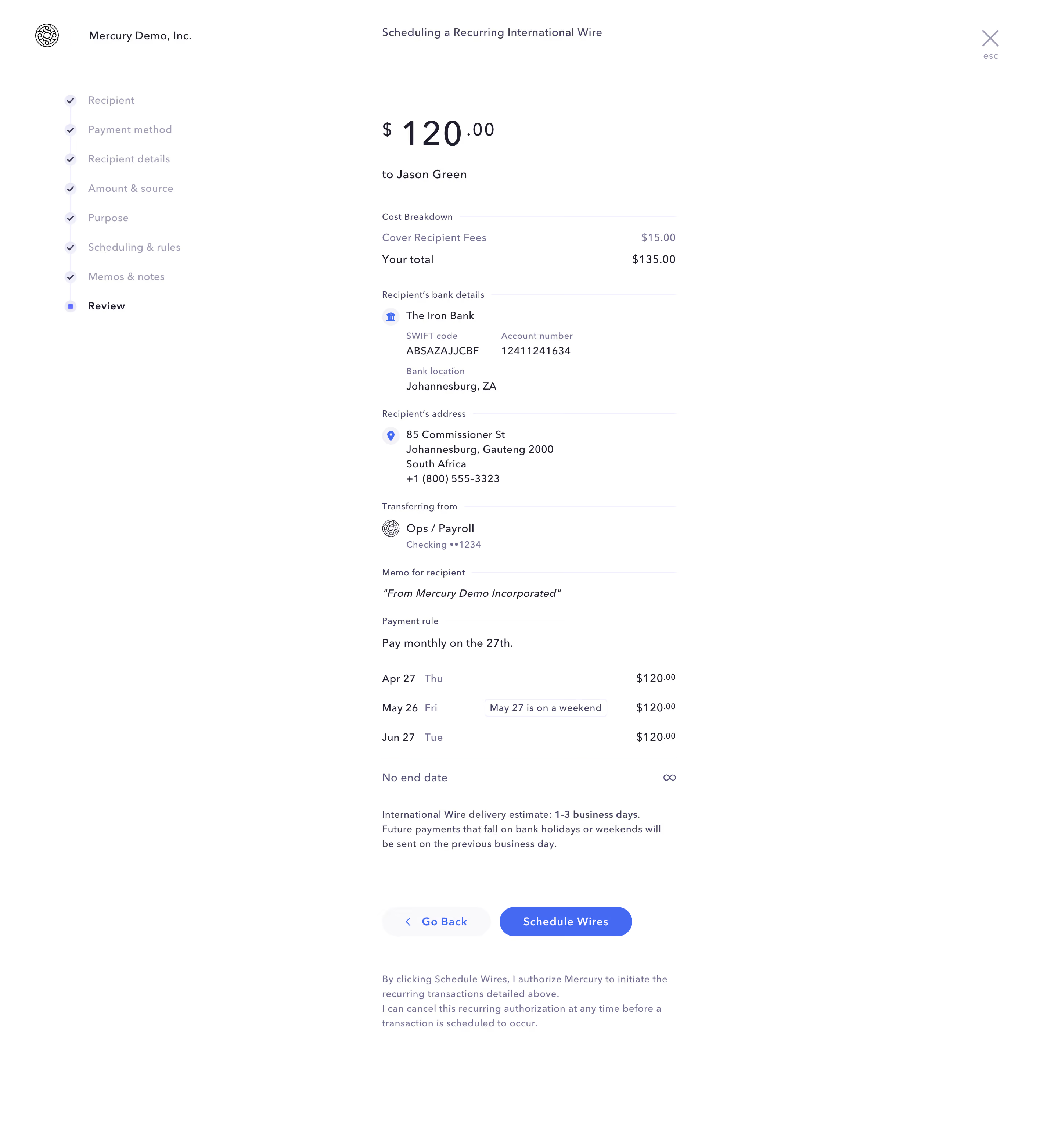
Mercury Transfer Reviez

Mercury
Banking for Startups
Designed by
No items found.

Bookmark
Bookmark

Design with AI
Thank you! Your submission has been received!
Oops! Something went wrong while submitting the form.
# Design from Reference: Mercury Transfer Reviez
Create an original, high-fidelity visual design inspired by the reference. Prioritize composition, typography, colors, spacing, and component styling over technical implementation.
## Reference
- **Product:** Mercury
- **Category:** Add & Edit
- **Screenshot:** https://cdn.prod.website-files.com/5e9dc792e1210c5325f7ebbc/6acb6f443156cd8dbc4711b9_6acb6e6d5e515b69c796db38_cms-2a43401fc977fffbdcb949c5.webp
Analyze the screenshot first. If inaccessible, request it rather than guessing.
## Content
{{content.instructions}}
{{content.data}}
Preserve essential messaging and factual accuracy. Adapt structure and copy length for visual balance; never invent product claims.
## Visual Design
### Overall aesthetic
- **Character:** Quiet financial workflow with a white canvas, narrow review column, delicate lavender rules and blue action accents.
- **Presentation:** Content is organized by labels and whitespace rather than cards. A left checklist communicates a completed sequence leading to the current review stage.
- **Scale:** The image measures 2880 × 3124 pixels. Measurements below assume a plausible 2× capture, equivalent to approximately 1440 × 1562 CSS px; device scale and browser zoom are unverified.
### Page composition
- **Header:** A small circular brand mark and company name sit at the upper left. The recurring-wire workflow title aligns above the main column; a large close icon with an esc caption sits at the upper right.
- **Step rail:** Eight vertically connected stages occupy a narrow left column. Seven show checkmarks, while Review has a blue dot and darker bold label.
- **Review column:** A roughly 400 CSS px content column starts near x520. It opens with a large currency amount and recipient line, then stacks cost, bank, address, source account, memo and recurrence details.
- **Schedule area:** A three-row date/amount preview follows the payment rule, including a small outlined adjustment note on one row and an infinity symbol beside the no-end-date line.
- **Bottom actions:** Delivery guidance precedes two pill buttons. A smaller authorization paragraph sits below them, with ample blank white space around the entire column.
### Information hierarchy
- **Amount:** Large numerals dominate the review, with smaller raised currency and fractional units. The recipient is secondary beneath the amount.
- **Grouping:** Small section captions end in thin horizontal rules, visually segmenting dense banking and scheduling information.
- **Label/value relationship:** Muted small labels identify bank metadata; darker values sit underneath. Small bank, location and account symbols add scanning cues.
- **Action hierarchy:** A saturated blue Schedule Wires button is primary; a pale Go Back button with left chevron is secondary. These are captured controls only; no transaction is executed.
- **State:** The screen is a review before authorization, with no visible error, success confirmation or processing state.
### Typography
- **Family:** A restrained sans-serif with slightly expanded tracking is visible; the exact family is unverified.
- **Amount:** Main digits are approximately 46–48 CSS px with lighter medium weight. Currency/fractional characters are around 23–26 px.
- **Body values:** Approximately 14–15 px with 20–22 px leading. Memo content is italic, separating it from standard values.
- **Labels:** Section captions and metadata are about 12 px, with subtle tracking and muted color. The workflow title and step labels are near 14 px.
- **Controls and notes:** Button labels are approximately 14 px, medium-to-bold, while delivery and authorization text are roughly 12–13 px with comfortable multiline leading.
### Colors & surfaces
- **Measured background:** ICC-aware sRGB sampling yields #FFFFFF as the overwhelming canvas color.
- **Measured action and text:** #4569F3 appears in the primary blue treatment; #201F30 is a deep text tone and #41415B a secondary dark foreground.
- **Measured pale surfaces:** #F0EFFE appears in lavender interface details; #F9F9FB supplies a near-white secondary surface.
- **Visual separation:** Very pale lavender divider lines, light circular step grounds and muted labels distinguish groups without heavy borders.
- **Depth:** The review remains flat with virtually no elevation; buttons use solid or pale fills rather than pronounced shadows.
### Components
- **Step markers:** Small circles approximately 16 CSS px across connect through a thin pale vertical line. Completed markers contain ticks; the current marker has a blue center.
- **Detail sections:** Captions align left with rules extending to the right edge. Bank metadata uses two columns before returning to a single-column location value.
- **Schedule rows:** Dates and weekday labels align left, amounts align right, and one compact outlined badge explains an adjusted date. No-end-date is separated by a horizontal rule.
- **Buttons:** Approximately 148 × 40 CSS px for Go Back and 180 × 40 px for Schedule Wires, with fully rounded ends and about 12 px between them.
- **Close control:** A thin lavender-gray X sits alone in the upper right with a tiny keyboard hint beneath it.
- **Privacy handling:** Bank, recipient and account details are described by role; reproducing their specific identifiers is unnecessary for this design context.
### Visual rhythm
- **Vertical cadence:** Approximately 24–32 px separate major detail groups; label/value stacks use much smaller gaps around 6–10 px.
- **Alignment:** Section rules, paragraphs, schedule rows and actions share one narrow left axis, while monetary values use a consistent right axis.
- **Whitespace:** The large unused right side and wide gap between the step rail and review column emphasize concentration on a single payment.
- **Action break:** A substantial gap after delivery guidance isolates the confirmation controls, and another gap separates the authorization note.
### Responsive
- **Evidence limit:** Only a desktop review is shown; these are recommendations, not observed behavior.
- **Navigation:** Replace the tall rail with a compact current-step indicator on narrow screens while retaining access to previous stages.
- **Column:** Let the review fill the available width with 20–24 px margins; wrap long bank/address values and preserve date/amount alignment.
- **Actions:** Keep both actions clearly labeled and comfortably touchable; stack them when needed without separating the authorization text from the primary action.
### Adaptation guidance
- **Reusable pattern:** Use an amount-led summary followed by compact labeled sections and a concrete upcoming schedule preview.
- **Financial clarity:** Separate fees from total, distinguish source from recipient information and make date adjustments explicit.
- **Interaction design:** Require a deliberate confirmation action and provide accessible review/edit navigation. Do not infer a successful transfer from this pre-submit screenshot.
- **Accessibility:** Ensure pale labels/rules remain legible, give the close control a text alternative and expose checklist progress semantically.
Use this context to reproduce the reference's visual language: layout, typography, colors, spacing, borders, radii, and distinctive elements. The screenshot takes priority if descriptions conflict.
## Direction
{{preferences.fidelityInstructions}}
## Output
{{output.instructions}}
Deliver a polished, cohesive design with precise alignment, hierarchy, and spacing. Produce the requested visual artifact, not just a description. If unsupported, explain the limitation.


Category
Patterns


Added on
April 27, 2023


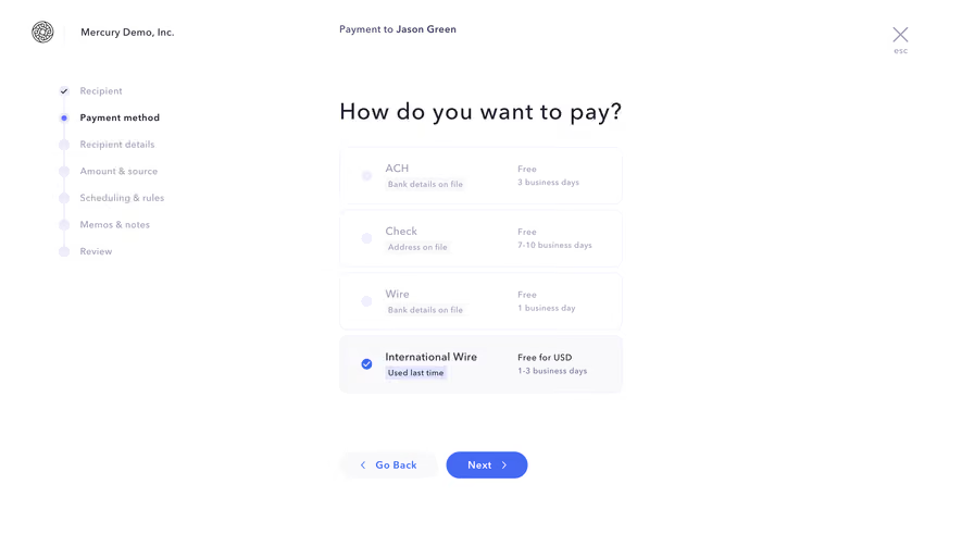
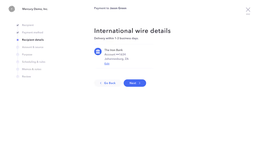


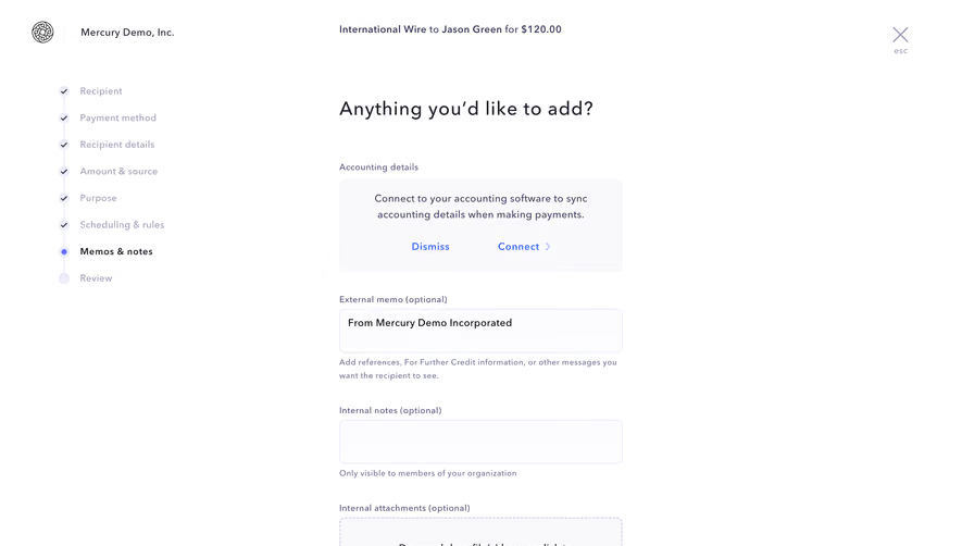


Similar screens






Upgrade to SaaSFrame Pro now to see similar examples.
Monthly
$18 /month
Billed $18 monthly
Browse all screens & flows
Filter and search screens & flows
Search text in screenshots
Access Figma files
Access mobile versions
Join now
Quarterly
$16 /month
Billed $48 quarterly
Browse all screens & flows
Filter and search screens & flows
Search text in screenshots
Access Figma files
Access mobile versions
Join now
Yearly
$15 /month
Billed $180 yearly
Browse all screens & flows
Filter and search screens & flows
Search text in screenshots
Access Figma files
Access mobile versions
Join now