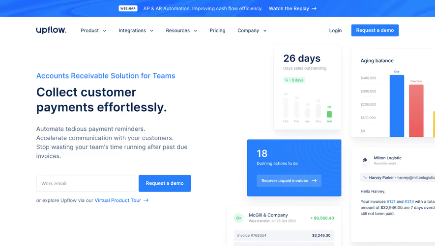
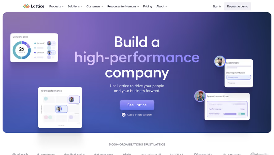
Overall Style and Aesthetic
Gitness exemplifies a modern, minimalist SaaS design, balancing whitespace with impactful visual moments. The site feels professional and innovative, projecting trust and clarity through its neat alignment, orderly grid, and restrained graphic accents. There's a subtle energy from small design flourishes, while content focus and simplicity invite exploration without distraction. Layout and Structure
The layout leads with a bold hero section featuring a concise headline, supportive tagline, and clear CTA, immediately articulating the value proposition. Sequential feature sections employ card-based arrangements and side-by-side text and visual pairings, guiding visitors through benefits effortlessly. Missing are testimonials and pricing, suggesting a focus on brand storytelling and project overview. The footer consolidates navigation and resources with clarity, maintaining visual equilibrium. Visual Elements
Custom illustrations and playful 3D cubes introduce a sense of dimension and movement, contrasting the understated page with pops of creativity. Iconography is streamlined, supporting key points without visual clutter. Animated reveals and hover states add interaction, sustaining engagement as users scroll. The visual rhythm is deliberately paced, making the experience lively yet professional. Color Palette and Typography
The color palette relies on crisp whites and deep navy, punctuated by a signature purple and occasional gradients—a sophisticated, cool-toned base enlivened by vivid accents. Typography leverages geometric sans-serifs in weighty display for headlines and lighter styles for body copy. Hierarchical contrast uses size, color, and spacing to channel attention gracefully. User Experience Patterns
Navigation is sticky and unintrusive, ensuring easy access throughout the visit. Prominent CTAs repeat across sections, maintaining clear paths for conversion. Subtle scroll-triggered animations provide visual feedback, while sectioned layouts encourage skimming. The interface is accessible, mobile-friendly, and intuitively predictable. Unique or Notable Design Choices
Gitness stands out with its restrained, almost architectural structure and micro-interactions that deliver delight. The animated product diagrams and geometric motifs—like cascading cubes—embody digital progress and innovation, imbuing the page with personality. Every element, from color to animation, serves the message: focused, modern, and confidently open-source.