Overall Style and Aesthetic
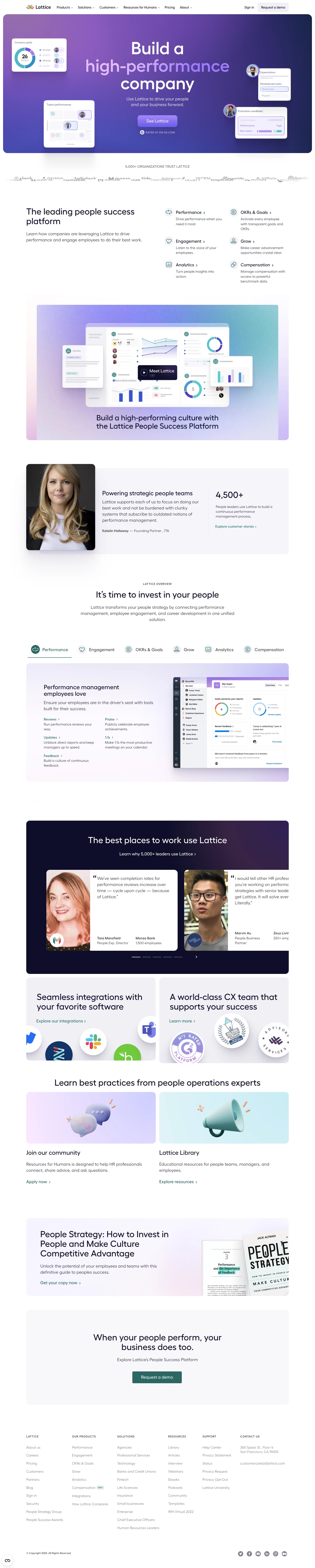
Lattice’s website embodies a modern, professional atmosphere with a refined, human-centered flair. Clean lines, generous white space, and pops of pastel colors contribute to a welcoming yet sophisticated look, making the brand feel accessible and innovative. The design gracefully balances minimalism with warmth, inviting users to engage without feeling overwhelmed. Layout and Structure
The page’s structure flows logically, immediately capturing attention with a bold hero section—strong headline, concise copy, and a clear CTA button. Below, succinct feature highlights use grids for visual clarity, weaving in product benefits with illustrative support. Real-user testimonials lend credibility, while a streamlined footer consolidates resources and secondary navigation. Each section transitions smoothly, maintaining narrative momentum without clutter. Visual Elements
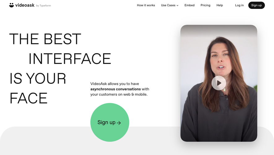
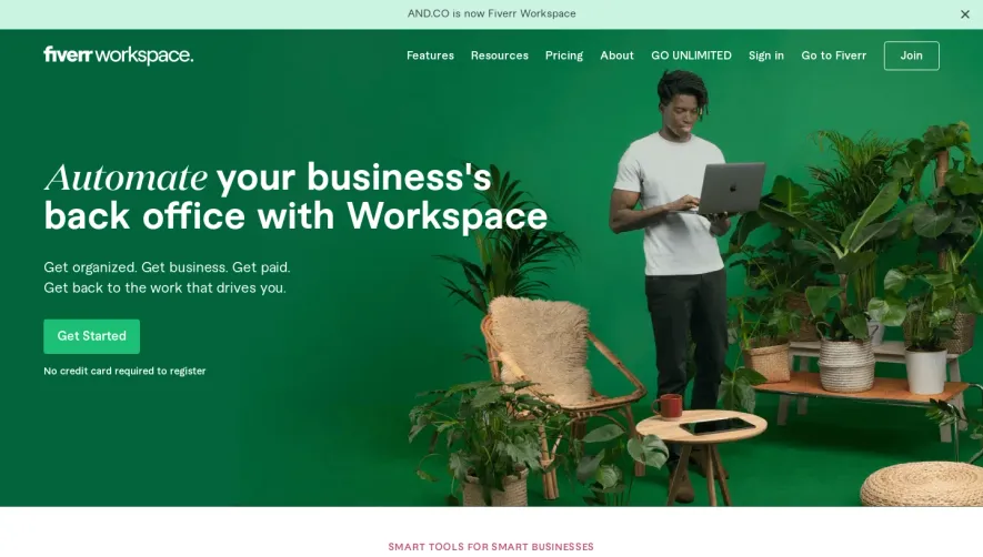
Impactful illustrations and custom icons reinforce the platform’s approachable voice, while subtle motion—such as animated transitions and hover effects—enrich interactivity. Photography integrates authentic, diverse teams, adding relatability and human depth. Occasional product screenshots ground the abstract benefits in tangible UI, while the judicious use of video provides dynamic storytelling. Color Palette and Typography
A muted palette of soft blues, greens, and purples conveys calm competence, accentuated by strategic highlights for key actions or sections. Typography is contemporary and crisply legible—sans-serif fonts in a clear hierarchy guide the eye, with bold headlines and generous body copy spacing boosting readability. User Experience & Unique Touches
Navigation remains ever-accessible via a sticky header, guiding users to primary sections (“Solutions,” “Platform,” “Pricing”) with minimal friction. Call-to-action buttons are consistently styled and prominent, ensuring conversion pathways remain intuitive. Subtle microinteractions and tailored illustrations throughout imbue the experience with personality—delivering not just clarity, but delight.