Overall Style and Aesthetic
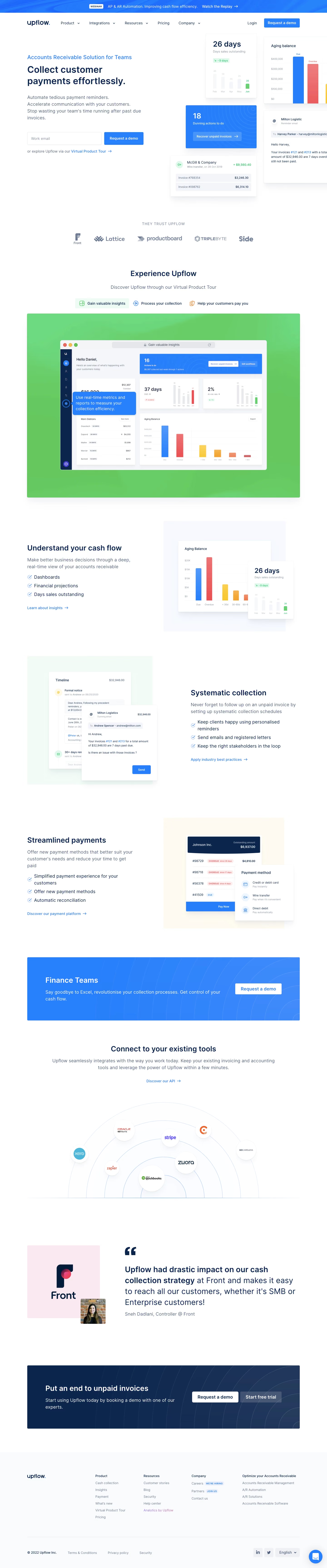
Upflow’s website showcases a modern, minimalist design with a distinctly professional and trustworthy appeal. Clean lines, ample white space, and a restrained use of vibrant accent colors combine to create an uncluttered interface that prioritizes clarity and usability. The page exudes a sense of confidence and innovation, balancing friendly approachability with corporate credibility. Layout and Structure
The homepage follows a well-structured, logical flow: an impactful hero section immediately communicates value with concise messaging and a prominent CTA. Below, alternating feature sections provide visual interest and break up content, while strategically placed testimonials and client logos foster social proof. A streamlined footer rounds things off with quick links and contact details, maintaining the site’s minimal vibe. Visual Elements
Custom illustrations dominate the visual language, blending subtle motion and micro-animations to maintain user engagement without overwhelming the eye. Simple, geometric graphics and intuitive icons support key messages, while sparse but effective use of photography conveys authenticity. Occasional hover effects and smooth transitions contribute to a polished, interactive experience. Color Palette and Typography
The palette is mostly composed of crisp whites, muted grays, and deep blues, punctuated with energetic cyan and yellow highlights that draw attention to action points and important sections. Typography favors a modern sans-serif font, establishing visual hierarchy through varied weights and ample spacing, ensuring readability and scannability throughout. User Experience Patterns
Navigation is persistent and intuitive, with a sticky header for seamless access. CTAs are clear, visually distinct, and consistently positioned, prompting users toward trial or demo sign-ups. Interactive forms are minimal and invite engagement without friction. Subtle scroll-triggered effects maintain momentum as users move down the page. Unique or Notable Design Choices
Noteworthy touches include the subtle background gradients behind illustrations, and lively, on-brand animations that invite exploration without distracting from the core message. The site masterfully blends professionalism with an energetic, innovative feel—ideal inspiration for SaaS teams seeking a design that’s both approachable and high-converting.