Design with AI
Generate a new design based on this screen using your own content.
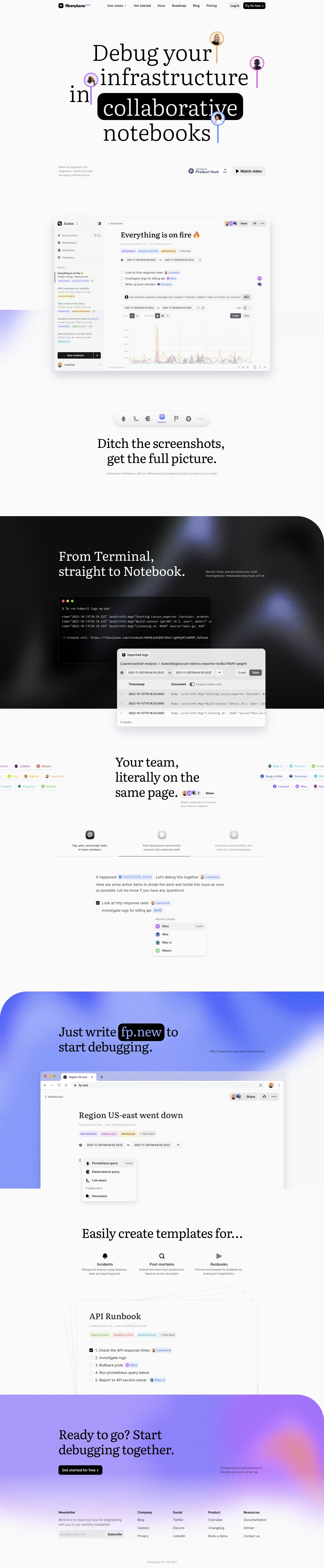
# Design from Reference: Fiberplane Landing Page
Create an original, high-fidelity visual design inspired by the reference. Prioritize composition, typography, colors, spacing, and component styling over technical implementation.
## Reference
- **Product:** Fiberplane
- **Category:** Landing Page
- **Screenshot:** https://cdn.prod.website-files.com/5e9dc792e1210c5325f7ebbc/6acbca338313d4c6c0cc4020_6acbc82a5c8937341a577c85_cms-0f27c137625b2e833a7ceb5f.webp
Analyze the screenshot first. If inaccessible, request it rather than guessing.
## Content
{{content.instructions}}
{{content.data}}
Preserve essential messaging and factual accuracy. Adapt structure and copy length for visual balance; never invent product claims.
## Visual Design
### Overall aesthetic
- **Character:** Editorial developer marketing page mixing large serif typography, collaborative avatar cursors and grainy violet gradients.
### Page composition
- **Capture:** 1440 × 6963 screenshot pixels; estimated CSS scale approximately 1×.
- **Structure:** Compact navigation, typographic hero, large notebook demo, integration dock, dark terminal feature, collaboration section, gradient quick-start demo, templates and closing CTA/footer.
### Information hierarchy
- **Priority:** Oversized serif statement highlights collaborative in a black capsule; large screenshots then explain product workflows.
### Typography
- **Families:** Serif display headings with sans-serif interface/body and monospace terminal text; exact families unverified.
- **Estimated CSS sizes:** Hero 96–104px, section headings 56px, body 16px and utility/helper 12–14px.
### Colors & surfaces
- **Measured palette:** Canvas #FAFAFA with #FAF9FA/#F8F8F8/#F9F9F9 variants, black #000000 and pale #F4F6F4.
- **Accents:** Violet/blue/pink grainy gradients and colored collaborator outlines/mentions.
### Components
- **Elements:** Avatar cursor stems, black highlighted word, shadowed notebook screenshots, terminal/log overlays, icon tabs, stacked template sheets and black CTA.
- **Estimated geometry:** Main content 960px wide, screenshot radii 16px, 44px actions and oversized 100px corner curves on feature bands.
### Visual rhythm
- **Spacing:** Exceptionally broad gaps and large product imagery alternate with serif headings; dark and gradient bands create strong chapters.
### Responsive
- **Suggested adaptation:** Reduce display type to 44–56px, simplify cursor overlays, stack feature content and keep screenshots legible. Mobile behavior is unverified.
### Adaptation guidance
- **Transfer:** Preserve the serif/technical contrast and collaborative annotations while adapting screenshots to real workflows.
Use this context to reproduce the reference's visual language: layout, typography, colors, spacing, borders, radii, and distinctive elements. The screenshot takes priority if descriptions conflict.
## Direction
{{preferences.fidelityInstructions}}
## Output
{{output.instructions}}
Deliver a polished, cohesive design with precise alignment, hierarchy, and spacing. Produce the requested visual artifact, not just a description. If unsupported, explain the limitation.