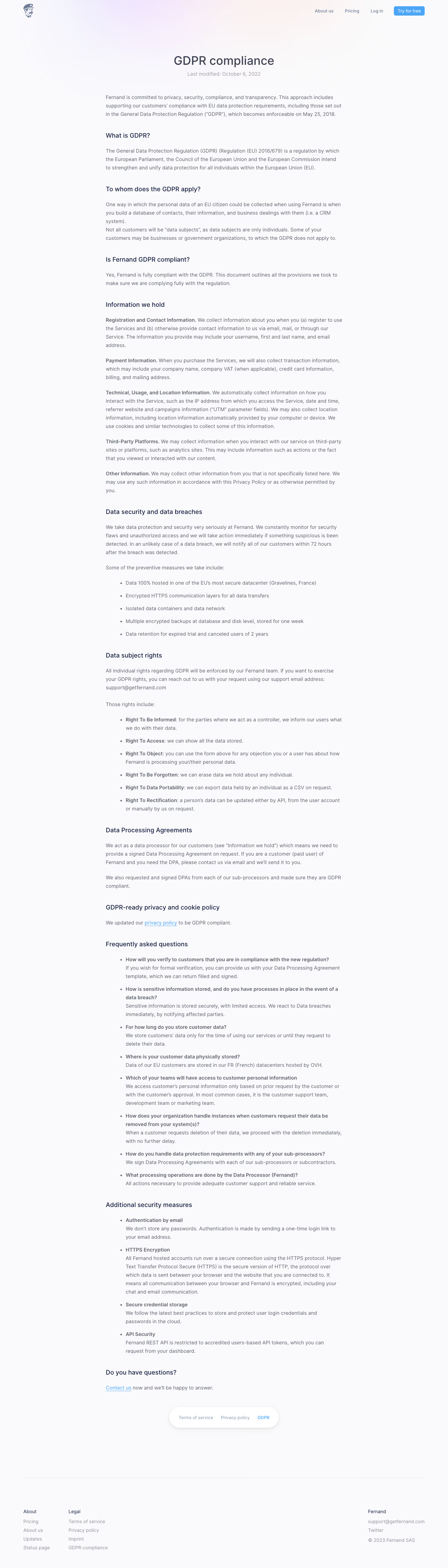
Generate a new design based on this screen using your own content.
Thank you! Your submission has been received!
Oops! Something went wrong while submitting the form.
# Design from Reference: Fernand GDPR Compliance Page
Create an original, high-fidelity visual design inspired by the reference. Prioritize composition, typography, colors, spacing, and component styling over technical implementation.
## Reference
- **Product:** Fernand
- **Category:** Compliance Page
- **Screenshot:** https://cdn.prod.website-files.com/5e9dc792e1210c5325f7ebbc/6acbbd9ad6be908889c4e4d3_6ac5735c0d8d42da5de5a1d3_richtext-b8ea93a4175b1a467b99.webp
Analyze the screenshot first. If inaccessible, request it rather than guessing.
## Content
{{content.instructions}}
{{content.data}}
Preserve essential messaging and factual accuracy. Adapt structure and copy length for visual balance; never invent product claims.
## Visual Design
Use this context to reproduce the reference's visual language: layout, typography, colors, spacing, borders, radii, and distinctive elements. The screenshot takes priority if descriptions conflict.
## Direction
{{preferences.fidelityInstructions}}
## Output
{{output.instructions}}
Deliver a polished, cohesive design with precise alignment, hierarchy, and spacing. Produce the requested visual artifact, not just a description. If unsupported, explain the limitation.
Fernand’s GDPR Compliance page epitomizes modern minimalism with a polished, professional edge. The design exudes trust and clarity, balancing generous whitespace with sharp, structured elements. This creates an inviting, approachable tone, making complex legal topics feel accessible and non-intimidating for users.
Layout and Structure
The layout unfolds methodically: a clean hero section headlines the purpose with concise value proposition, followed by well-organized content blocks. Each section is clearly delineated, with consistent spacing and hierarchy guiding visitors’ eyes through features and compliance details. Noticeable absences—such as testimonials or lengthy pricing sections—streamline the experience and maintain focus on the GDPR messaging.
Visual Elements
Soft, custom illustrations featuring subtle animations add warmth and character, supporting the copy without overshadowing it. Crisp iconography punctuates key points, and playful blobs of accent color gently break up rigidity. There’s no heavy photography—just engaging visuals that maintain an air of professionalism and ease.
Color Palette and Typography
A calming palette of off-whites, gentle blues, and fresh greens dominates, conveying safety and approachability. Typography choices blend a modern sans-serif for headlines with a slightly rounded body text, signaling both clarity and friendliness. Hierarchy is clear, with bold headings, intuitive subheadings, and ample contrast for effortless reading.
User Experience Patterns & Unique Design Choices
Navigation remains unobtrusive, tucked into a neat header with clear CTAs—such as a primary “Request a Demo” button. Scrolling is smooth, punctuated by sticky elements that keep key actions accessible. One standout element is the layered illustration style in the hero, adding visual depth without clutter. Overall, the site feels deeply trustworthy and user-centric—an ideal reference point for SaaS platforms striving for both precision and personality.