Generate a new design based on this screen using your own content.
Thank you! Your submission has been received!
Oops! Something went wrong while submitting the form.
# Design from Reference: Forest Admin Privacy Compliance Page
Create an original, high-fidelity visual design inspired by the reference. Prioritize composition, typography, colors, spacing, and component styling over technical implementation.
## Reference
- **Product:** Forest Admin
- **Category:** Compliance Page
- **Screenshot:** https://cdn.prod.website-files.com/5e9dc792e1210c5325f7ebbc/6acad3fcc910b3adf9e48a32_6acad1775de9841cab63d248_cms-3b84e16f99e45da9b7a48645.webp
Analyze the screenshot first. If inaccessible, request it rather than guessing.
## Content
{{content.instructions}}
{{content.data}}
Preserve essential messaging and factual accuracy. Adapt structure and copy length for visual balance; never invent product claims.
## Visual Design
Use this context to reproduce the reference's visual language: layout, typography, colors, spacing, borders, radii, and distinctive elements. The screenshot takes priority if descriptions conflict.
## Direction
{{preferences.fidelityInstructions}}
## Output
{{output.instructions}}
Deliver a polished, cohesive design with precise alignment, hierarchy, and spacing. Produce the requested visual artifact, not just a description. If unsupported, explain the limitation.
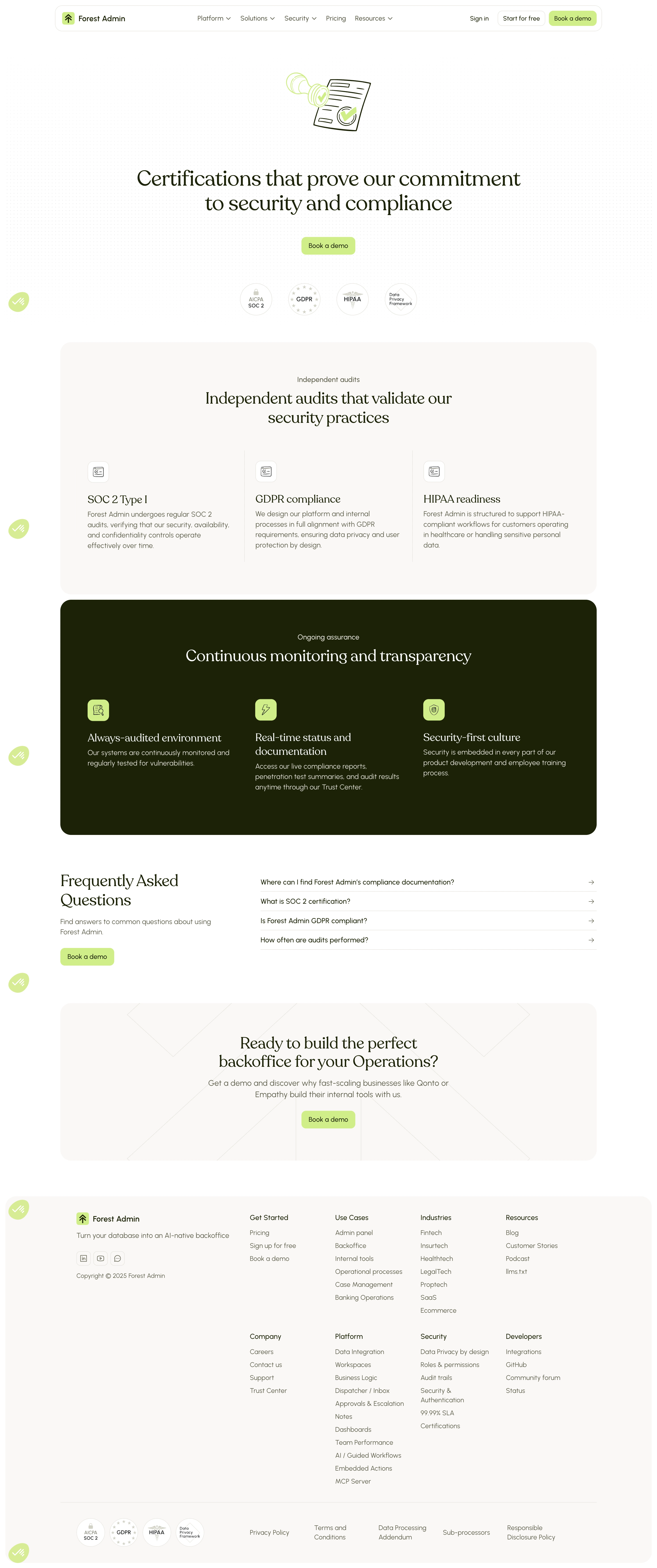
Forest Admin's certifications page nails the "we take security seriously" vibe without feeling sterile or boring. The illustration up top with the document and checkmark sets the tone immediately. Soft green accents on a clean white background keep things approachable. Those certification badges (SOC 2, GDPR, HIPAA, Data Privacy Framework) sit right below the fold like quiet proof points.
Structure that does the heavy lifting
The page flows in clear blocks. Independent audits section breaks into three cards with just enough detail. Then a dark section hits for "Continuous monitoring and transparency" which creates strong visual contrast and signals a shift in content. The green icon badges pop against the dark background. Smart move.
Details worth noting
The FAQ accordion is minimal and functional. No fuss. Typography is confident with large serif headings that feel editorial mixed with clean sans-serif body text. The repeated "Book a demo" CTAs in that pale lime green are consistent without being aggressive. Footer is dense but well-organized into logical columns. Overall it feels trustworthy and human, which is exactly what a security page should do.