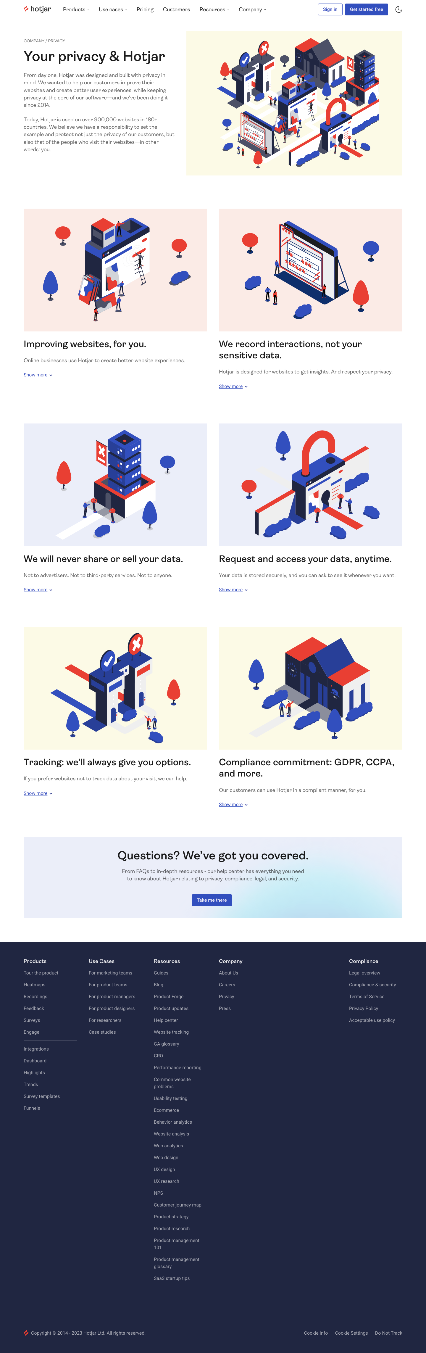
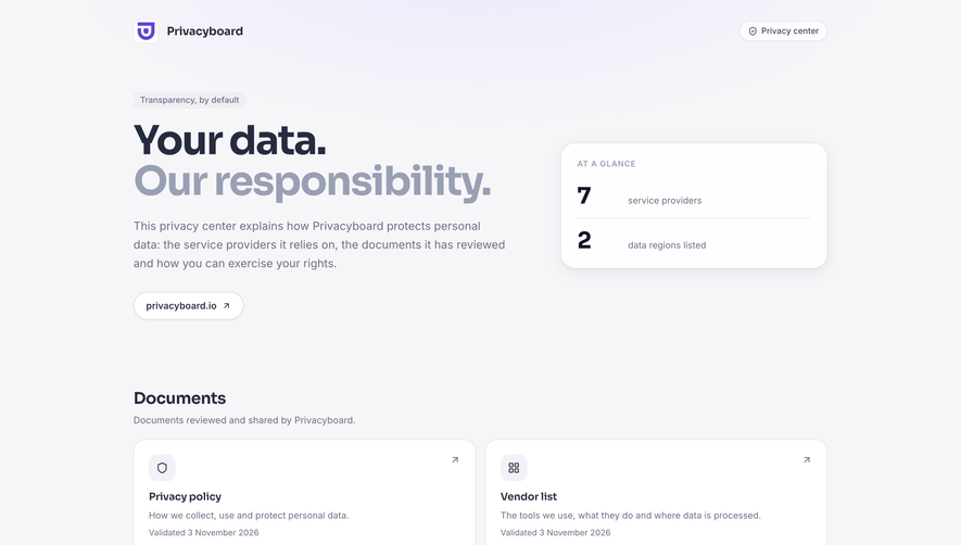
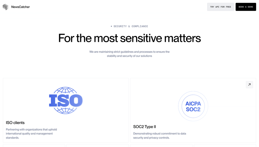
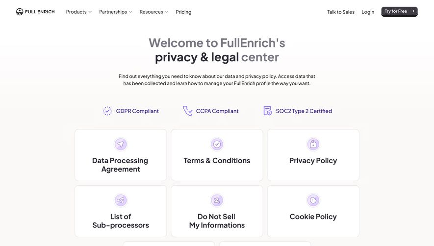
Hotjar’s privacy page embraces a modern, minimalist aesthetic tailored for clarity and trust. The design skillfully balances professionalism with approachability, using whitespace to reduce cognitive load while subtle illustrations add a welcoming touch. The tone is confident and transparent, instantly reassuring visitors.
Layout and Structure
The page is structured with a clear, inviting hero section, including a friendly illustration and headline that frame privacy as a priority. Information is organized into digestible segments with collapsible FAQ panels, emphasizing scannability. Instead of overwhelming users, content is broken up by headings, accordion sections, and callouts—keeping the layout lean and focused.
Visual Elements
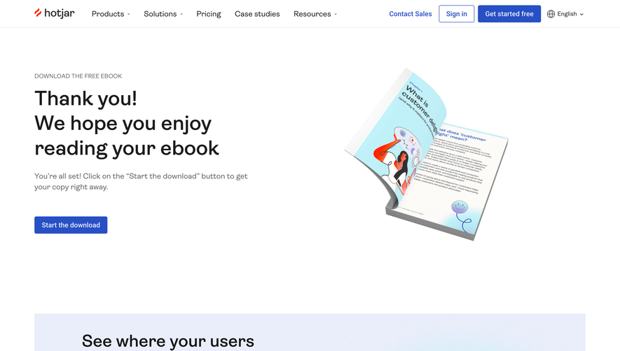
Custom illustrations introduce pops of personality and reinforce trust. Soft, friendly iconography clarifies concepts without distraction. No stock photography is used; instead, vector visuals support the brand’s approachable tone. Hover states and interactive elements create a lively—not static—appearance.
Color Palette and Typography
Primary hues are off-white, charcoal, and Hotjar’s signature coral red. The restrained palette enhances legibility and spotlights key actions. Clean, sans-serif fonts (with thoughtful weight hierarchy) guide the eye, while bold headers and accent color links ensure vital points stand out.
User Experience Patterns
Sticky navigation and anchor links foster seamless movement across sections. Clear CTAs and a prominent feedback button offer help at every scroll depth. Accordions prevent information overload, while consistent spacing and intuitive icons make scanning effortless.
Unique or Notable Design Choices
The page’s conversational copy, hand-drawn illustrations, and reassuring callouts elevate it above typical legal pages. The friendly design makes heavy content accessible, transforming a compliance necessity into a branded trust experience.
 SaaSFrame