Generate a new design based on this screen using your own content.
Thank you! Your submission has been received!
Oops! Something went wrong while submitting the form.
# Design from Reference: Clutch 404 Page
Create an original, high-fidelity visual design inspired by the reference. Prioritize composition, typography, colors, spacing, and component styling over technical implementation.
## Reference
- **Product:** Clutch
- **Category:** 404 Page
- **Screenshot:** https://cdn.prod.website-files.com/5e9dc792e1210c5325f7ebbc/6acad415c910b3adf9e48e5a_6acad2f7c9b1b0baa1ab5d71_cms-9e7d77520655d7c8ddd38b4c.webp
Analyze the screenshot first. If inaccessible, request it rather than guessing.
## Content
{{content.instructions}}
{{content.data}}
Preserve essential messaging and factual accuracy. Adapt structure and copy length for visual balance; never invent product claims.
## Visual Design
Use this context to reproduce the reference's visual language: layout, typography, colors, spacing, borders, radii, and distinctive elements. The screenshot takes priority if descriptions conflict.
## Direction
{{preferences.fidelityInstructions}}
## Output
{{output.instructions}}
Deliver a polished, cohesive design with precise alignment, hierarchy, and spacing. Produce the requested visual artifact, not just a description. If unsupported, explain the limitation.
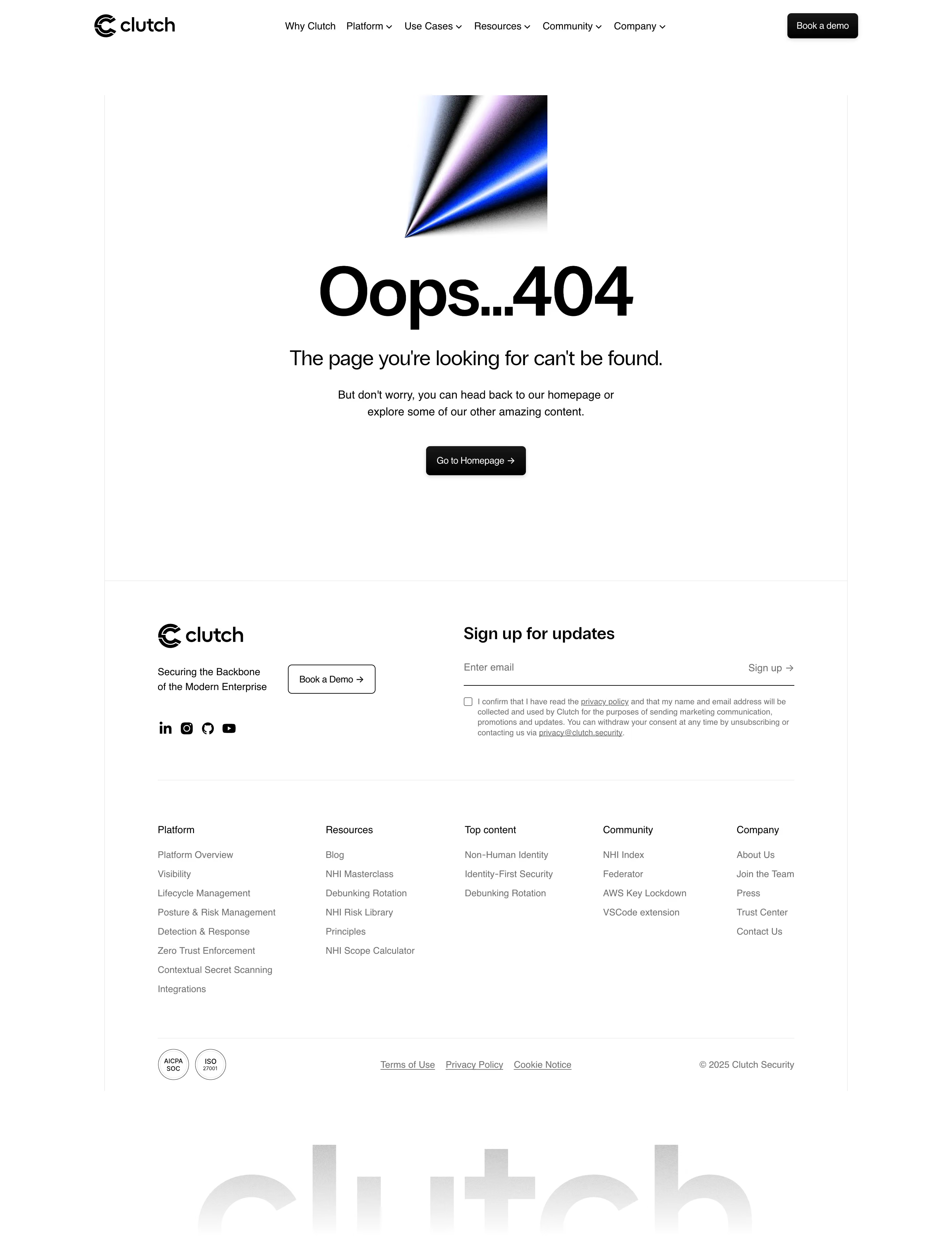
Clutch Security’s 404 page showcases a distinctly modern and minimalist aesthetic. The design harnesses ample white space, drawing visitors' attention to the central visual without overwhelming them. The page feels professional with subtle playful accents, projecting trustworthiness while maintaining an approachable vibe—ideal for a SaaS product focused on security.
Layout and Structure
The layout is centered with a clear hierarchy. The hero section immediately presents a bold “404 — Page Not Found” message, which sits above a clever, looping animation. Supporting text gently informs users of the error and suggests actionable next steps, while a prominent CTA button delivers users back to the homepage. No additional sections like testimonials or pricing appear, aligning with the focused intent of an error page.
Visual Elements
A standout animated icon—a magnifying glass searching, cleverly looping into a padlock—serves as the visual centerpiece, thematically linking to security. The playful motion creates delight and reassurance for users, softening the frustration of encountering an error. The illustration style is both simple and memorable, reinforcing brand identity.
Color Palette and Typography
The palette is crisp and clean, with a white background, gentle gray tones, and strategic pops of brand blue for interactive elements and the CTA. The font is modern, sans-serif, and highly legible, with clear typographic hierarchy: bold for the headline, medium for supporting text, and an unmissable button style.
User Experience Patterns and Unique Choices
Navigation is straightforward—a single call-to-action keeps users on the ideal path. The design’s unique strength lies in its playful-yet-professional animation with zero clutter, and its empathetic copy, which maintains brand personality even on error pages. This approach turns a 404 error into a positive brand interaction, embodying Clutch Security’s innovative and user-centric ethos.