
Thank you! Your submission has been received!
Oops! Something went wrong while submitting the form.
Get SaaSFrame Pro
Monthly
$18
Quarterly
$48
Yearly
$180
Upgrade to access this feature
Browse all screens & flows
Filter and search screens & flows
Access Figma files
Access mobile versions
Bookmark screens & flows
Join now


Checkout.com Contact Page

Checkout.com
Payments to power your performance
Designed by
No items found.

Bookmark
Bookmark

Design with AI
Thank you! Your submission has been received!
Oops! Something went wrong while submitting the form.
# Design from Reference: Checkout.com Contact Page
Create an original, high-fidelity visual design inspired by the reference. Prioritize composition, typography, colors, spacing, and component styling over technical implementation.
## Reference
- **Product:** Checkout.com
- **Category:** Contact Page
- **Screenshot:** https://cdn.prod.website-files.com/5e9dc792e1210c5325f7ebbc/6acad4bf1025e911ae5183f6_6acad3ccb2165b6c7f00874b_cms-ab8f819976da25a3fe8f899d.webp
Analyze the screenshot first. If inaccessible, request it rather than guessing.
## Content
{{content.instructions}}
{{content.data}}
Preserve essential messaging and factual accuracy. Adapt structure and copy length for visual balance; never invent product claims.
## Visual Design
### Overall aesthetic
- **Style:** Corporate contact hub with bold technical-looking headings, charcoal sections, warm-gray form surfaces, and electric-blue actions.
- **Character:** Strong rectangular geometry, generous section spacing, compact monospaced-looking headings, international flag markers, and a large simplified world map.
- **Surface treatment:** Rounded dark contact cards alternate with white and pale-gray address/form regions.
### Page composition
- **Capture and scale:** 2880 × 15730 image px. CSS estimates assume a 2× capture, approximately 1440 × 7865 CSS px; scale is unverified. All portions inspected.
- **Header:** Brand left, four navigation groups, outlined sign-in and blue contact action right.
- **Intro:** Small uppercase contact label, large Let’s talk heading, and one-line explanatory sentence.
- **Contact routes:** Charcoal band with three equal lighter-dark cards for sales, merchant support, and partnership.
- **Sales form:** Wide rounded split panel; dark copy area left and warm-gray form right. The tall left area remains mostly blank below its intro while matching the form height.
- **Form sequence:** Prefill notice, identity fields, contact details, business location/size, product/source selectors, marketing checkbox, explanatory/legal copy, and blue inquiry action.
- **Phone directory:** Fifteen compact country/contact tiles in a four-column grid.
- **Inquiries band:** Dark section with large heading and two broad cards for general and media inquiries.
- **Office section:** White area with large heading, broad pale-gray world map with blue dots, then twenty office cards in a four-column grid.
- **Legal addresses:** Pale-gray section with large heading and five entity/address blocks in a four-column layout.
- **Footer:** Dark conversion statement/action, brand/tagline/language row, four main navigation columns, dense legal block, and social icons.
### Information hierarchy
- **First choice:** Three contact-route cards distinguish sales, support, and partnership before the detailed form.
- **Sales emphasis:** Large uppercase form heading and blue send action establish the principal conversion route.
- **Form grouping:** Small bold technical-style headings separate identity, reachability, business details, and additional information.
- **International access:** Flags and bold place names lead phone/office tiles; addresses and underlined numbers are subordinate.
- **Corporate information:** Legal entities are grouped separately from ordinary office locations.
- **Footer hierarchy:** Large contact statement precedes brand/navigation and smaller regulatory/legal copy.
- **Personal data:** Prefilled identities are described structurally and not reproduced in this reusable design context.
### Typography
- **Heading family:** Technical/monospaced-looking display sans serif with rounded terminals; exact family is unverified.
- **Body family:** Neutral proportional sans serif; exact identity is unverified.
- **Hero / major headings:** Approximately 60–64px bold with 68px line-height and visibly open tracking.
- **Sales panel heading:** Approximately 58–60px uppercase across two lines.
- **Contact-card headings:** Approximately 24px bold with expanded tracking.
- **Body:** Approximately 18–20px with 26–28px leading.
- **Form values:** Approximately 14px; field labels are smaller gray text inside controls.
- **Form group labels:** Approximately 16px bold, monospaced-looking.
- **Office names:** Approximately 20px bold; address text around 16–18px.
- **Footer:** Approximately 16px links, small uppercase tracked group labels, and 14px legal copy.
- **Precision:** CSS sizes, weights, tracking, and font identities are visual estimates.
### Colors & surfaces
- **Dark bands / text:** Sampled #252933.
- **White:** Sampled #FFFFFF.
- **Warm-gray form/cards:** Sampled #F4F2F2.
- **Lighter dark cards:** Sampled #424249.
- **Map:** Sampled #DFDDDD.
- **Prefill notice:** Sampled #CAE5FF.
- **Action blue:** Sampled #006BFF.
- **Control boundary:** Sampled #C7C1C1.
- **Country-control detail:** Sampled #D0D4D3.
- **Treatment:** Mostly flat fills, pale input outlines, modest radii, and minimal shadows.
### Components
- **Header actions:** Around 48px high, blue filled/outlined rectangles with 5px radius.
- **Route cards:** Three equal panels roughly 400 × 248px, 16px radius, around 48px padding, white title/body/link.
- **Split form panel:** Approximately 1280px wide with about 16px outer radius; equal dark and pale halves.
- **Prefill notice:** Pale-blue rounded block with bold greeting, short explanation, and identity-change link.
- **Inputs:** Approximately 520 × 48px, white fill, fine warm-gray outline, 8px radius, inset small label and value.
- **Phone controls:** Separate country-code selector, phone input, and flag tile.
- **Selectors:** Full-width fields with right chevrons; no option menu is open.
- **Consent/legal:** Small empty checkbox and compact gray paragraphs before/after inquiry action.
- **Send inquiry:** Blue rectangle about 144 × 48px with white label.
- **Phone tiles:** Pale rounded cards with flag at upper-left, bold place name, and underlined number.
- **Map:** Simplified rounded-continent shapes and small blue office dots, without labels or open tooltip.
- **Office cards:** Four columns, pale-gray fill, around 8px radius, flag/name, multiline address, optional underlined phone.
- **Language control:** Dark outlined selector with flag, current locale, and down chevron.
- **Footer badges:** Small blue hiring label and compact monochrome social icons.
- **State limits:** No form submission, map interaction, dropdown, or contact confirmation is shown.
### Visual rhythm
- **Broad alignment:** Most sections share approximately 1280px centered width and 80px side margins.
- **Section cadence:** White intro, charcoal routes, white/form directory, dark inquiries, white offices, pale legal addresses, and dark footer alternate.
- **Grid repetition:** Four-column country/office tiles provide regular scanning lanes across long directories.
- **Form rhythm:** Short group headings, consistent controls, and larger inter-group gaps structure a very tall right column.
- **Whitespace:** Large breaks frame the map and major headings; footer becomes denser toward its legal conclusion.
### Responsive
- **Observed state:** Desktop only; mobile and interactive behavior are unverified.
- **Contact cards recommendation:** Stack three routes and two inquiry cards.
- **Form recommendation:** Stack copy above the form, removing the need for an extremely tall blank left half.
- **Directories recommendation:** Reduce four columns to two then one while keeping flag/name/address relationships.
- **Map recommendation:** Scale as a decorative overview and provide the full office list independently.
- **Footer recommendation:** Wrap navigation groups and keep language/legal controls usable.
### Adaptation guidance
- **Preserve:** Clear route selection, grouped sales form, international directories, distinct office/legal information, and strong charcoal/blue identity.
- **Starting geometry:** Approximately 1280px content width, 60px major headings, 48px controls, 16px route-card radii, and 8px directory radii under the unverified 2× assumption.
- **Data fidelity:** Populate approved current contact/office data; screenshot addresses and numbers are historical reference content.
- **Privacy:** Use actual user-entered values or approved examples rather than copying prefilled personal data.
- **Implementation recommendation:** Provide accessible labels, validation, consent behavior, keyboard navigation, and submission feedback from real requirements.
- **State fidelity:** No inquiry was sent, and no business relationship or contact availability is inferred from the screenshot.
Use this context to reproduce the reference's visual language: layout, typography, colors, spacing, borders, radii, and distinctive elements. The screenshot takes priority if descriptions conflict.
## Direction
{{preferences.fidelityInstructions}}
## Output
{{output.instructions}}
Deliver a polished, cohesive design with precise alignment, hierarchy, and spacing. Produce the requested visual artifact, not just a description. If unsupported, explain the limitation.


Category
Patterns
No items found.
Tech Stack



Added on
April 10, 2024
Similar screens
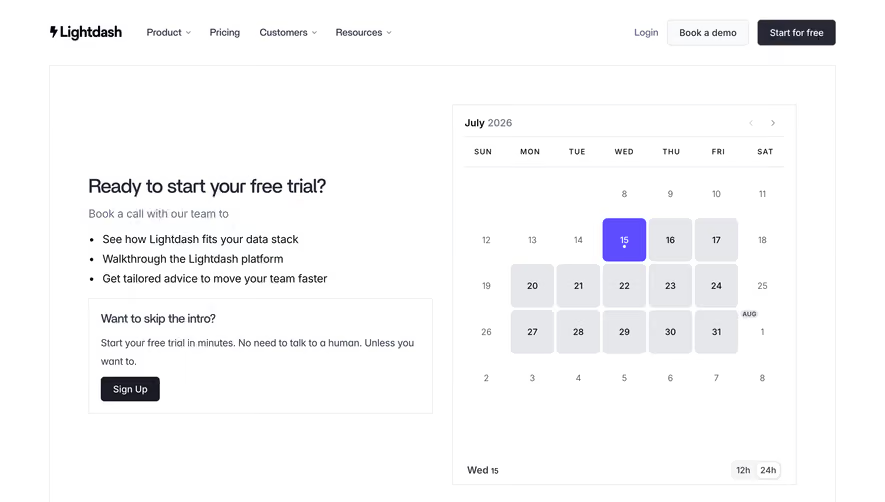




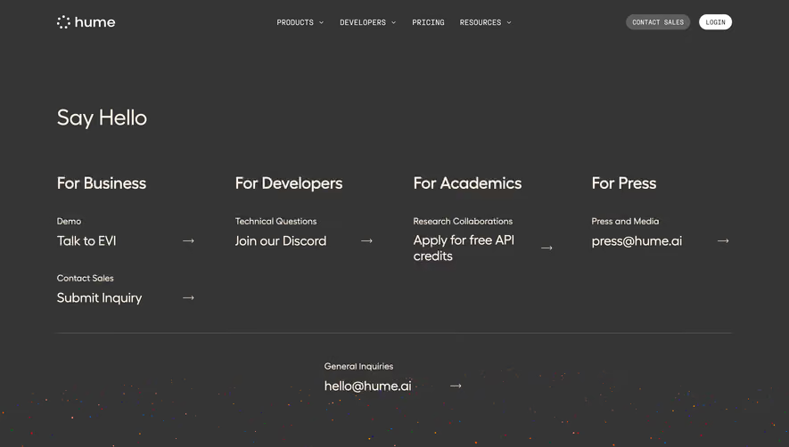

Upgrade to SaaSFrame Pro now to see similar examples.
Monthly
$18 /month
Billed $18 monthly
Browse all screens & flows
Filter and search screens & flows
Search text in screenshots
Access Figma files
Access mobile versions
Join now
Quarterly
$16 /month
Billed $48 quarterly
Browse all screens & flows
Filter and search screens & flows
Search text in screenshots
Access Figma files
Access mobile versions
Join now
Yearly
$15 /month
Billed $180 yearly
Browse all screens & flows
Filter and search screens & flows
Search text in screenshots
Access Figma files
Access mobile versions
Join now