Overall Style and Aesthetic
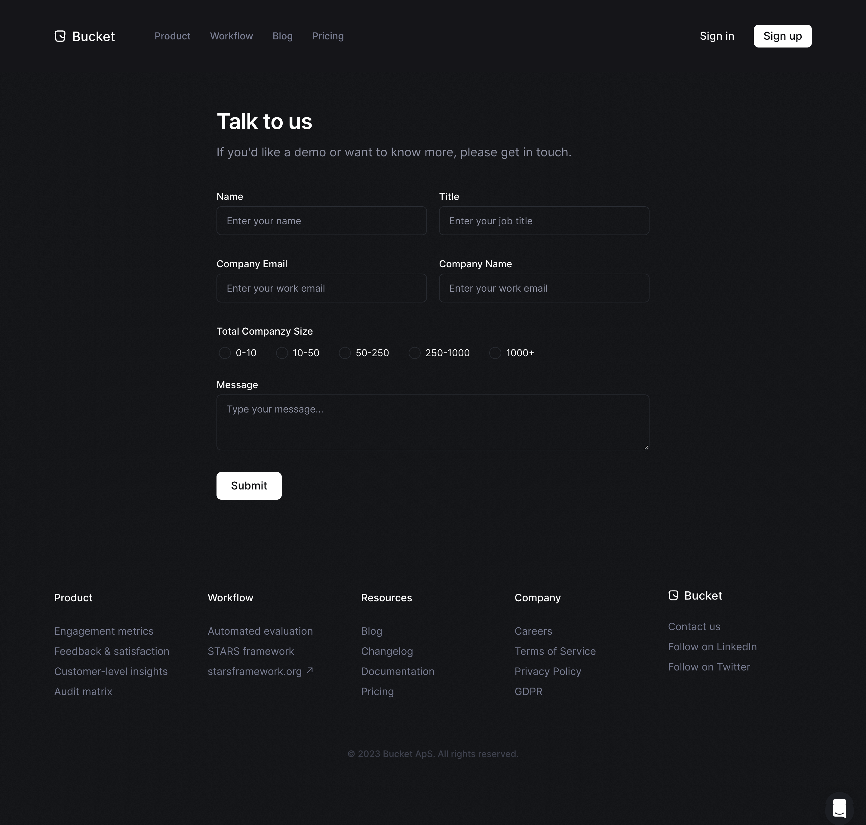
Bucket’s contact page embodies a clean, ultra-modern minimalist approach, radiating professionalism with subtle, friendly undertones. The design leverages ample whitespace, crisp edges, and a restrained yet inviting vibe, making each element feel intentional and approachable. Layout and Structure
The structure is streamlined and purposeful. A bold header establishes the page’s intent instantly, followed by a concise and welcoming intro. The primary focus is the contact form, positioned front and center, ensuring clarity for user action. Supporting contact details and social links are thoughtfully grouped below, with a persistent, clearly organized footer rounding out the layout. Visual Elements
Gentle illustrations pepper the page, echoing the brand’s playful edge without distracting from the core content. Delicate iconography signals purpose and enhances guidance, while simple geometric background patterns add depth and visual interest, creating warmth without clutter. Color Palette and Typography
A fresh palette balances deep indigo blues with bursts of energetic coral orange, promoting a sense of trust and optimism. Typography is contemporary and geometric—strong, sans-serif headlines guide attention, and clean, legible body text supports scannability. Hierarchy is established with weight, size, and color contrast, ensuring seamless readability. User Experience Patterns & Unique Choices
Navigation is sticky and minimal, reinforcing focus. CTAs—like the “Send Message” button—use accent colors for high visibility. The form is short, reducing friction and encouraging completion. Notably, micro-animations and feedback on input fields and button hovers subtly delight the user and signal interactivity, underscoring a polished, user-first SaaS experience. Tone and Feel
Overall, the tone conveys warmth, trust, and innovation—ideal for a forward-thinking SaaS product aiming to engage and reassure visitors that their outreach matters.