Overall Style and Aesthetic
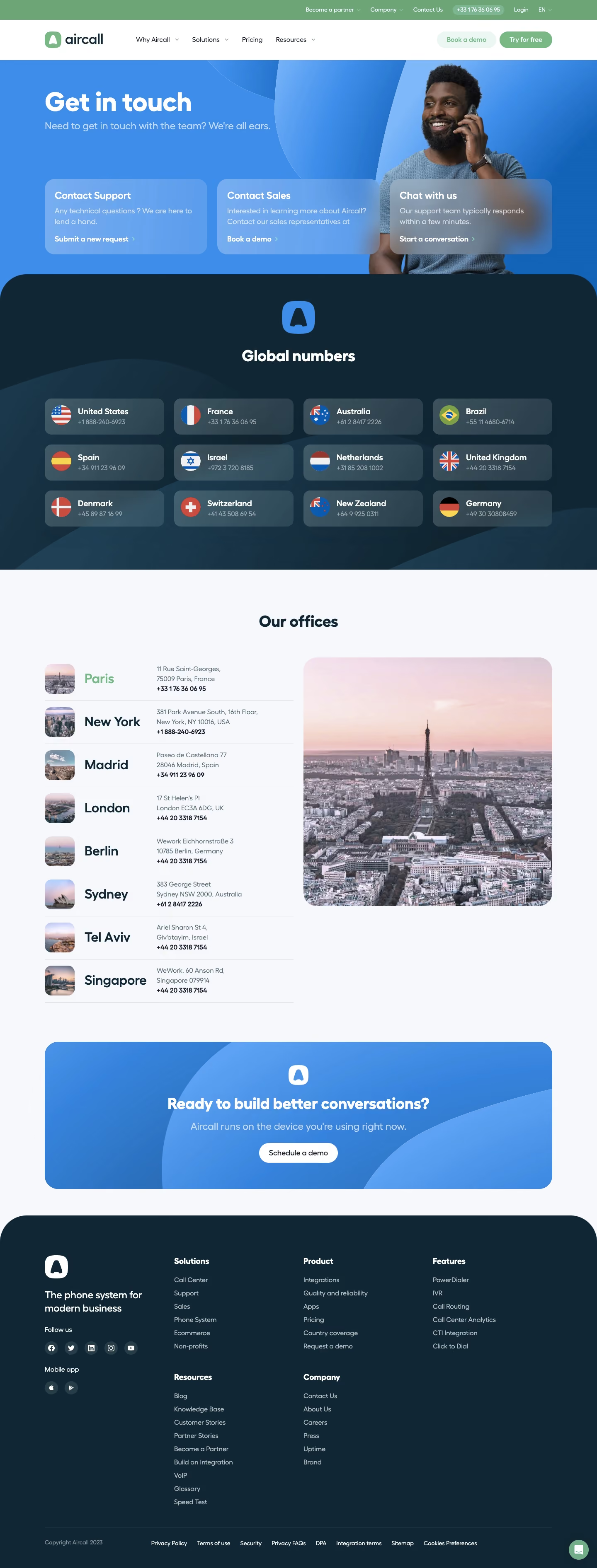
Aircall’s contact page embodies a crisp, minimalist style wrapped in a modern, professional aura. The site uses abundant white space to let content breathe, complemented by soft, rounded UI elements that feel approachable yet sophisticated. Splashes of Aircall’s signature green inject energy throughout, balancing professionalism with a welcoming, tech-forward vibe. Layout and Structure
The page is intuitively structured: a clear, concise hero header communicates the page’s purpose instantly. Below, visitors find a cleanly architected form beside essential contact information. Quick-access links—such as support and sales—cater to nuanced user needs. The sticky header maintains easy navigation, while the comprehensive footer anchors the page with further resources and legal links. Visual Elements
Custom illustrations, including playful yet on-brand avatars and subtle icons, enrich the interface without overwhelming it. These visuals guide the eye and add personality, while the absence of stock photography keeps the experience distinctive and purposeful. Small animations, like field highlights and hover states, provide tactile feedback and reinforce interactivity. Color Palette and Typography
Aircall leans on a calming palette of whites, light grays, and its signature green, creating contrast and guiding attention without clutter. Sleek, modern sans-serif fonts ensure readability and reinforce hierarchy, especially with bold headlines and comfortably sized subtext. User Experience Patterns and Notable Design Choices
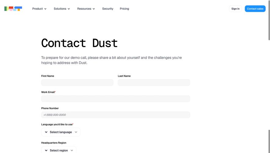
The user journey is seamless—prominent CTAs, progress indicators on forms, and accessible navigation minimize friction. Noteworthy is the way the form gently adapts for different user goals, personalizing the experience. The consistent tone strikes a balance between trustworthy and innovative, building confidence for enterprise users while welcoming startups.