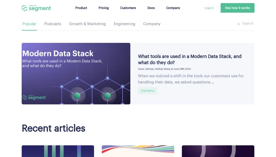
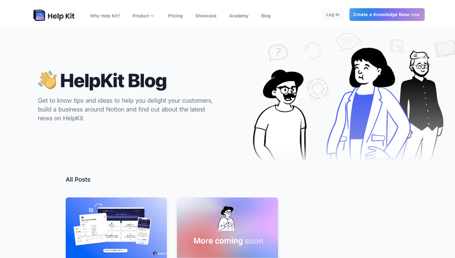
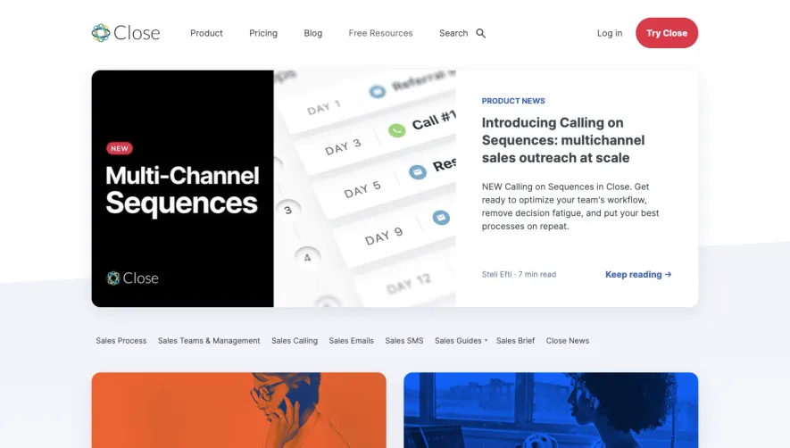
Generate a new design based on this screen using your own content.
Thank you! Your submission has been received!
Oops! Something went wrong while submitting the form.
# Design from Reference: Stripe Blog Feed
Create an original, high-fidelity visual design inspired by the reference. Prioritize composition, typography, colors, spacing, and component styling over technical implementation.
## Reference
- **Product:** Stripe
- **Category:** Blog Feed
- **Screenshot:** https://cdn.prod.website-files.com/5e9dc792e1210c5325f7ebbc/6acadcc18c9a73ab05f13409_6acadc29adcaf74490d2a945_cms-f95e8aab227395f33d2a18e4.webp
Analyze the screenshot first. If inaccessible, request it rather than guessing.
## Content
{{content.instructions}}
{{content.data}}
Preserve essential messaging and factual accuracy. Adapt structure and copy length for visual balance; never invent product claims.
## Visual Design
Use this context to reproduce the reference's visual language: layout, typography, colors, spacing, borders, radii, and distinctive elements. The screenshot takes priority if descriptions conflict.
## Direction
{{preferences.fidelityInstructions}}
## Output
{{output.instructions}}
Deliver a polished, cohesive design with precise alignment, hierarchy, and spacing. Produce the requested visual artifact, not just a description. If unsupported, explain the limitation.
Stripe’s blog page showcases a sophisticated, minimalist aesthetic, balancing professionalism with approachability. Clean lines, generous white space, and sharp organization create a visually calming, credible atmosphere that feels modern but never sterile.
Layout and Structure
The layout is thoughtfully modular. A visible but lightweight navigation header keeps focus on content, while each blog entry is presented as a distinct card with clear visual separation. A persistent yet subtle sidebar surfaces popular and recent posts, aiding easy exploration without distraction. No clutter—just content, ordered purposefully.
Visual Elements
Vibrant yet refined illustrations, often geometric or abstract, perfectly complement Stripe’s technical narrative. Blog cards integrate hero images or custom iconography for scannable differentiation. Micro-animations and hover effects provide a sense of interactivity, guiding users without overwhelming the experience.
Color Palette and Typography
The palette is anchored by clean whites and deep, trustworthy navies, punctuated with signature Stripe gradients (electric blues, purples). Elegant sans-serif typography (often Inter for body and display) ensures legibility throughout; clear headline hierarchies help readers navigate with ease.
User Experience Patterns
Navigation is frictionless—fixed, concise, and extending to Stripe’s broader product ecosystem. No intrusive CTAs; instead, affordances like “Read more” or topic filters are intuitively placed. Thoughtful scrolling keeps the interface fast and content-focused, with no distracting pop-ups or form interruptions.
Unique or Notable Design Choices
Subtle thematic transitions (like hover color shifts) and smooth page loads reflect technical excellence. The tone feels both innovative and reassuring—ideal for a SaaS brand respected by developers and business leaders alike. Stripe’s blog page doesn’t just host articles; it demonstrates UI best practices in motion.