
Thank you! Your submission has been received!
Oops! Something went wrong while submitting the form.
Get SaaSFrame Pro
Monthly
$18
Quarterly
$48
Yearly
$180
Upgrade to access this feature
Browse all screens & flows
Filter and search screens & flows
Access Figma files
Access mobile versions
Bookmark screens & flows
Join now


Stripe Blog Feed

Stripe
Online payment processing
Designed by
No items found.

Bookmark
Bookmark

Design with AI
Thank you! Your submission has been received!
Oops! Something went wrong while submitting the form.
# Design from Reference: Stripe Blog Feed
Create an original, high-fidelity visual design inspired by the reference. Prioritize composition, typography, colors, spacing, and component styling over technical implementation.
## Reference
- **Product:** Stripe
- **Category:** Blog Feed
- **Screenshot:** https://cdn.prod.website-files.com/5e9dc792e1210c5325f7ebbc/6acadcc18c9a73ab05f13409_6acadc29adcaf74490d2a945_cms-f95e8aab227395f33d2a18e4.webp
Analyze the screenshot first. If inaccessible, request it rather than guessing.
## Content
{{content.instructions}}
{{content.data}}
Preserve essential messaging and factual accuracy. Adapt structure and copy length for visual balance; never invent product claims.
## Visual Design
### Overall aesthetic
- **Style:** A polished corporate blog uses navy typography, white/pale-blue surfaces, purple links and a subtle vertical grid.
- **Character:** Large editorial spacing and shadowed product imagery balance a long chronological feed.
### Page composition
- **Capture:** The source measures 2880 × 16936 pixels. Estimated CSS dimensions below assume an unverified 2× capture; the full page was inspected.
- **Container:** A centered region around 1080 pixels wide follows faint vertical rules dividing four underlying columns.
- **Header:** Brand and five navigation links sit left, with contact and dashboard actions right. A smaller blog/social row follows.
- **Featured story:** A large white two-column card pairs category, title, author, summary and link left with a nearly square blue image right. A diagonal multicolor ribbon passes behind.
- **Filters:** Four category choices sit below, with All in a purple capsule.
- **Feed:** Repeated article sections place text across the broad left region and date/author metadata in a narrow right column. Several entries include large shadowed images extending across the right half.
- **Highlights:** A pale-blue band interrupts the feed with horizontally arranged saturated-color update cards, clipped at the right edge.
- **Closing utility band:** RSS subscription, recruitment and feedback blocks share the pale surface.
- **Footer:** Brand/location/language occupy the first column, beside three long navigation columns with multiple subgroups.
### Information hierarchy
- **Featured title:** Large navy text leads the opening card.
- **Article entries:** Purple category labels precede bold headings, medium-gray summaries and Read more links.
- **Metadata:** Date, circular portrait, bold author name and role remain in the right rail.
- **Highlights:** Short white headings and copy on colored cards create a denser secondary-news layer.
- **Utilities:** Compact icons and headings distinguish subscription, roles and contact routes before footer navigation.
### Typography
- **Family:** Neutral sans serif throughout; exact identity is unverified.
- **Featured/feed titles:** Approximately 36–38 pixels, semibold, with 46–48-pixel leading.
- **Summaries:** Around 18 pixels with 28-pixel line height.
- **Categories and links:** Approximately 14–16 pixels, medium weight.
- **Author metadata:** Around 14 pixels, with names heavier than roles.
- **Footer:** Around 14 pixels with generous 28-pixel row spacing.
### Colors & surfaces
- **Measured base:** White #FFFFFF and pale blue-gray #F6F9FC define the main regions.
- **Ink:** Navy #0A2540 supplies strong text.
- **Accent:** Purple #635AFF is sampled in links, selected filters and action details.
- **Hero ribbon:** Blended cyan, purple, pink, orange and yellow forms a broad diagonal stripe.
- **Highlight cards:** Cyan, bright blue, deep blue, violet and navy fills carry white text.
- **Depth:** Large soft gray shadows lift hero and product-image panels; the feed itself is unboxed.
### Components
- **Featured card:** Around 1080 × 536 pixels, small roughly 8-pixel radius, with generous text padding and narrow image inset.
- **Author units:** Small circular portraits align beside two text lines.
- **Category markers:** A short purple vertical tick appears at the container boundary beside each category.
- **Feed imagery:** White rounded panels frame product mockups, conference graphics and illustration with broad lower shadows.
- **Highlights:** Roughly 245 × 345-pixel colored cards have small radii, padded text and bottom-aligned action links.
- **Actions:** Small filled capsules and arrow-led text links recur; the dashboard action uses dark navy.
- **Footer groups:** Bold subgroup labels separate dense lists without enclosing cards.
### Visual rhythm
- **Long-form cadence:** Large 100-pixel-plus gaps separate article entries.
- **Grid continuity:** Faint dashed vertical guides align text, imagery and footer columns.
- **Variation:** Plain text stories alternate with image-led stories and a compact highlight strip.
- **Whitespace:** Wide margins and open backgrounds preserve readability despite the long page.
### Responsive
- **Evidence:** Only desktop is observed; filters, highlight scrolling and mobile behavior are unverified.
- **Recommended feed:** Move date/author metadata into each article's text stack on narrow screens.
- **Featured card:** Stack image and copy while preserving title priority.
- **Highlights:** Use accessible horizontal scrolling or a wrapped layout with readable cards.
- **Footer:** Stack link groups and retain location/language access.
### Adaptation guidance
- **Preserve:** Keep navy/purple hierarchy, faint grid structure, diagonal gradient ribbon and spacious feed.
- **Build:** Use reusable featured, text-only, image-led and highlight article variants.
- **Content fidelity:** Captured article claims, dates and product mockups are historical content, not verified current facts.
- **Images:** Preserve intended crops and avoid recreating unreadable internal UI.
- **Interaction:** Define filtering, article navigation, RSS and utility links explicitly; only visual states are established.
Use this context to reproduce the reference's visual language: layout, typography, colors, spacing, borders, radii, and distinctive elements. The screenshot takes priority if descriptions conflict.
## Direction
{{preferences.fidelityInstructions}}
## Output
{{output.instructions}}
Deliver a polished, cohesive design with precise alignment, hierarchy, and spacing. Produce the requested visual artifact, not just a description. If unsupported, explain the limitation.


Category
Patterns
No items found.
Tech Stack

Added on
August 2, 2023
Similar screens
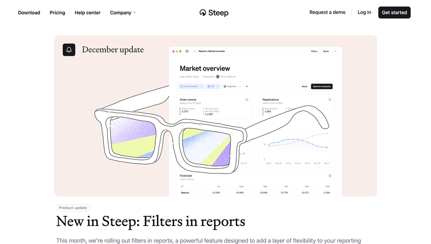


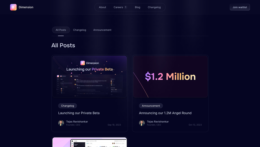

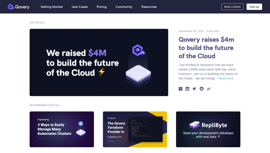

Upgrade to SaaSFrame Pro now to see similar examples.
Monthly
$18 /month
Billed $18 monthly
Browse all screens & flows
Filter and search screens & flows
Search text in screenshots
Access Figma files
Access mobile versions
Join now
Quarterly
$16 /month
Billed $48 quarterly
Browse all screens & flows
Filter and search screens & flows
Search text in screenshots
Access Figma files
Access mobile versions
Join now
Yearly
$15 /month
Billed $180 yearly
Browse all screens & flows
Filter and search screens & flows
Search text in screenshots
Access Figma files
Access mobile versions
Join now