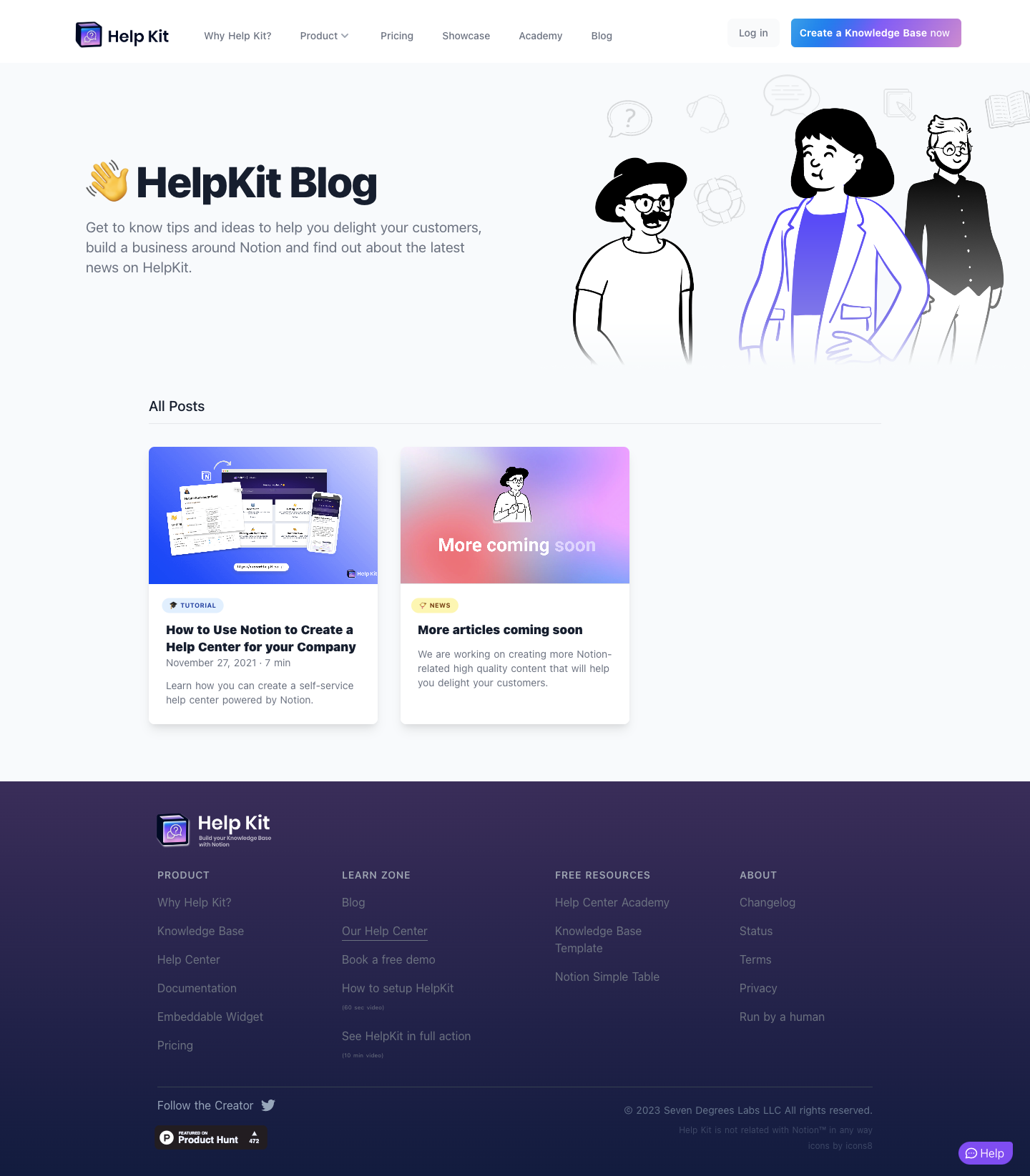
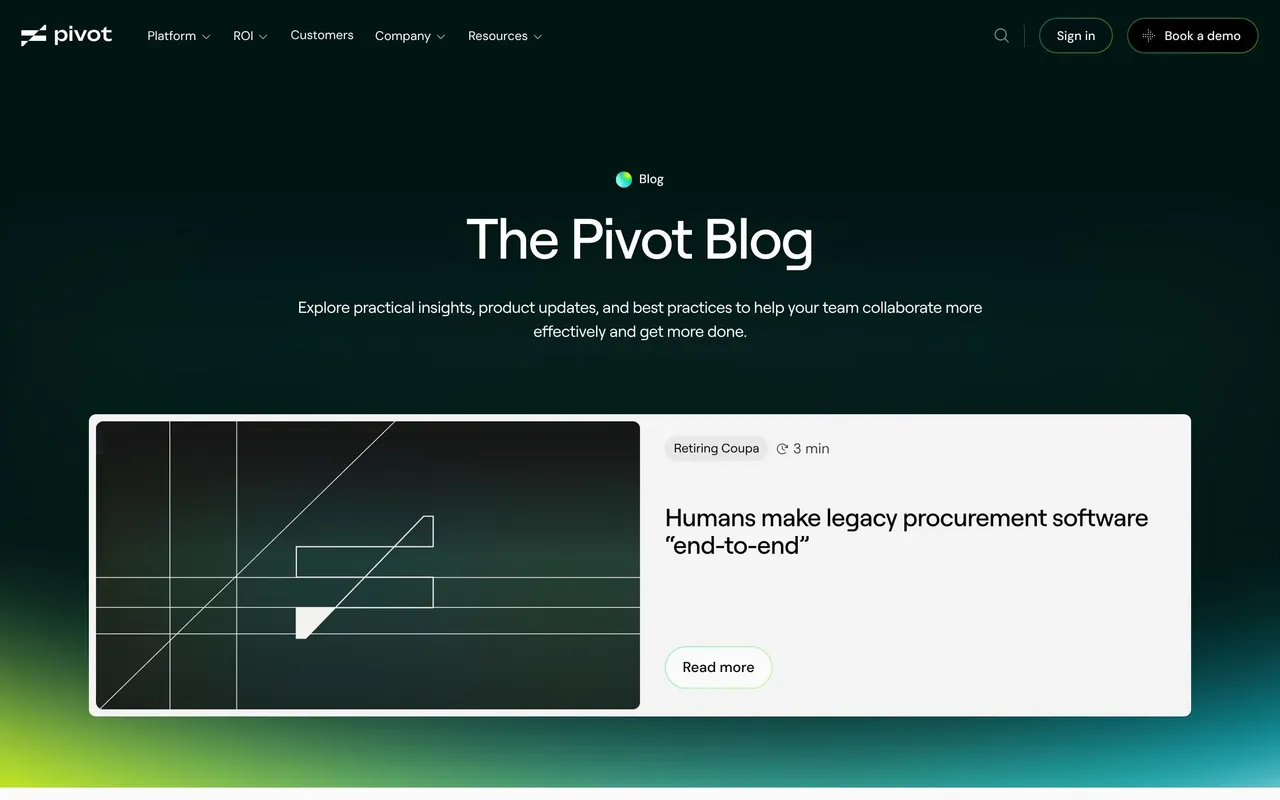
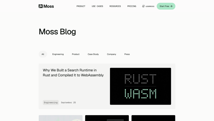
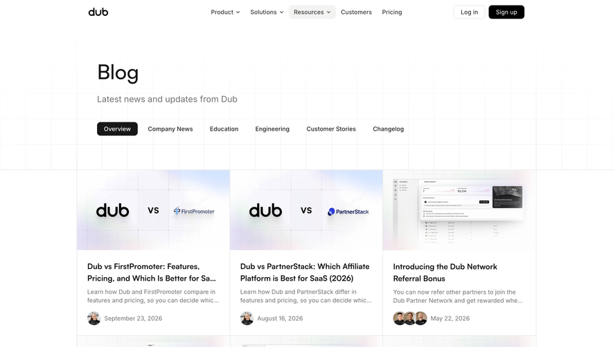
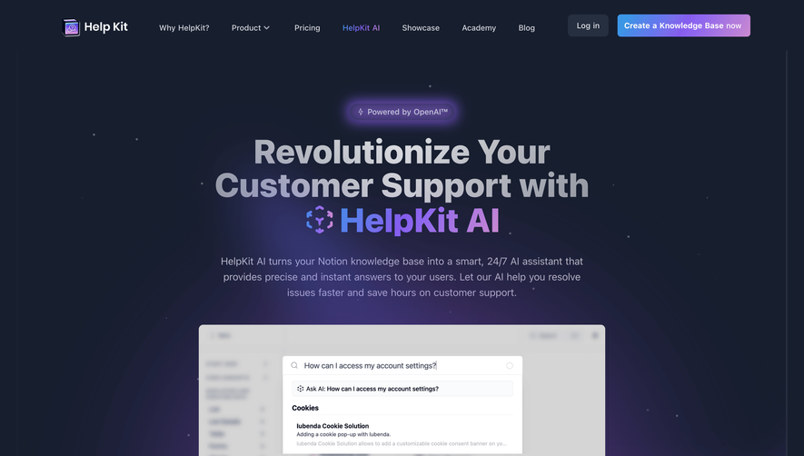
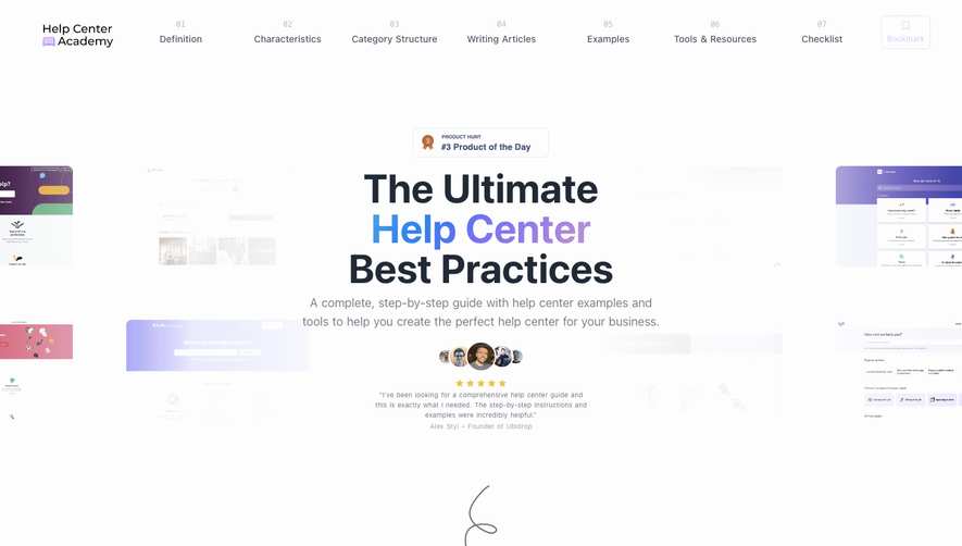
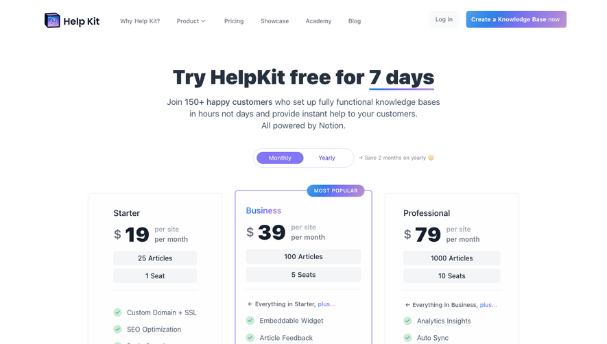
``` HelpKit’s blog page embraces a crisp, minimalist aesthetic—anchored in modern SaaS design language. White space is lavishly used to create a sense of openness, while subtle shadows lend gentle depth and tactility. Content is king here, with a streamlined interface steering visitors’ attention without visual clutter or distraction. The overall effect is polished yet inviting, creating a sense of trust and credibility while remaining effortlessly approachable. ```html
Layout and Structure
``` The page opens with a compact header offering clear navigation, immediately situating visitors within the blog section. A clean grid layout follows, where blog cards are visually separated yet aligned, supporting maximum readability. There’s no elaborate hero section—putting focus directly on valuable content. The sticky footer echoes the site-wide navigation, ensuring users never hit a dead end. This linear, distraction-free structure aligns perfectly with SaaS readers seeking quick learning. ```html
Visual Elements
``` Authors’ avatars, crisp featured images, and minimalist icons punctuate each card, balancing personality and clarity. Visual consistency is maintained across imagery, and all illustrations use flat or soft gradients—amplifying the site’s modern feel without overcomplicating the page. ```html
Color Palette and Typography
``` A clean, monochrome background contrasts with muted accent colors—blues and purples for buttons and highlights—creating gentle visual hierarchy. The typography is sleek and slightly geometric, ensuring scannability: prominent blog titles, lighter metadata, and understated body text offer immediate hierarchy for readers. ```html
User Experience Patterns & Notable Design Choices
``` Intuitive navigation flows abound, with persistent links and hover effects underscoring clickable elements. Bold, seamless CTAs invite exploration both within and beyond the blog. Unique to HelpKit, the absence of a hero banner lets content "breathe," while strong post categorization and author visibility humanize the SaaS experience. The overall tone is warm, expert, and quietly innovative—an inspiring blueprint for SaaS brands aiming to build trust while simplifying discovery.
 SaaSFrame