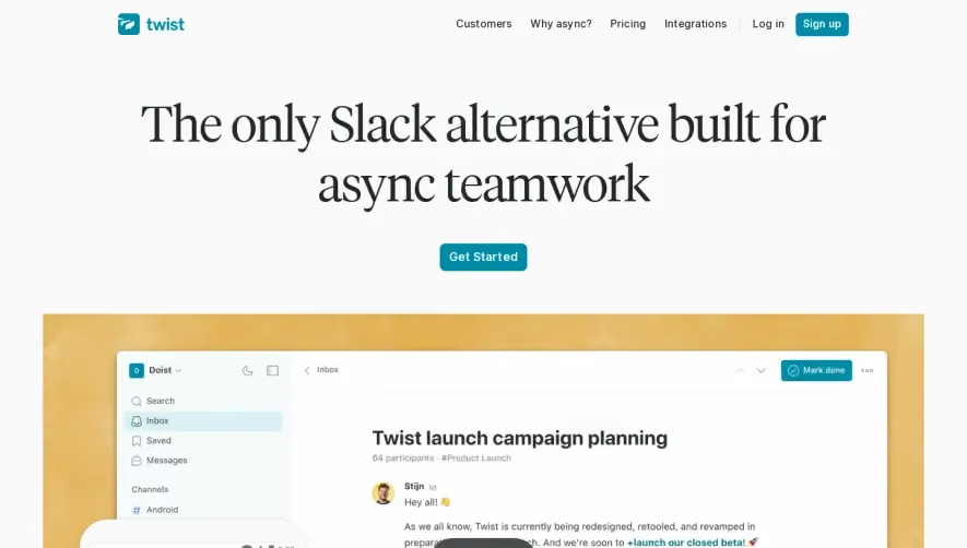
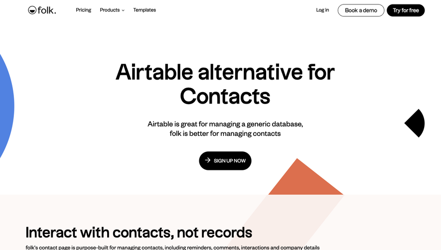
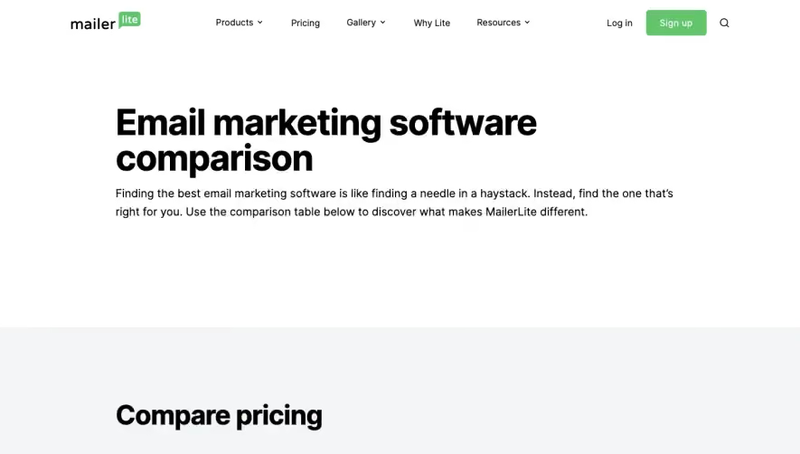
Generate a new design based on this screen using your own content.
Thank you! Your submission has been received!
Oops! Something went wrong while submitting the form.
# Design from Reference: Better Stack Comparison Page
Create an original, high-fidelity visual design inspired by the reference. Prioritize composition, typography, colors, spacing, and component styling over technical implementation.
## Reference
- **Product:** Better Stack
- **Category:** Comparison Page
- **Screenshot:** https://cdn.prod.website-files.com/5e9dc792e1210c5325f7ebbc/6acb6a5b03442b22fb62ad8a_6acb695fe9370e78965ce6b3_cms-aab6c3b691face0545585b76.webp
Analyze the screenshot first. If inaccessible, request it rather than guessing.
## Content
{{content.instructions}}
{{content.data}}
Preserve essential messaging and factual accuracy. Adapt structure and copy length for visual balance; never invent product claims.
## Visual Design
Use this context to reproduce the reference's visual language: layout, typography, colors, spacing, borders, radii, and distinctive elements. The screenshot takes priority if descriptions conflict.
## Direction
{{preferences.fidelityInstructions}}
## Output
{{output.instructions}}
Deliver a polished, cohesive design with precise alignment, hierarchy, and spacing. Produce the requested visual artifact, not just a description. If unsupported, explain the limitation.
Better Stack’s “Pingdom Alternative” page embodies a crisp, contemporary, and purpose-driven style. The design embraces spaciousness and clarity, balancing minimalism with subtle visual flair. It exudes professionalism, using clean lines and unfussy layouts, yet feels welcoming and accessible—perfect for SaaS audiences seeking trustworthiness and innovation.
Layout and Structure
The page architecture is meticulously organized: a bold hero section with a value proposition and primary CTA; a comparison table replacing traditional feature blocks; customer logos as trust signals; testimonial sections; use-case-driven content areas; and a compact, informative footer. Each section transitions smoothly, guiding the user journey without overwhelming.
Visual Elements
The design leverages vector illustrations and refined icons that add visual interest without intruding on content. Product screenshots are strategically placed, giving real context to features. Micro-animations and soft shadows subtly direct attention, while scrolling reveals content organically—never jarring or disruptive.
Color Palette and Typography
A cool, high-contrast palette dominates: deep navy backgrounds and brilliant white content blocks, accented with vibrant primary colors (lime green, cyan) for CTAs and highlights. Typography is modern and readable—sans-serif fonts for headers deliver hierarchy and impact, while body text remains understated for easy scanning.
User Experience Patterns & Unique Choices
Sticky navigation enhances orientation. CTAs use distinctive coloring and actionable language. Comparisons with competitors are visually digestible, employing toggles and highlighting edges the product offers. The design maintains an energetic yet steady tone, blending innovative UI touches (like floating badges) with tried-and-true usability patterns for a frictionless experience.
Tone and Feel
Every touchpoint feels reliable, forward-thinking, and user-centric. The brand voice is authoritative but approachable, energizing visitors to explore further—and subtly, encouraging conversion.