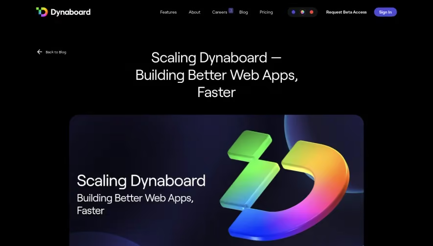
Design with AI
Generate a new design based on this screen using your own content.
# Design from Reference: Arcade Blog Post
Create an original, high-fidelity visual design inspired by the reference. Prioritize composition, typography, colors, spacing, and component styling over technical implementation.
## Reference
- **Product:** Arcade
- **Category:** Blog Post
- **Screenshot:** https://cdn.prod.website-files.com/5e9dc792e1210c5325f7ebbc/63dd9e7ddd47a2513b93e394_screenshot.webp
Analyze the screenshot first. If inaccessible, request it rather than guessing.
## Content
{{content.instructions}}
{{content.data}}
Preserve essential messaging and factual accuracy. Adapt structure and copy length for visual balance; never invent product claims.
## Visual Design
### Overall aesthetic
- **Character:** Understated product-company article with a large UI-collage cover and a narrow editorial reading column.
### Page composition
- **Canvas:** 1680 × 7233 screenshot px.
- **Structure:** Navigation; broad rounded cover graphic; centered category/title/deck; four long text sections; author/share row; three related-article cards; compact footer.
- **Capture state:** Several exceptionally large blank white gaps separate article sections; no imagery is visible in those gaps.
### Information hierarchy
- **Priority:** Cover artwork and repeated article title establish the topic. Bold section headings and underlined inline links organize the body.
### Typography
- **Family:** Neutral sans serif, exact font unverified.
- **Scale:** Estimated screenshot article title 48–52 px, section headings 34–38 px, body 20 px with approximately 34 px leading and metadata 12–14 px.
### Colors & surfaces
- **Sampled palette:** White #FFFFFF dominates; very pale near-white pink/lavender tones occur in the cover.
- **Accents:** Dark navy text and blue signup/share controls. Exact accent hex values not established by the sampled dominant pixels.
### Components
- **Cover:** Large title/year at left and overlapping product-library, share and analytics windows right, over a subtle pastel background.
- **Article:** Plain paragraphs without enclosing cards; fine dividers separate sections.
- **Related/footer:** Thin outlined rounded article tiles with category/read-time labels; small author portrait capsule and three solid blue share squares.
### Visual rhythm
- **Spacing:** Narrow prose column surrounded by broad margins; unusually tall empty regions slow the captured page. Use intentional section spacing rather than reproducing unexplained voids.
### Responsive
- **Observed:** Desktop only.
- **Adaptation:** Keep body approximately 65–75 characters per line, stack related cards and crop cover imagery to maintain title legibility.
### Adaptation guidance
- **Preserve:** Editorial restraint, UI-collage cover, strong subsection hierarchy and subtle outlined related cards.
- **Replace:** Use supplied article copy and actual media; do not invent content for the capture's blank regions.
Use this context to reproduce the reference's visual language: layout, typography, colors, spacing, borders, radii, and distinctive elements. The screenshot takes priority if descriptions conflict.
## Direction
{{preferences.fidelityInstructions}}
## Output
{{output.instructions}}
Deliver a polished, cohesive design with precise alignment, hierarchy, and spacing. Produce the requested visual artifact, not just a description. If unsupported, explain the limitation.