
Thank you! Your submission has been received!
Oops! Something went wrong while submitting the form.
Get SaaSFrame Pro
Monthly
$18
Quarterly
$48
Yearly
$180
Upgrade to access this feature
Browse all screens & flows
Filter and search screens & flows
Access Figma files
Access mobile versions
Bookmark screens & flows
Join now
Officevibe Blog Post

Officevibe
A new approach to employee experience
Designed by
No items found.

Bookmark
Bookmark

Design with AI
Thank you! Your submission has been received!
Oops! Something went wrong while submitting the form.
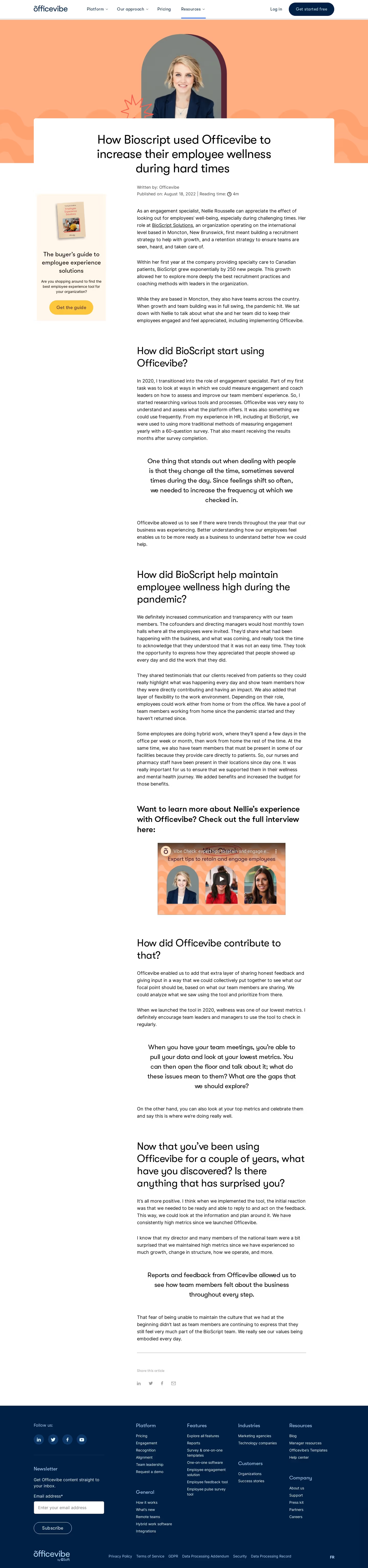
# Design from Reference: Officevibe Blog Post
Create an original, high-fidelity visual design inspired by the reference. Prioritize composition, typography, colors, spacing, and component styling over technical implementation.
## Reference
- **Product:** Officevibe
- **Category:** Blog Post
- **Screenshot:** https://cdn.prod.website-files.com/5e9dc792e1210c5325f7ebbc/62ff1da72ebb2c247df0685a_1660886334483-how-bioscript-used-officevibe-to-increase-their-employee-wellness-Laptop%2520Medium-1660886282295.webp
Analyze the screenshot first. If inaccessible, request it rather than guessing.
## Content
{{content.instructions}}
{{content.data}}
Preserve essential messaging and factual accuracy. Adapt structure and copy length for visual balance; never invent product claims.
## Visual Design
### Overall aesthetic
- **Style:** Warm editorial customer-story article with a peach illustrated hero, white reading area and deep navy multi-column footer.
- **Character:** Large rounded sans-serif headings, comfortable black body copy, generous whitespace and occasional centered pull quotes.
- **Brand treatment:** An arched portrait, plum offset silhouette, coral hand-drawn burst and low-contrast peach waves introduce a human tone without decorating the article body.
### Page composition
- **Capture scale:** 1440 × 6124 image px. CSS reconstruction estimates assume an unverified 1× capture.
- **Header:** A roughly 76 px-high white navigation row uses a centered container about 1180 px wide. Logo sits left; platform, approach, pricing and resources links occupy the middle; login and a navy pill action sit right. Resources has a blue underline.
- **Hero image band:** A full-width peach region extends approximately 560 px below the header. An arched portrait is centered, with darker offset arch and small burst accent.
- **Overlapping title:** A broad white rounded-top article block begins before the peach band ends. The centered three-line title overlaps this transition, creating a layered editorial entry.
- **Article layout:** A narrow promotional sidebar begins near x=144, while the main reading column begins around x=536 and is approximately 660 px wide.
- **Opening content:** Author, publication date and reading-time metadata precede several introductory paragraphs. The left sidebar contains a guide cover image, centered headline, short description and yellow rounded action.
- **Reading sequence:** Large question-style subheadings alternate with paragraphs and three centered pull quotes. A bold invitation introduces a centered embedded video with a peach thumbnail.
- **Closing article:** The final paragraphs end above a thin horizontal divider, a small share label and four compact sharing icons.
- **Footer:** A full-width navy band contains social controls and newsletter form at left, four additional navigation columns, brand mark below and a bottom legal/language row.
### Information hierarchy
- **Primary title:** The centered article headline is the largest editorial element and clearly sits above the metadata and body.
- **Reading hierarchy:** Large regular-weight question headings introduce each interview topic. Paragraphs remain consistently sized; pull quotes interrupt the flow with larger centered text.
- **Promotional hierarchy:** The guide card is separate from the reading column, using a cream surface and yellow action rather than competing with the article's headline.
- **Embedded media:** A bold multi-line invitation and centered thumbnail mark the interview video as supplemental content.
- **Footer hierarchy:** Muted blue group headings distinguish link collections; the newsletter area includes its own description, email label, input and outlined Subscribe control.
### Typography
- **Family:** Rounded geometric sans-serif forms appear in headings and navigation; body copy is a simpler neutral sans serif. Exact font identities are unverified.
- **Article title:** Approximately 46–48 px, regular to medium weight, with 55–58 px leading and centered alignment.
- **Section headings:** Approximately 38–40 px with 46–48 px leading, regular weight and generous spacing above.
- **Body copy:** Approximately 18 px with 28 px line-height. The reading column supports long but comfortable lines, usually around 65–80 characters depending on word length.
- **Pull quotes:** Approximately 25–27 px with 38 px leading, centered inside a slightly inset portion of the reading column.
- **Metadata:** Approximately 16 px with 24 px leading, medium gray, including a small clock glyph near the reading time.
- **Sidebar:** Guide title is approximately 24 px with 32 px leading; description is approximately 14 px. Footer links are approximately 14 px, with headings around 18 px.
- **Measurement limit:** Typography values are visual estimates under the assumed 1× capture, not extracted CSS or verified font assignments.
### Colors & surfaces
- **Reading canvas:** Sampled sRGB #FFFFFF fills the main article and navigation.
- **Navy:** Sampled #012045 supplies the strong footer and primary header-action background.
- **Peach hero:** Sampled #FFAE81 is the principal hero color, with sampled #FEA26F among the related wave/decorative tones.
- **Guide surface:** Sampled #FFF6EC forms the warm cream promotional card.
- **Text:** Sampled #000000 provides the article's darkest text reference; sampled #5F5F5F is a medium-gray reference for secondary text.
- **Additional accents:** The guide action is yellow, the hero includes coral and plum details, and the active navigation underline is blue. Their exact values are not established by the dominant-color sample.
- **Footer contrast:** Light blue headings, links and outlined controls sit on navy. Keep footer text readable rather than making it as faint as decorative hero waves.
### Components
- **Portrait treatment:** Tall arch-shaped image with rounded upper half and straight lower sides, paired with an offset darker silhouette. The lower portrait is partly covered by the title block.
- **Article title block:** White, broad and lightly rounded at its upper corners; no prominent border or shadow.
- **Guide card:** Approximately 270 px wide, cream fill, small radius and centered content. The guide-cover image has a slight angle and soft shadow.
- **Guide action:** Yellow pill, approximately 170 × 56 px, centered beneath the card description.
- **Inline links:** Underlined within body paragraphs, maintaining ordinary body size rather than appearing as detached buttons.
- **Video embed:** Approximately 500 × 280 px, centered in the reading column, with a play control and visible platform-style title overlay.
- **Pull quotes:** Text-only, centered and generously separated from surrounding paragraphs; no enclosing colored card or large decorative quotation glyph.
- **Share controls:** Small muted icons aligned horizontally beneath a fine rule, with a subdued share label above.
- **Newsletter:** White email input approximately 275 px wide with small-radius corners, followed by a separate outlined navy-compatible pill action.
- **Social controls:** Four circular blue buttons with light symbols appear together near the top-left footer area.
### Visual rhythm
- **Macro pacing:** Colorful portrait hero gives way to a quiet long-form reading experience, followed by a dense dark footer.
- **Reading rhythm:** Paragraph spacing is around 30–40 px; major headings receive larger breaks around 70–90 px.
- **Quote pacing:** Centered enlarged quotations create pauses between left-aligned paragraphs without changing the page background.
- **Asymmetry:** The small guide card occupies the upper left while the article continues far below it, leaving open space in that sidebar region.
- **Alignment:** Metadata, paragraphs, subheadings, divider and share controls share the main reading-column edge; pull quotes and media are inset.
### Responsive
- **Evidence limit:** Only desktop is shown; the following are adaptation recommendations.
- **Article recommendation:** Use a single reading column with 20–24 px side padding; reduce title to approximately 30–36 px and section headings to 26–30 px.
- **Sidebar recommendation:** Move the guide promotion after the introduction or article, retaining a clear separation from editorial text.
- **Hero recommendation:** Scale or crop the arch portrait carefully and reduce the overlap so the title does not obscure the subject's face.
- **Media recommendation:** Preserve the video aspect ratio and keep pull quotes within the available text width.
- **Footer recommendation:** Stack newsletter and navigation groups, allowing legal links to wrap comfortably.
### Adaptation guidance
- **Retain editorial clarity:** Lead with a relevant portrait and clear article title, then use metadata, readable paragraphs, meaningful subheadings and selected pull quotes.
- **Use authentic material:** Replace interview claims, quotations, customer names and photography with authorized source content.
- **Keep promotion secondary:** Use the side card only for a genuinely related resource and avoid interrupting every article section with conversion prompts.
- **Preserve brand warmth:** Adapt peach/cream accents and rounded typography while keeping the reading area neutral and high contrast.
- **Match article length:** Let the number of sections and quotes follow the supplied story. Do not stretch short content to reproduce the reference's full height.
- **Accessibility recommendation:** Provide descriptive image alternatives, accessible video controls and clearly labeled sharing/newsletter actions; these behaviors are not verified from the screenshot.
Use this context to reproduce the reference's visual language: layout, typography, colors, spacing, borders, radii, and distinctive elements. The screenshot takes priority if descriptions conflict.
## Direction
{{preferences.fidelityInstructions}}
## Output
{{output.instructions}}
Deliver a polished, cohesive design with precise alignment, hierarchy, and spacing. Produce the requested visual artifact, not just a description. If unsupported, explain the limitation.


Category
Patterns
No items found.
Tech Stack




Added on
August 19, 2022
Similar screens
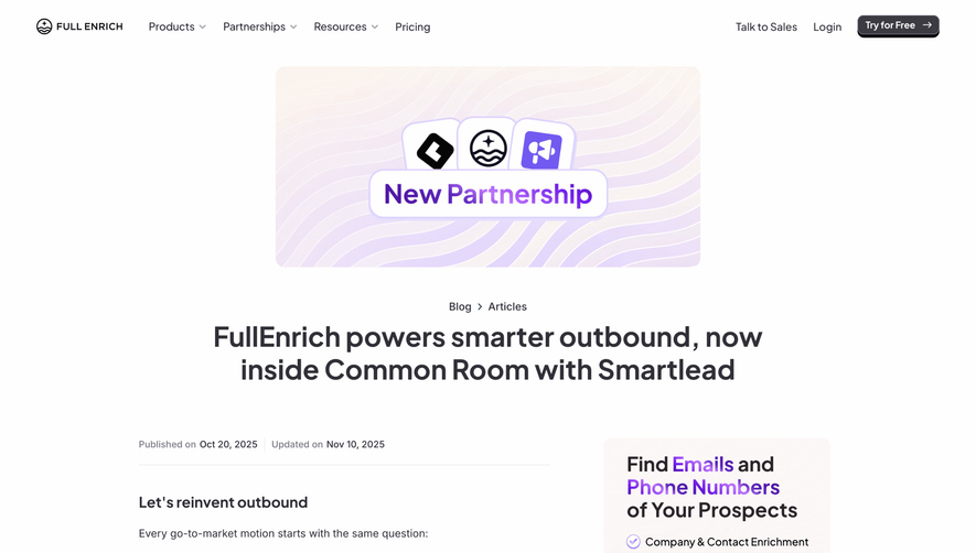



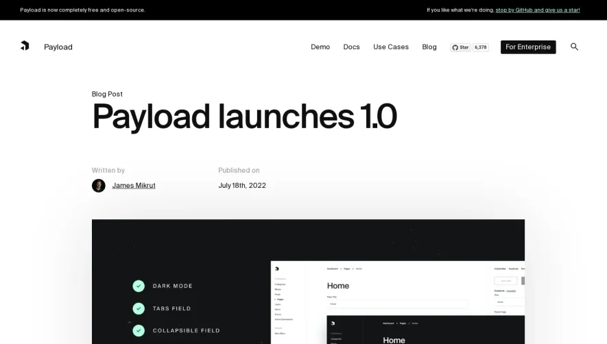

Upgrade to SaaSFrame Pro now to see similar examples.
Monthly
$18 /month
Billed $18 monthly
Browse all screens & flows
Filter and search screens & flows
Search text in screenshots
Access Figma files
Access mobile versions
Join now
Quarterly
$16 /month
Billed $48 quarterly
Browse all screens & flows
Filter and search screens & flows
Search text in screenshots
Access Figma files
Access mobile versions
Join now
Yearly
$15 /month
Billed $180 yearly
Browse all screens & flows
Filter and search screens & flows
Search text in screenshots
Access Figma files
Access mobile versions
Join now